Burgundy Home Decor: Why It's Everywhere this fall and How to Style It
On rainy fall evenings, there's nothing I love more than lighting a candle, wrapping myself in a soft blanket and pouring a glass of Amarone, my favorite wine, while the rain runs down the windows and the house slowly gets quiet around me.
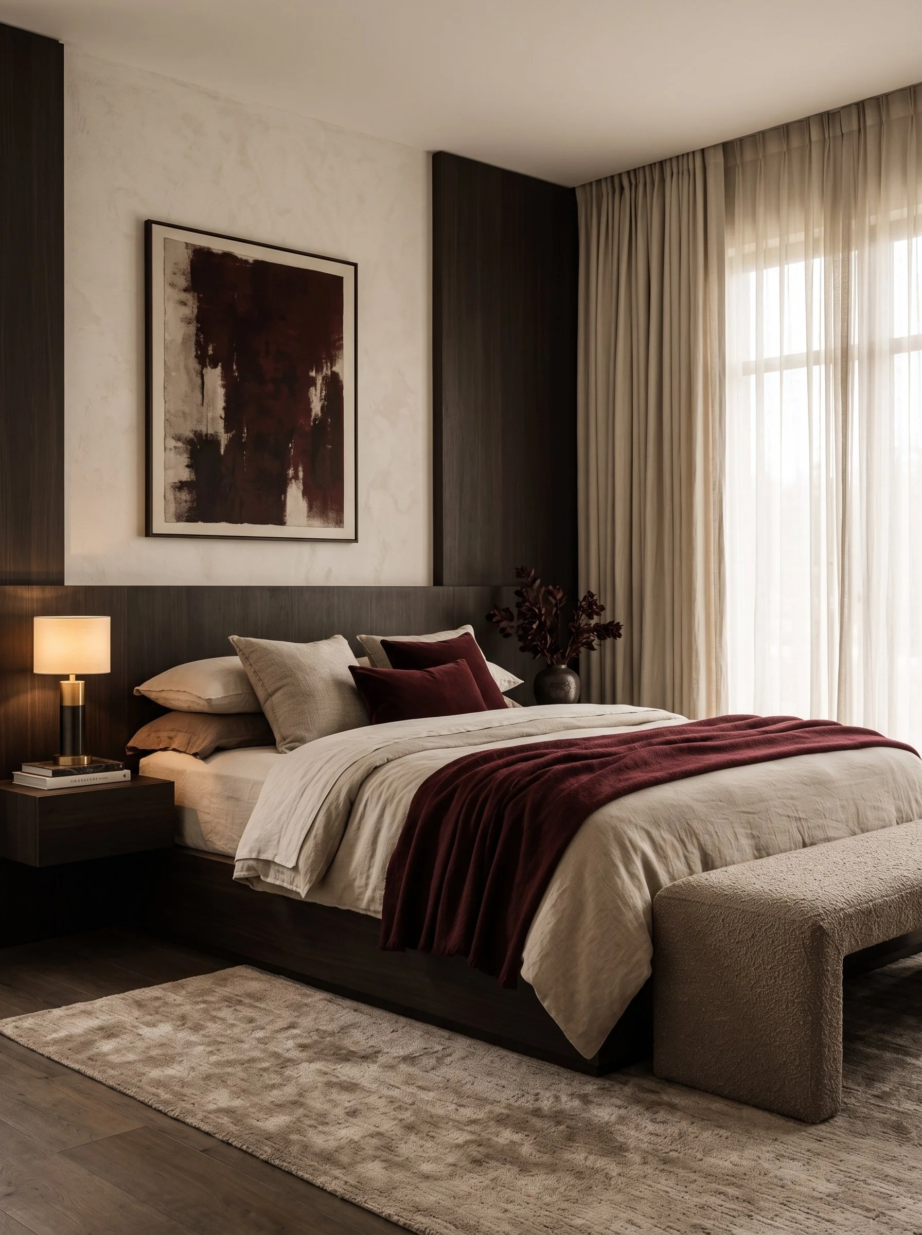
I think a big part of that feeling comes from the color itself. The wine in my glass, the velvet pillow on the sofa and the throw over my knees all share the same deep burgundy tone, and together they make the whole room feel warm, calm and wrapped up for the season.
So when burgundy home decor became one of the biggest interior trends of 2026, it made complete sense to me. Paint brands have named it their color of the year, Pinterest searches for deep burgundy have more than tripled, and designers are treating it as a new, richer kind of neutral. The good news is that it's much easier to live with than you might expect: pair it with soft neutrals like ivory, sand and taupe, ground it with dark wood such as walnut, and finish with a little brushed brass and plenty of texture like velvet and bouclé.
In this post, I'm sharing why burgundy is trending right now, where it works best in your home and how much of it to use, along with the color combinations and materials that make it look elegant and my favorite pieces to shop the look.
Why Burgundy Home Decor Is Trending in 2026
Burgundy home decor is trending because homeowners are trading pale, cool neutrals for deep, warm colors that make a space feel personal and cozy. The signals come from every corner of the design world.
Pinterest search data: In the data behind Pinterest's 2026 color forecast, searches for "deep burgundy" rose 230% and "dark plum" rose 220% (Elle Decor).
Paint colors of the year: Graham & Brown chose Divine Damson, a deep burgundy, and Little Greene chose Adventurer, a shade between burgundy and plum, as their 2026 colors of the year (Ideal Home). Glidden picked Warm Mahogany, a rich red-brown (Apartment Therapy).
Sherwin-Williams: The Colormix Anthology II forecast includes a Restorative Darks collection with Plum Brown, Dark Auburn and Rojo Marrón, each a different take on burgundy (Hunker).
Textile fairs: At Heimtextil 2026 in Frankfurt, burgundy appeared across rugs, textiles and trend displays, with some exhibitors calling it the new black (Rug News).
Interior designers: Designers name brown and burgundy as the rich neutrals to watch this year (Southern Living).
Why does it resonate so deeply? Burgundy is the natural next step after cherry red, which topped Pinterest's trend report for 2025 (i-D). It feels deeper and more grown-up, closer to a neutral than a statement. And while Pantone chose a soft white called Cloud Dancer for 2026 (Livingetc), many people are reaching for the opposite: richness, depth and warmth.
Where Burgundy Home Decor Works Best (and Why)
Burgundy home decor shines in rooms where you want atmosphere and warmth. Ask yourself these questions to find the right spot in your home.
Where do you spend your evenings? Living rooms and bedrooms are natural fits. Burgundy glows under lamplight and candlelight, which is exactly when these rooms get used most.
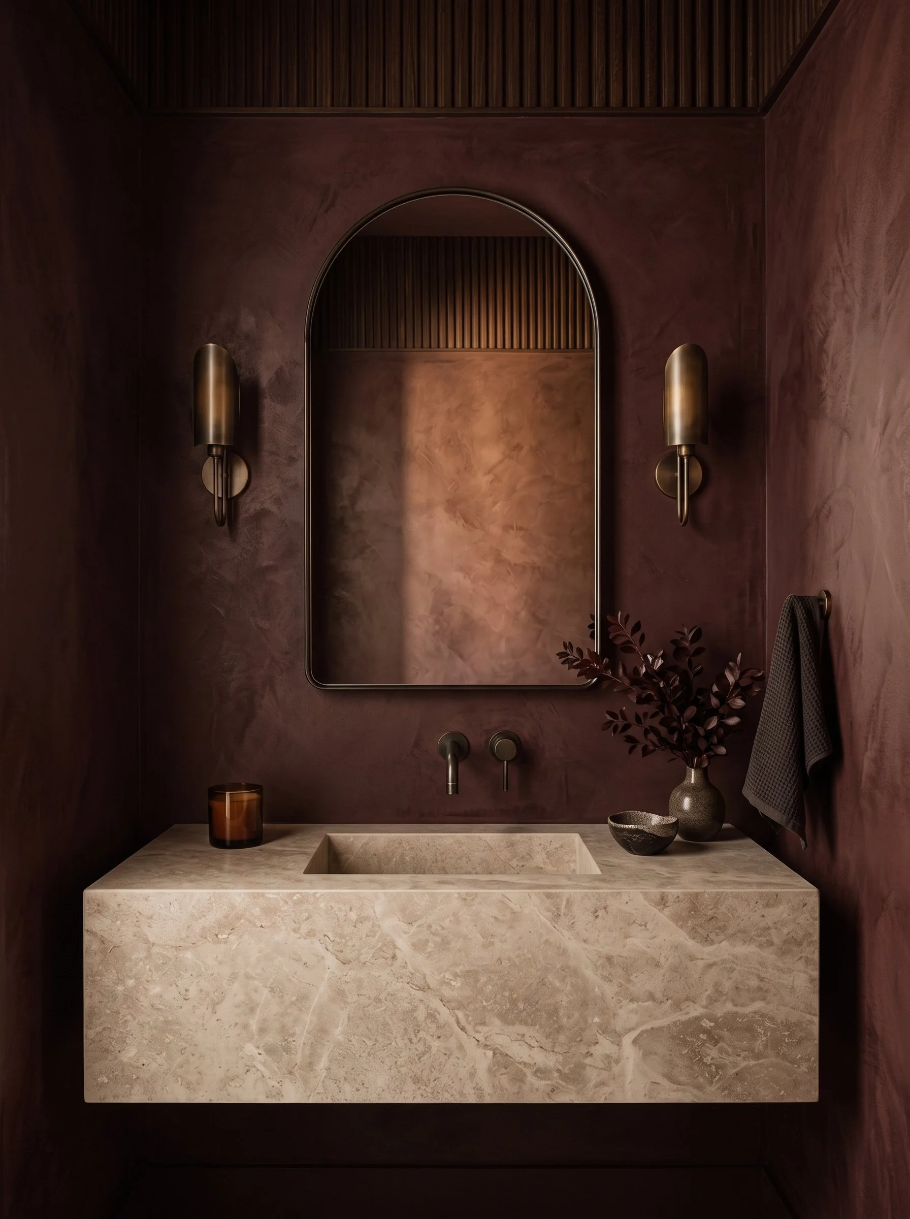
Is the room small and enclosed? A powder room is a wonderful place to start. Interior designer Michaela Sedlak of ODE Design calls it the perfect spot to experiment with burgundy without it feeling overwhelming (Southern Living).
Is it the kitchen? Burgundy bar stools or cabinetry add depth to stone and wood. Designers pair burgundy kitchen cabinets with an icy or slate blue for extra drama.
Is the room bright and airy? In light-filled spaces, designers suggest a softer, muted burgundy layered with camel and tan.
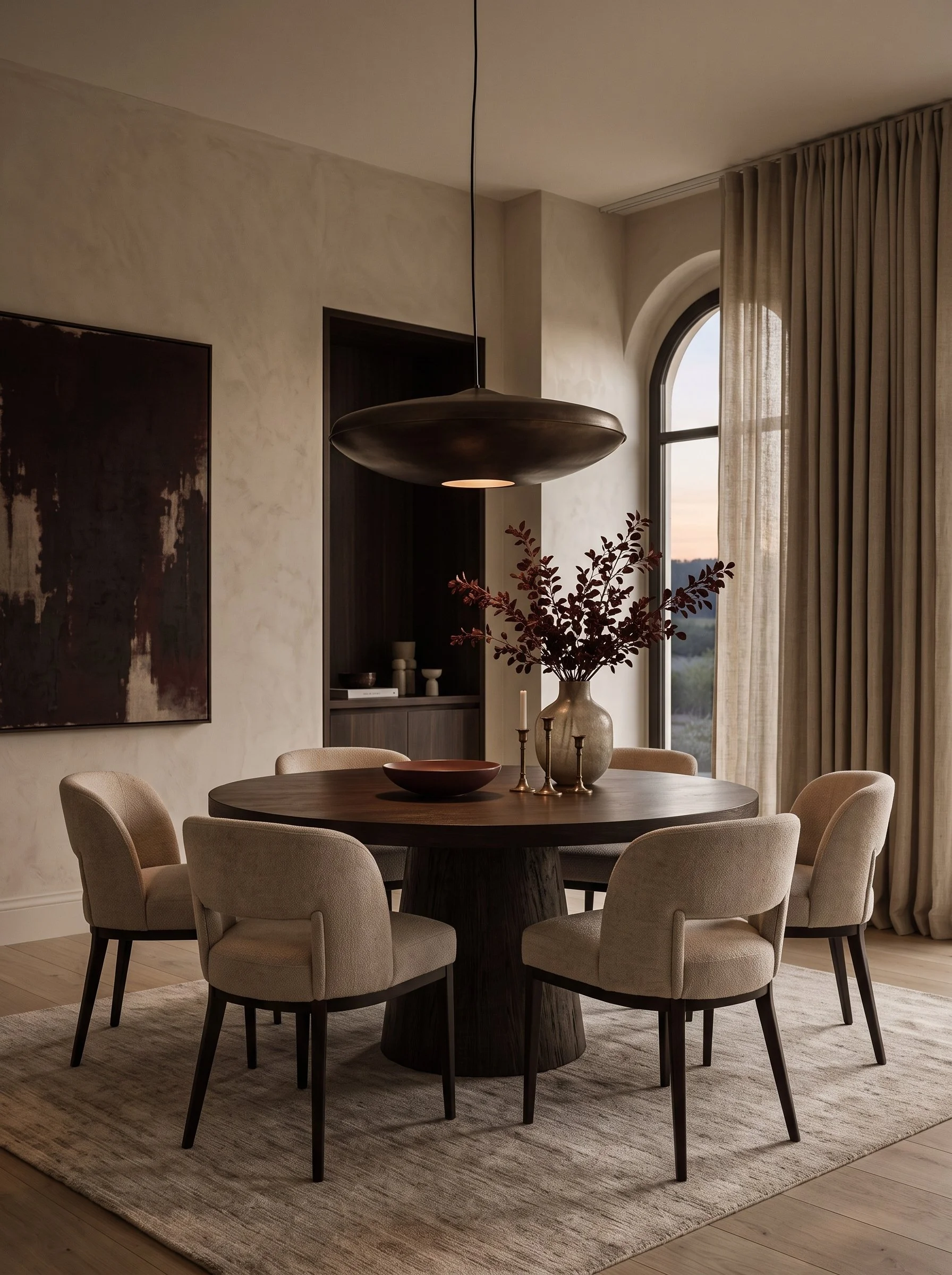
Do you want full drama? A media room or dining room can carry burgundy from walls to upholstery. Albionnord wrapped a home theater in tonal burgundy with paneled walls, a velvet sofa and a marble bar (Hunker).
Accent or All In? How Much Burgundy Home Decor to Use
The easiest way to use burgundy home decor is to keep a calm neutral base and add burgundy in layers. How far you go depends on how much commitment you want.
Accents: A throw, velvet pillows, candles or dried stems are the easiest place to start, and since you can swap them every season, they're perfect if you rent or simply want to test the trend first.
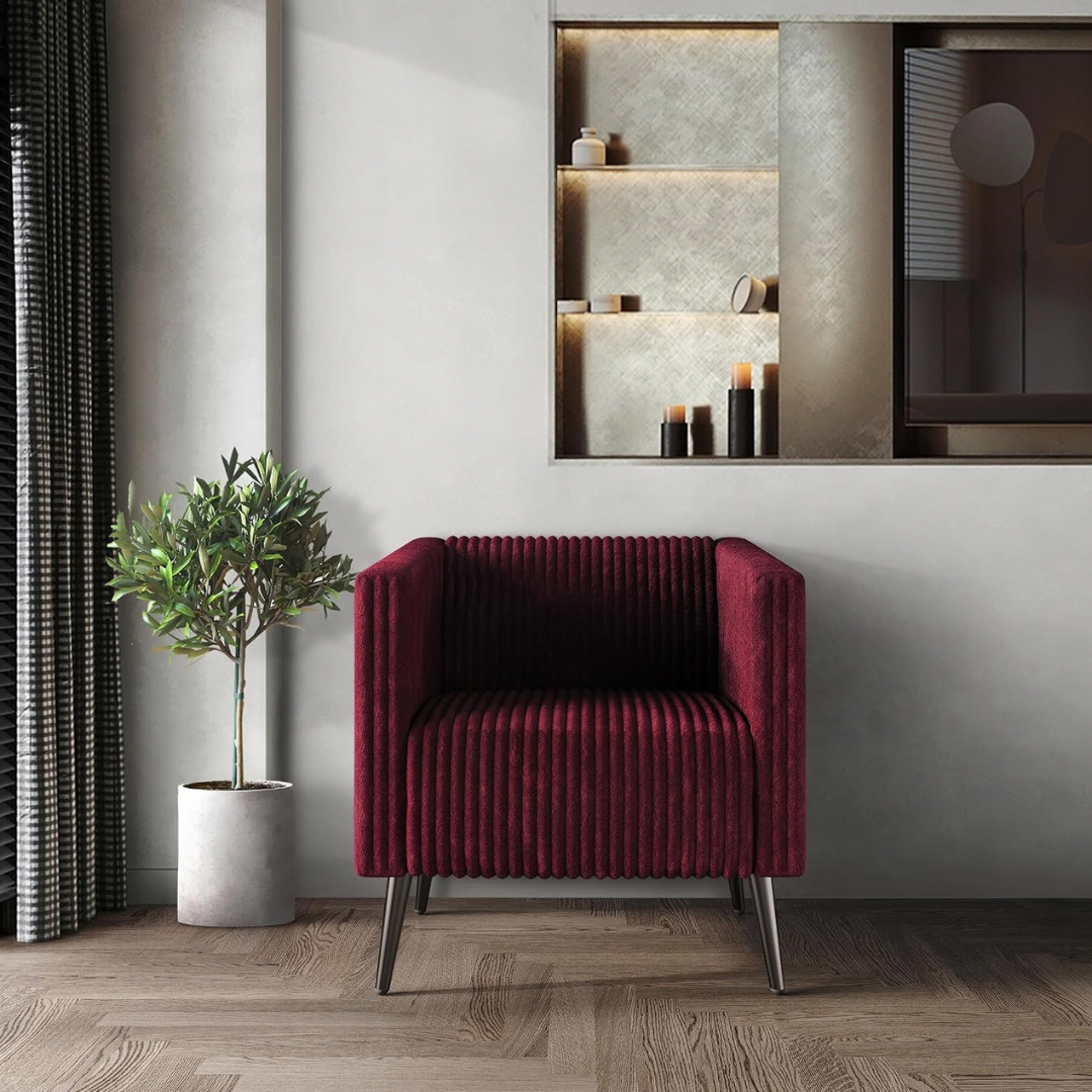
A statement piece: A velvet accent chair, a rug or a set of bar stools gives an ivory or taupe room a clear anchor without touching the walls.
An accent wall or cabinetry: One painted wall, a patterned wallpaper or burgundy kitchen cabinets take a little more commitment and add depth to one area of your home.
A full color drench: Walls, trim and furniture in tonal burgundy create the most drama and work especially well in powder rooms, dining rooms and media rooms.
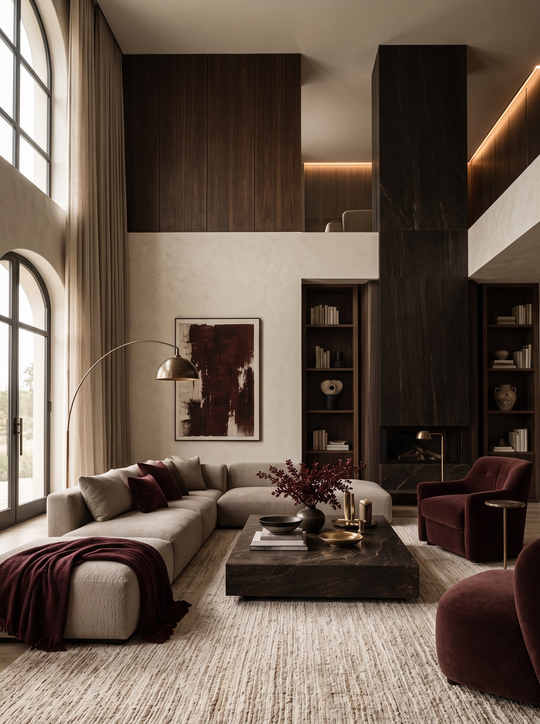
If you are unsure, start with accents and a single statement piece. That is the approach in my concept board: an ivory and sand base, espresso wood, and burgundy repeated in the throw, pillows, an armchair and the kitchen stools. Repeating the color in a few places makes it feel intentional.
Going bolder? Burgundy also works beautifully as a considered accent on a feature wall or in a wallpaper pattern (Komar). For a full drench, designers balance the depth with brushed brass accents and warm, textured neutrals (Hunker).
Burgundy Home Decor Color Combinations
The colors that go best with burgundy home decor are soft warm neutrals (ivory, cream, sand, taupe), deep browns, muted greens and blues. Because burgundy carries hints of brown and purple, it sits comfortably next to earthy shades.
The Casa Ferrier burgundy color palette
This is the palette from my concept board: quiet, layered and timeless.
Ivory (approx. #E8E0D3) for walls, the sofa and curtains
Sand (approx. #BFB09C) for rugs, bouclé and linen
Taupe (approx. #7D756C) for textured throws, stone and lamp shades
Espresso (approx. #2A1E18) for wood furniture, shelving and frames
Burgundy (approx. #4A1018) for velvet, throws, pillows, art and candles
More burgundy color combinations to try
Burgundy, cream and walnut: The most classic and versatile combination, easy to try with a cream sofa, a walnut coffee table and a burgundy throw.
Burgundy with camel and tan: Soft and sunlit, especially lovely with a tan leather chair and muted burgundy pillows.
Burgundy and olive green: Earthy and collected, for example olive linen curtains next to a burgundy velvet chair.
Burgundy with navy or slate blue: Moody and tailored, whether that's navy bedding against a burgundy headboard or blue walls with burgundy cabinets.
Burgundy and butter yellow: Playful and fresh, like a butter yellow lamp or vase in front of a burgundy wall.
Burgundy and dusty rose: Romantic and soft, with blush linen and a few burgundy velvet accents.
Burgundy, black and brass: Dramatic and polished, think a black side table, a brass lamp and burgundy art above it.
Navy is tipped as the go-to partner for this year's jewel tones, and the burgundy and butter yellow combination is showing up from fashion to interiors (Southern Living, Ideal Home).
The Best Materials for Burgundy Home Decor
The best materials for burgundy home decor are rich textiles, natural stone, dark wood and warm metal. Material matters as much as the shade itself: a burgundy velvet chair and a burgundy leather chair belong to the same color family, yet they bring a completely different feel to a room.
Velvet: The signature burgundy texture. Use it on an accent chair, pillows or a throw for instant softness and depth.
Bouclé and nubby knits: Ivory or sand bouclé next to burgundy velvet creates a cozy contrast you can almost feel.
Leather: A burgundy leather chair or stool feels tailored and ages beautifully.
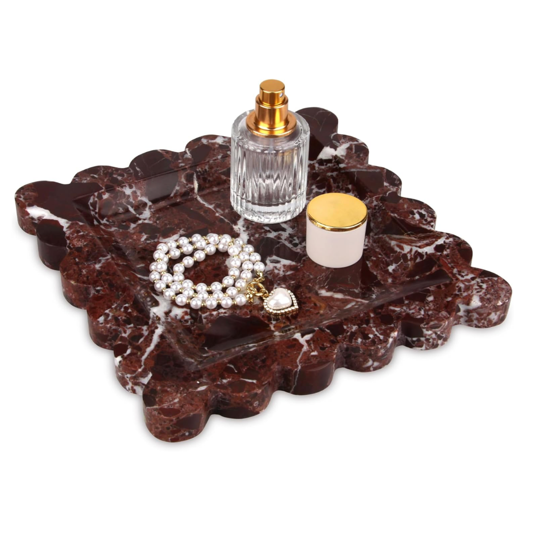
Natural stone: Creamy travertine and marble keep burgundy feeling light and elegant. Dark veined marble adds drama on a coffee table or tray.
Dark wood: Walnut and espresso-stained wood ground the color, a pairing that also appears in this season's fall trend forecasts (Komar).
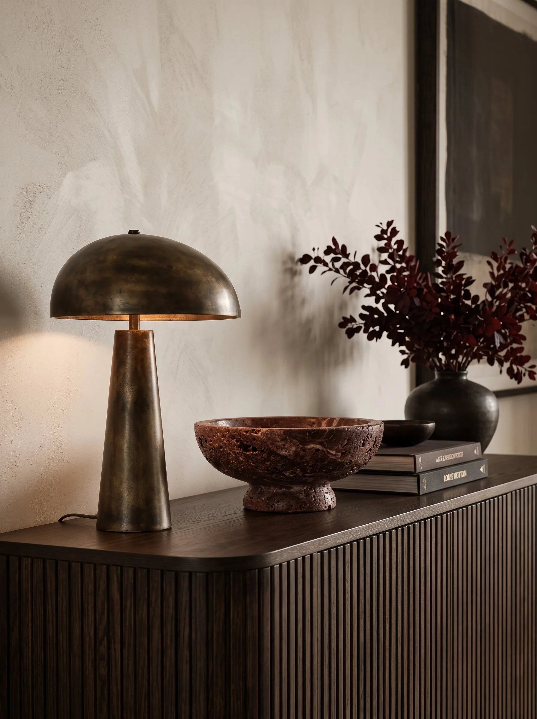
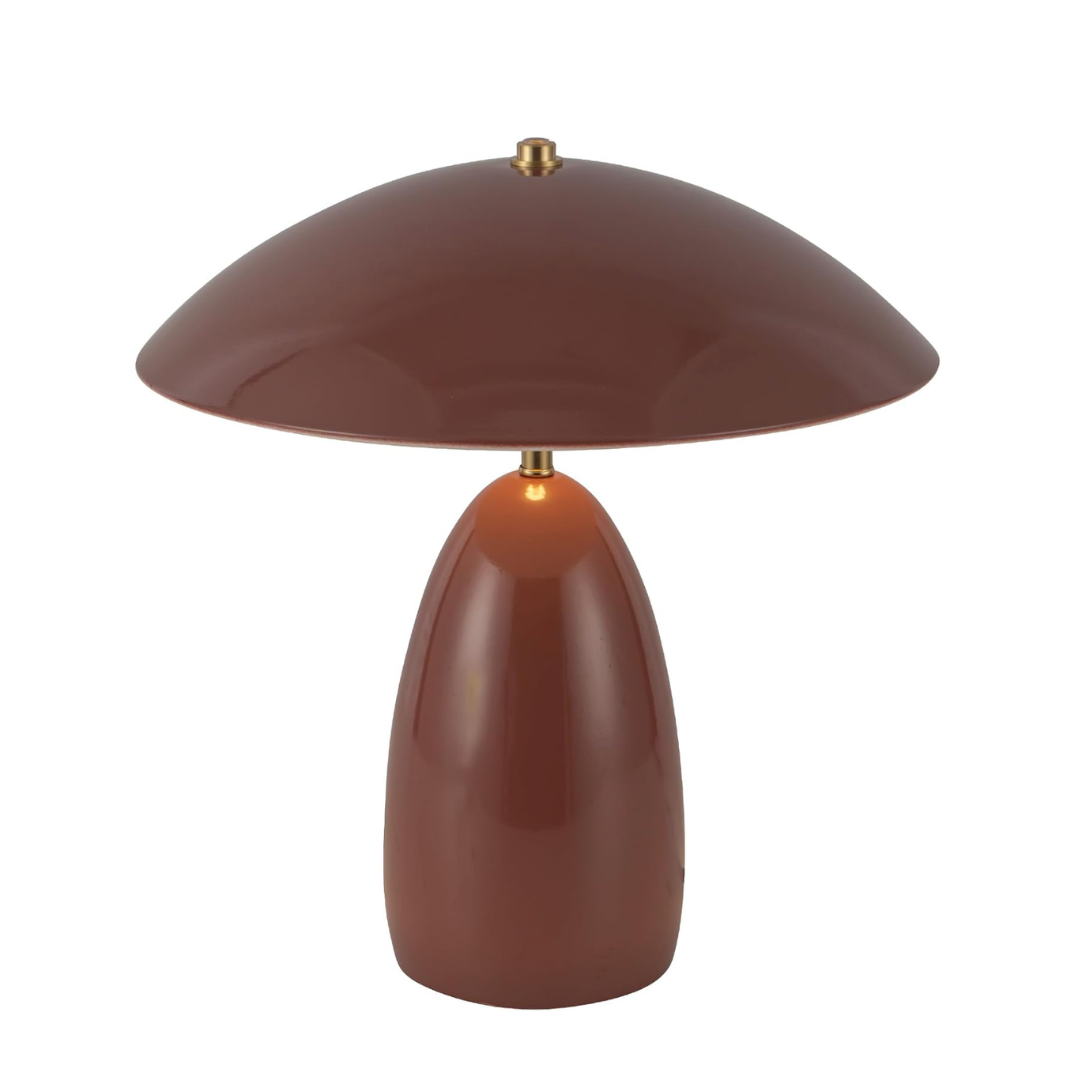
Brushed brass: Warm metal in lamps, bowls and candle holders gives burgundy a soft glow and a polished finish.
Glass: Burgundy or amber glass candle holders and vases catch the light beautifully in the evening.
Burgundy Home Decor on a Budget (and for Renters)
You can bring in burgundy home decor without painting a single wall. These small swaps deliver the look for less and move with you.
Swap your pillow covers for burgundy velvet. Keep the inserts, change the mood.
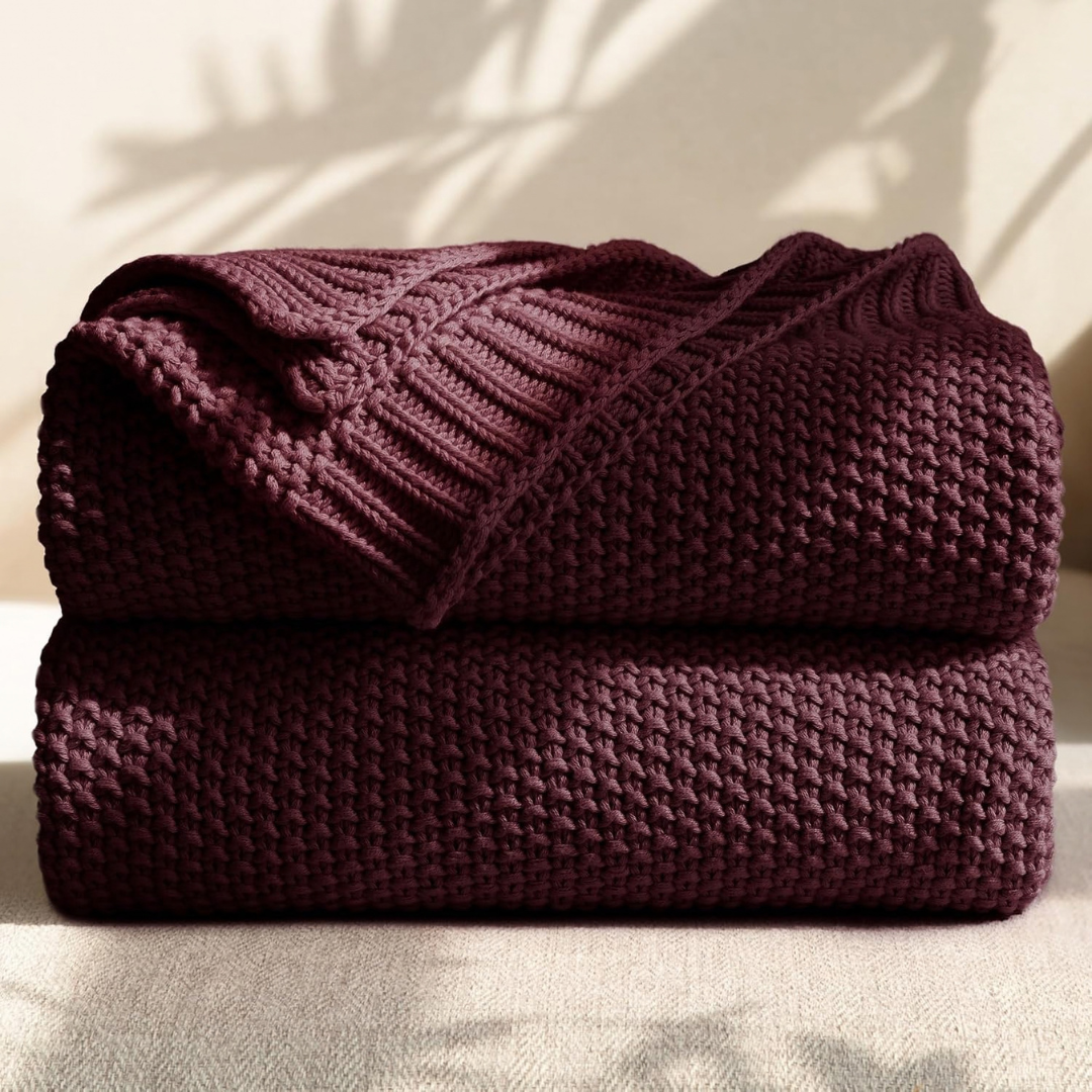
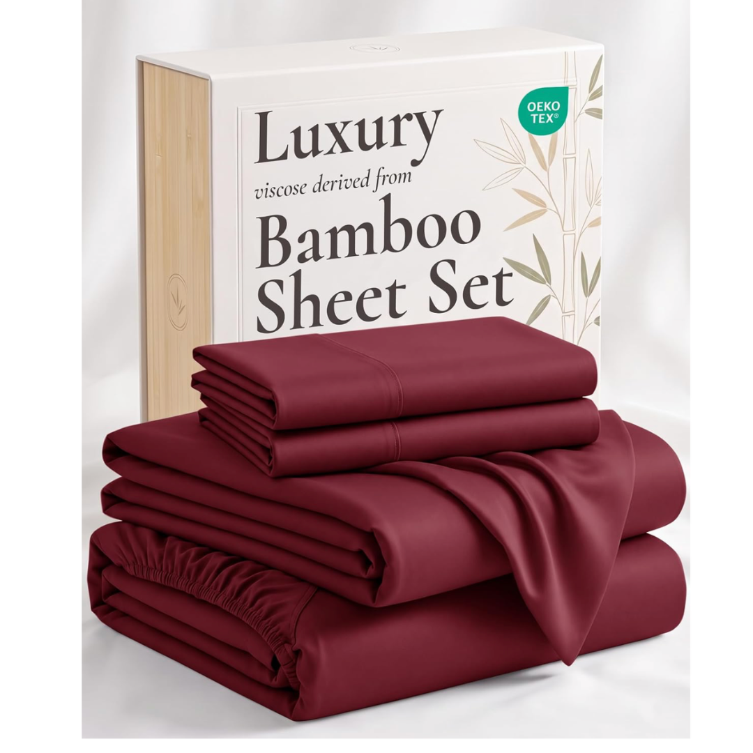
Drape a burgundy throw over the sofa or the end of the bed.
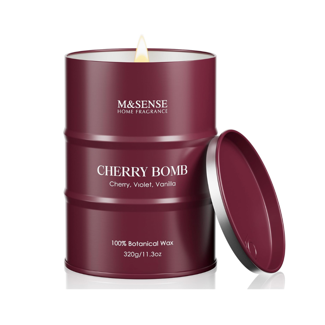
Light a burgundy glass candle. It is the coziest way to add the color, especially on rainy evenings.
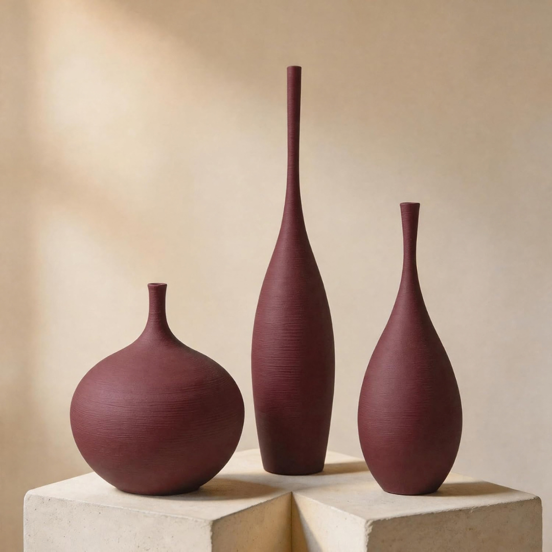
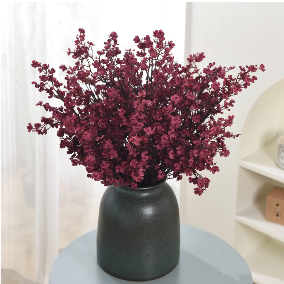
Add faux burgundy stems in a dark ceramic or clear glass vase.
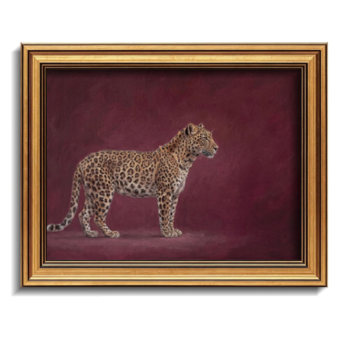
Hang a burgundy abstract art print above the sofa or bed.
Stack books with deep red spines on your coffee table with a brass bowl on top.
Try peel-and-stick tiles in glossy burgundy for a removable kitchen backsplash.
Shop the Burgundy Home Decor Look
This post contains affiliate links. As an Amazon Associate, I earn from qualifying purchases at no extra cost to you.
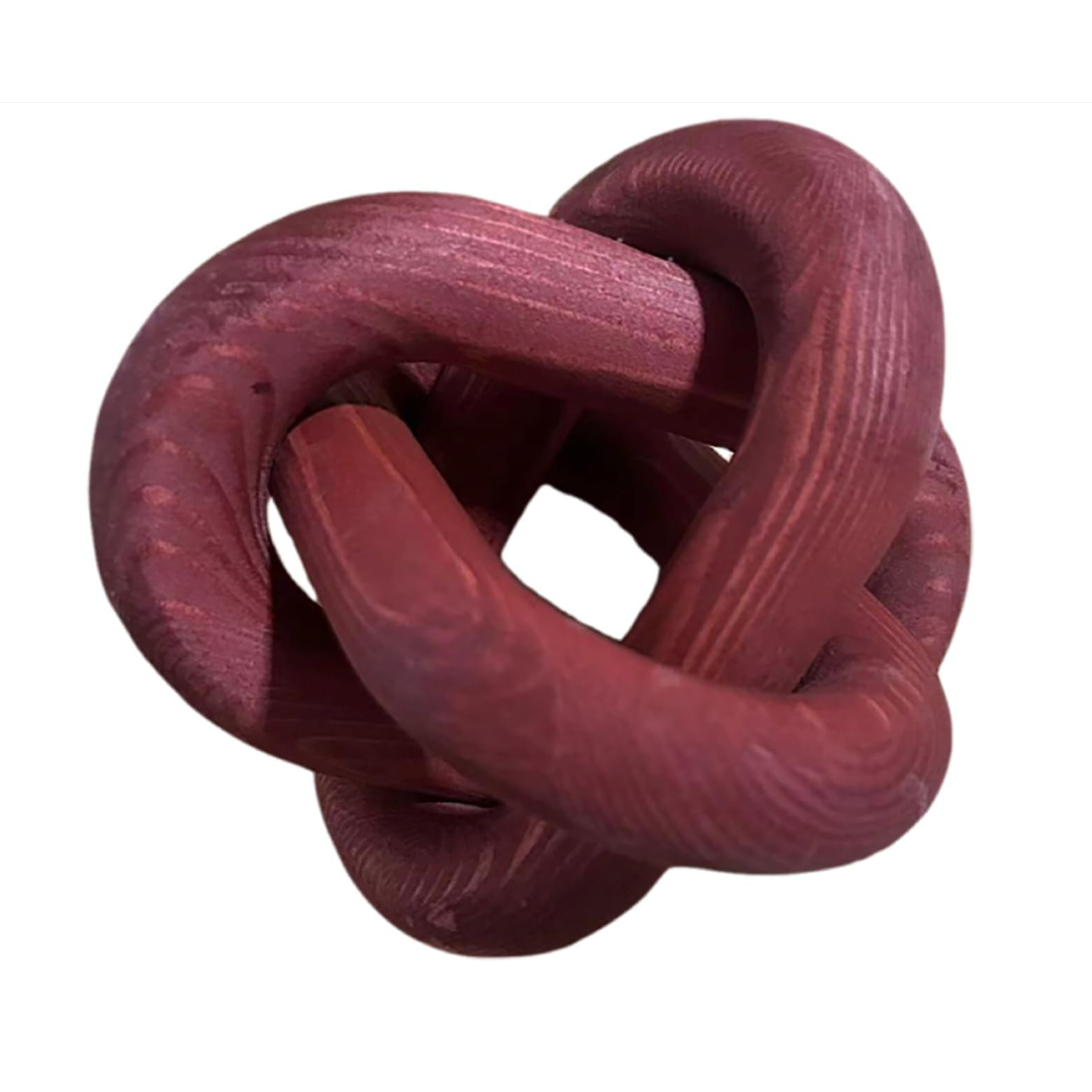
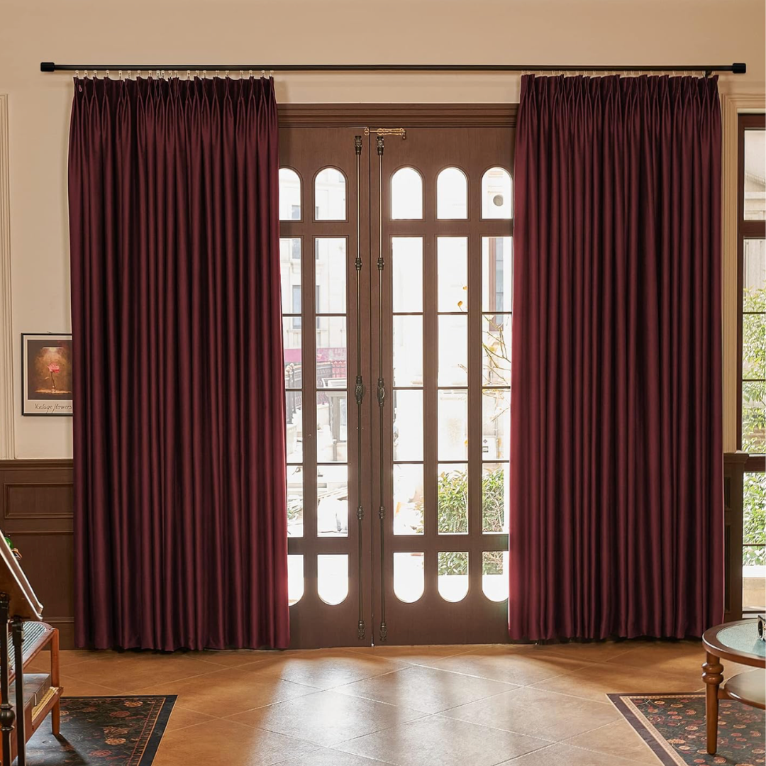
These are the pieces I would reach for to recreate my burgundy concept board at home. Each one adds the color in a way that is easy to live with.

Burgundy Home Decor FAQ
What colors go with burgundy home decor?
Ivory, cream, sand, taupe and espresso brown are the easiest partners. For more personality, try olive green, navy, slate blue, butter yellow or dusty rose. Brushed brass and walnut add warmth.
Is burgundy home decor just a trend?
Burgundy is a classic color making a comeback rather than a passing fad. Designers describe it as a rich neutral, and it has long roots in traditional interiors. Paired with timeless materials like wood, stone and velvet, it stays elegant for years.
What is the difference between burgundy and cherry red?
Cherry red is brighter and more energetic. Burgundy is deeper, with brown and purple undertones, which makes it calmer and easier to use in larger doses.
Which room is best for burgundy?
Living rooms and bedrooms are great for cozy evenings, while powder rooms are ideal for testing a bolder look. Kitchens work well with burgundy bar stools or cabinetry.
Which Sherwin-Williams colors have a burgundy look?
Sherwin-Williams' Colormix Anthology II forecast features Plum Brown, Dark Auburn and Rojo Marrón, each a slightly different expression of burgundy. Always test a sample on your wall first, since lighting changes how deep reds read.
How can I add burgundy without painting?
Start with textiles: a throw, pillow covers or bedding. Then add a burgundy candle, faux stems or an art print. A velvet accent chair is the next step up.
AI Disclosure: The room images in this post are AI-generated to visualize the concept, and the writing was drafted with AI assistance and edited by me before publishing.
Affiliate Note: Some links in this post are Amazon affiliate links, and I earn a small commission on qualifying purchases at no extra cost to you.