
Defining a Visual Signature in Home Styling
The first time someone walked into my home and said, "This feels like you," I wasn't sure what they meant. I hadn't consciously designed the space to communicate anything specific. But when I looked around, I saw it. The warm neutrals. The natural textures. The absence of anything overtly decorative. There was a consistency I hadn't named but had intuitively followed.
That's a visual signature. It's the thread that runs through your space, connecting rooms that serve different functions into a cohesive whole. It's not about making everything matchy, but about creating a recognizable aesthetic that feels intentional rather than accidental.
What a Visual Signature Is
A visual signature is the set of aesthetic choices that repeats throughout your home. It might be a color palette, a preference for certain materials, a consistent level of visual complexity, or a particular design era you're drawn to.
It's what allows your bedroom and your kitchen to feel like they belong to the same person, even though they contain entirely different objects. It's the reason a room feels finished or not, regardless of how many things are in it.
Most people develop a visual signature without realizing it. You buy things you like, and over time, patterns emerge. The work is in noticing those patterns and leaning into them deliberately.
Why Consistency Matters
A home without a visual signature can feel disjointed. Each room is fine on its own, but walking from one to the next is jarring. The living room is modern and minimal. The bedroom is traditional and ornate. The kitchen is industrial. There's no conversation between them.
I've lived in spaces like this. Rooms I'd decorated over years, accumulating furniture and decor without a unifying vision. Every piece was something I liked in isolation, but together, they didn't add up to anything coherent.
When I started editing for consistency, the space changed. It felt calmer. More intentional. Like a place designed by someone who knew what they were doing, rather than someone responding to impulses.
Identifying Your Visual Signature
The hardest part is recognizing what you're actually drawn to versus what you think you should like.
Look at What You Already Own
I started by photographing every room in my home and looking at the images as a whole. Patterns emerged immediately. I gravitated toward warm wood tones. I avoided anything shiny or overly polished. I chose simple shapes over ornate ones.
These weren't conscious decisions at the time, but they revealed my preferences. Once I saw the pattern, I could make future choices more deliberately.
Notice What You Save
I keep a folder of images that resonate with me. Room layouts, individual objects, color palettes. When I reviewed it, I noticed recurring themes. Spaces with lots of natural light. Rooms that felt uncluttered but warm. Materials like linen, leather, and raw wood.
Your visual signature is often hiding in what you're already collecting, even if you haven't acted on it yet.
Identify What Doesn't Fit
Sometimes it's easier to define your signature by what it's not. I know I'm not drawn to bold patterns, high-contrast color schemes, or anything overly glossy. Those elements feel wrong in my space, even when they're objectively beautiful.
Knowing what to avoid is as useful as knowing what to pursue. It helps you filter out things that don't serve your vision, even when they're tempting.
Elements of a Visual Signature
A signature can be built on several elements. You don't need all of them, but having a few consistent threads creates coherence.
Color Palette
This is the most obvious element. A consistent palette ties disparate rooms together visually.
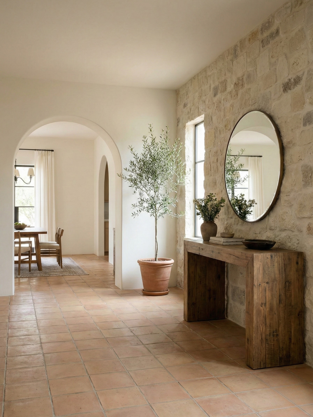
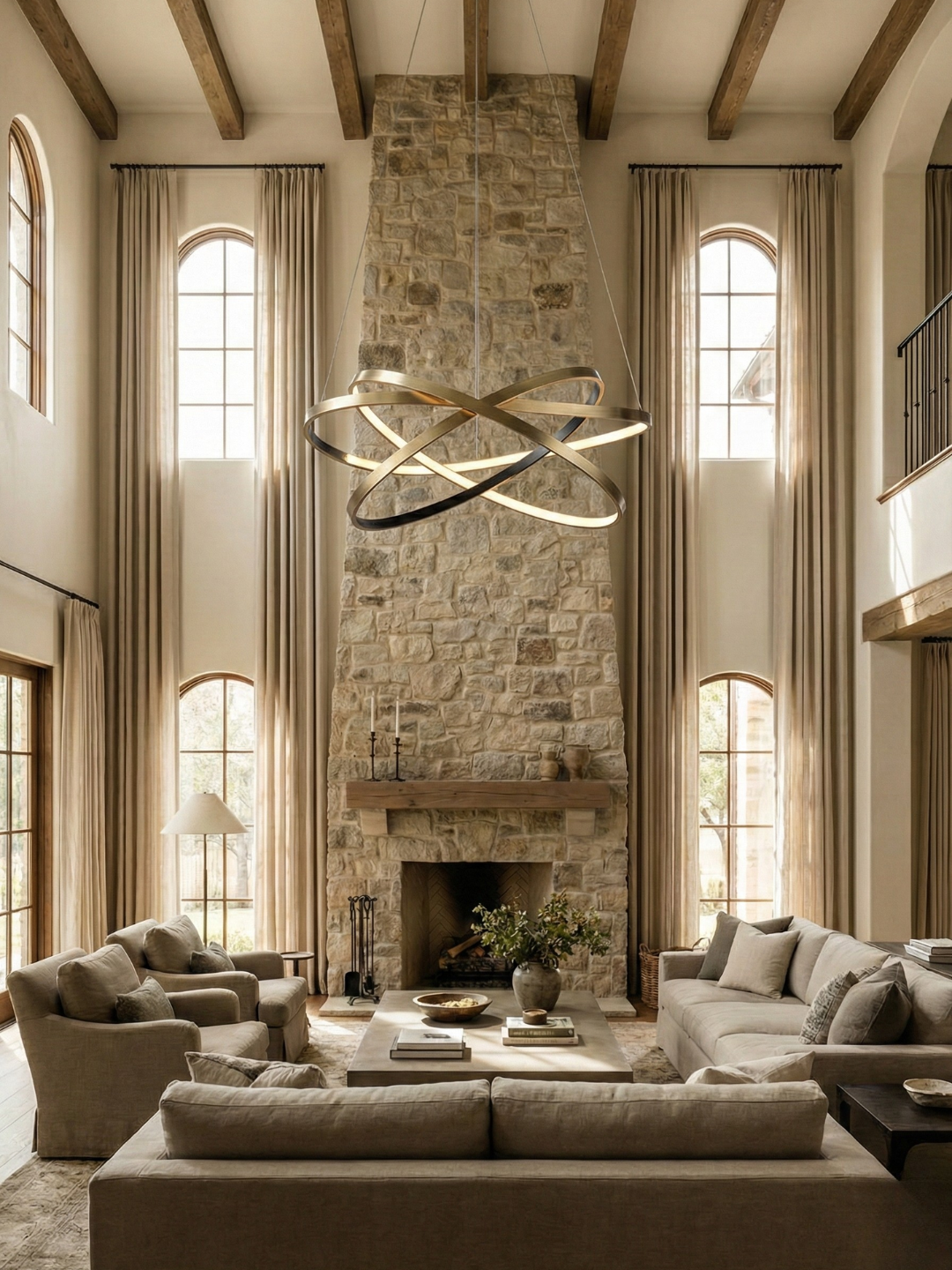
My palette is warm neutrals: cream, camel, soft grey, warm white. I allow for variation within that range, but I don't introduce colors that clash with it. A rust-colored throw can work. A bright turquoise pillow can't.
I also think about undertones. My neutrals lean warm rather than cool. That small distinction affects every choice I make, from paint to textiles to wood finishes.
Material Preferences
The materials you choose create a tactile signature that's as important as color.
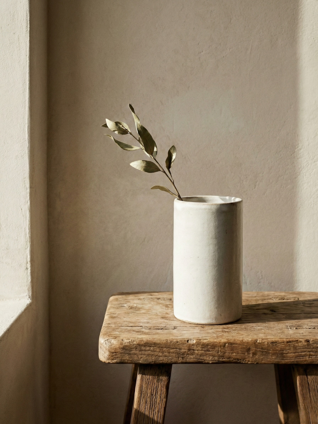
I lean toward natural materials. Linen, wool, solid wood, stone, leather. These materials age in a way that synthetic ones don't, and they create a warmth that's hard to replicate with manufactured alternatives.
Even when I use something modern or industrial, I make sure it's grounded by natural elements. A metal lamp base, but with a linen shade. A glass coffee table, but on a wool rug.
Level of Ornamentation
Some people love pattern and decoration. Others prefer restraint. Neither is wrong, but consistency matters.
I'm in the restrained camp. I choose pieces with clean lines and minimal embellishment. When I do introduce pattern, it's subtle. A textured throw rather than a graphic print. Wood grain rather than a painted design.
This doesn't mean my space is sterile. It means the interest comes from texture, proportion, and material rather than decorative elements.
Design Sensibility
This is the overarching aesthetic lens. Mid-century modern. Industrial. Scandinavian. Traditional with a modern twist.
I describe my sensibility as warm minimalism. It's cleaner and more restrained than traditional interiors, but warmer and more textural than stark minimalism. That description helps me make purchasing decisions. If something feels too cold or too busy, it doesn't fit.
Applying Your Signature Across Rooms
Once you've identified your visual signature, the work is in applying it consistently without making every room identical.
Anchor Each Room With the Palette
Even if rooms serve different functions and have different furniture, the color palette should be recognizable.
My bedroom has a cream duvet and camel linen curtains. My living room has a grey sofa and cream walls. My kitchen has warm white cabinetry and natural wood shelving. The specific items differ, but the tonal range is consistent.
Repeat Materials Strategically
I don't use the same materials in every room, but I make sure certain materials show up throughout the house.
Linen appears in my living room as curtains, in my bedroom as bedding, and in my dining room as napkins. Wood shows up in furniture, shelving, and cutting boards. These repetitions create subliminal connections between spaces.
Maintain a Consistent Level of Visual Complexity
If your living room is minimal, your bedroom shouldn't be maximalist. The level of visual activity should feel related, even if the specific items are different.
I keep every room relatively restrained. My living room has a few key pieces and negative space. My bedroom follows the same principle. This consistency means you're never visually overwhelmed moving from one room to another.
When to Break Your Own Rules
A visual signature isn't a prison. There's room for variation, especially in spaces that serve specific functions.
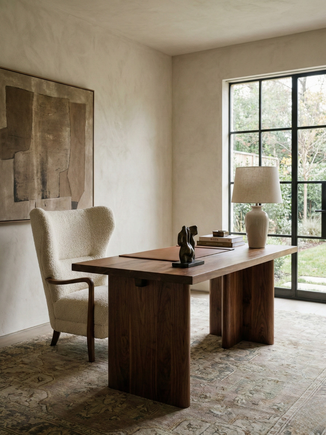
I allow my home office to be slightly more functional and less aesthetically driven. The desk is ergonomic rather than beautiful. The shelving is practical. But even there, I stick to the color palette and avoid anything that would feel alien to the rest of the house.
The key is that any deviation should be intentional. If you're introducing something that doesn't fit your signature, you should know why and be able to articulate it.
Real Examples From My Home
Walking through my house, you'd see the signature immediately. The living room has a linen sofa, a wool rug, and a walnut coffee table. The bedroom has linen bedding, a wood platform bed, and a ceramic lamp. The kitchen has open wood shelving, linen tea towels, and stone countertops.
None of these rooms look identical, but they share a DNA. The materials, the tones, the level of restraint. It's what makes the space feel cohesive rather than like a series of unrelated boxes.
What a Visual Signature Creates
When your home has a clear visual signature, it becomes easier to make decisions. You have a filter for every purchase. Does this fit my palette? Does this material align with what I already use? Is this the right level of complexity?
That filter eliminates a lot of noise. You're not second-guessing every choice or wondering if something will work. You know what fits and what doesn't.
It also creates a sense of home. A space that feels designed by one person with a point of view, rather than assembled from trend pieces and impulse buys. That coherence is what makes a house feel like it belongs to you.
The work of defining your visual signature is ongoing. Your taste will evolve. You'll discover new materials or colors that resonate. The goal isn't to lock yourself into a fixed aesthetic forever. It's to create a framework that guides your choices and keeps your space feeling intentional.
That's the difference between a curated home and a decorated one. Curation has a point of view. It has continuity. It feels like a reflection of the person living there, not a collection of things that happened to end up in the same place.