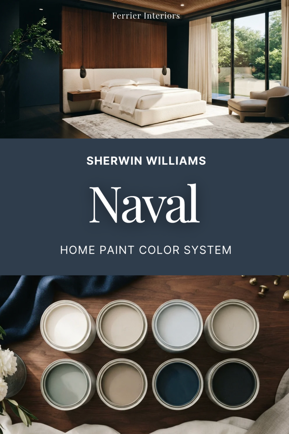
Sherwin Williams Naval Color Review and pairing tips
Naval: A Deep, Classic Sherwin-Williams Shade Worth Trying
Most dark paint colors ask you to be brave. Naval doesn't. It's the navy that shows up in hundred-year-old dining rooms and brand-new kitchens alike, and both look like they were always meant to have it. If you've been circling dark blues and can't decide which one is actually safe to commit to, this is the one with the track record.
Sherwin-Williams' Naval (SW 6244) is a deep classic navy with a gray backbone. Sherwin-Williams named it Color of the Year in 2020, and it outlived the trend cycle because it was never really a trend. Navy this composed has been used in homes for a century.
What Does Naval Look Like?
Across a room in average light, Naval reads close to ink. Step closer and the blue shows itself, a rich navy that sits between indigo and charcoal rather than anywhere near bright blue. There's nothing preppy or nautical about it on the wall.
That double life is the appeal. From a distance it does the job of a near-black, giving a room weight and structure. Up close it rewards you with actual color. Very few dark paints manage both.
What Are the Undertones?
The base under the blue is gray, with a barely-there touch of green. What matters is what's missing: there's no purple and no red in it. Navies with purple in them go violet under warm evening bulbs, and that's the shift that makes people regret their dining room a month in.
Naval doesn't do that. It stays blue by day and slides toward charcoal by night, which is a shift you'll actually enjoy.
What Is the LRV of Naval?
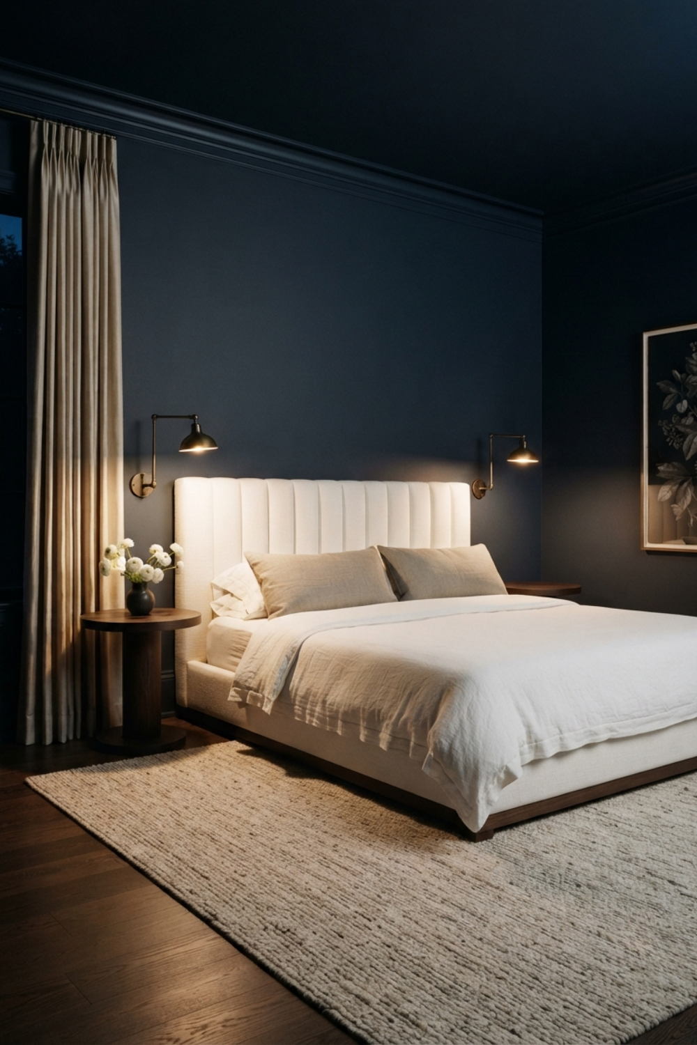
The Light Reflectance Value (LRV) of Naval is 4. On a scale where pure white sits near 100, that means this color swallows nearly all the light in a room. That's not a warning, it's the job description. You choose an LRV 4 color to create atmosphere, to pull walls in, to make a space feel deliberate. Just know that no amount of recessed lighting will make a Naval room feel airy, so pick rooms where airy was never the goal.
Is Naval Warm or Cool?
Cool, clearly. Blue and gray with no warm undertone to argue about it. But the gray does something useful here: it takes the chill off. Naval doesn't fight warm woods, brass, or cream the way a sharper cobalt or royal blue would. In practice you can treat it like a dark neutral and it will cooperate with almost anything warm you put in front of it.
What Lighting Directions Work Best?
Light changes everything, and here's how Naval tends to shift based on the room's exposure:
North-facing rooms: The gray wins and Naval leans charcoal. Beautiful if you want a true moody room, heavy if you don't
South-facing rooms: The most flattering exposure. Steady daylight keeps the blue legible all day
East-facing rooms: Blue and alive in the morning, quieter and more slate-like after noon
West-facing rooms: Darkest early, then the low afternoon sun brings a softness to it right at the hour most people are home to see it
Tip: A standard sample chip of Naval will just look black in your hand. Paint at least a two-foot board, stand it against the wall, and check it after dark under your real lamps. Rooms this dark are lived in mostly at night, so the nighttime version is the one to judge.
Best Rooms to Use Naval In
Some of my favorite rooms for Naval:
Dining Rooms: Candlelight and dark navy walls flatter everyone at the table
Home Offices and Libraries: The color equivalent of closing the door. Focus comes easier in a dark room
Bedrooms: Drenched on all four walls, it turns a bedroom into somewhere you actually wind down
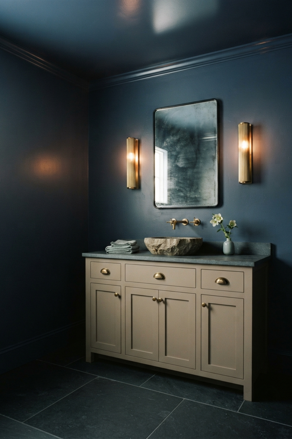
Powder Rooms: The smallest room in the house is the cheapest place to get the biggest reaction
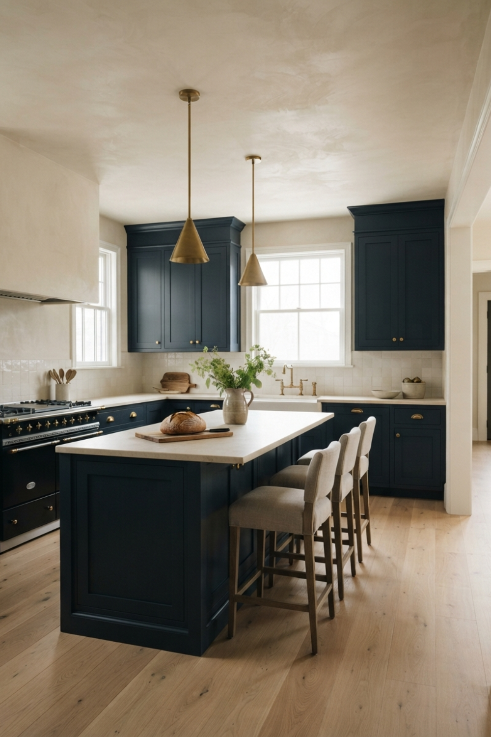
Kitchens: Naval lower cabinets or an island under light counters is one of the most repeated combinations in American kitchens because nobody has found a reason to stop
What Wood Tones Pair Beautifully?
Naval looks especially lovely with:
White oak or light natural wood: The pale grain keeps a Naval room from going heavy, very current and very forgiving
Walnut or mid-tone wood: Adds warmth and a bit of tradition, this is the study-and-shelves direction
Ebonized or dark-stained wood: Low contrast, high drama. For rooms where you're committing to the dark side entirely
What Materials and Finishes Complement It?
This color shines when paired with:
Wool, linen, and heavier weaves: Texture keeps a dark room from feeling flat, and Naval needs that relief
Cognac and tan leather: Navy and saddle leather is as close to a guaranteed pairing as interiors have
Travertine and warm-veined marble: Warm stone against the cool wall keeps the balance honest
Unlacquered brass and aged bronze: Gold-toned metal glows against navy, which is why every navy kitchen you've saved has brass hardware
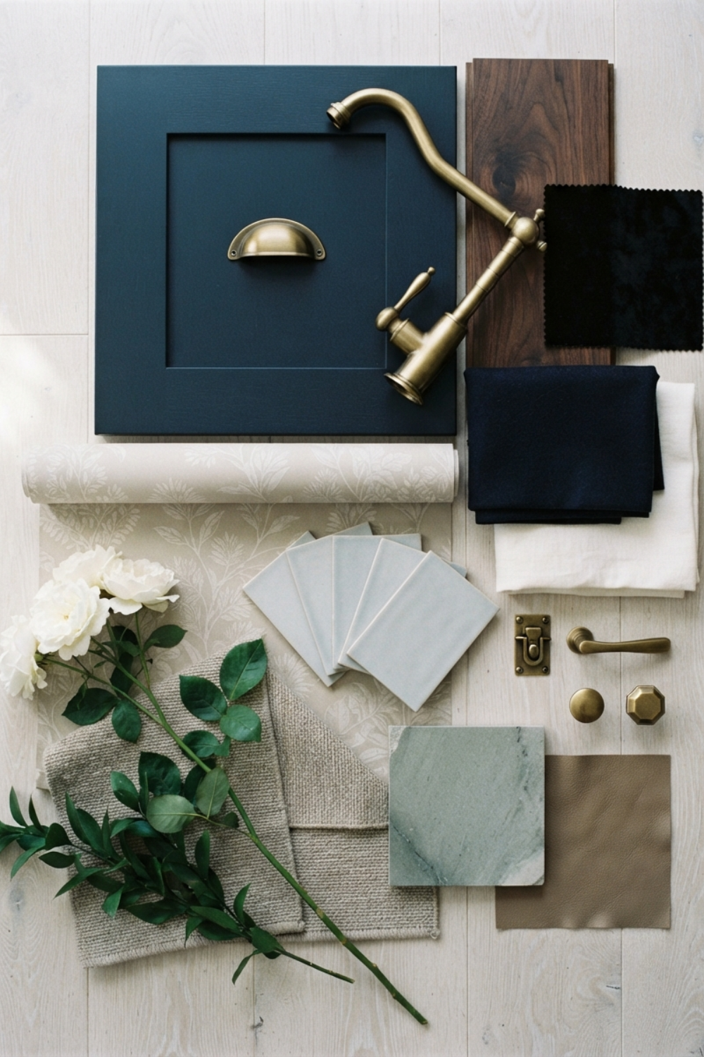
What Colors Pair Well With Naval?
This color plays well with:
Warm whites and creams: Maximum contrast, fully classic, impossible to get wrong
Soft greiges and warm beiges: Lowers the formality so navy works in a relaxed family home
Pale fog blues: A tonal route that feels coastal without a single piece of rope decor
Camel, caramel, and rust: Warm earth tones push the blue richer through contrast
Muted gray-greens: The quiet pairing most people don't think of, and the one that looks most custom
What Styles Work Best with This Color?
Naval feels right at home in:
Traditional and Classic American: Dining rooms, paneling, studies. This is home turf
Coastal and New England: Delivers the maritime feel through depth instead of decoration
Modern Farmhouse: The standard-bearer for navy islands and navy front doors on white houses
Transitional: Strong enough to anchor rooms that mix eras
English-inspired interiors: With walnut and brass, Naval carries the library look without costume
Would I Use This for Trim or Doors?
For doors, cabinetry, and built-ins: absolutely, and before I'd use it on walls. Naval might honestly be a better furniture-and-millwork color than a wall color. A Naval front door, island, or vanity gives you the full payoff of the color in a contained, low-regret dose.
As a whole-house trim color it's a much bigger swing. Dark trim photographs beautifully and lives more demandingly, showing dust and locking your palette into high contrast everywhere. If you're tempted, test it in one room first and live with it through a winter.
Who Is Naval Best For?
This shade is perfect for:
Anyone drawn to black rooms who suspects they'd enjoy blue ones more
People who want their one bold choice to still look right in ten years
Anyone about to paint an island, a front door, or a built-in and tired of second-guessing
Final Thoughts
There's a reason Naval keeps showing up on shortlists year after year: it takes the risk out of going dark. The depth is real, the drama is real, and the regret rate is about as low as dark paint gets. Start with a door or an island if you're cautious, or drench the dining room if you're not.
Either way, sample big and judge it at night. A color with an LRV of 4 keeps its secrets in daylight.
Want the Full Naval Guide?
If Naval is the color, the harder question is what goes around it. The full Naval guide answers that: a color palette built to work with this navy, a complete profile for every shade, styled combinations for each one, and exterior pairings so the house reads as one idea from the curb to the back bedroom. Grab it on Etsy here.