
Balancing Warm and Cool Undertones in Your Home
The most common color mistake I see is mixing warm and cool undertones without intention. Not because mixing temperatures is wrong, but because it is difficult to do well. When it works, it feels sophisticated. When it fails, it feels confused.
I have tried both approaches in my own home. The purely warm palette felt cohesive but eventually monotonous. The mixed palette felt dynamic but required more precision. I prefer the latter, with careful attention to where the temperatures shift.
Understanding What Creates Temperature
Undertone temperature is not about whether a color looks warm or cool at first glance. It is about the bias beneath the surface. A beige can have a pink undertone, making it warm, or a gray undertone, making it cool. A white can lean yellow or blue. These distinctions are subtle but they accumulate.
In my living room, I use a warm white on the walls and a cooler white on the trim. The difference is slight, maybe two degrees on the color wheel, but it creates depth. The trim appears crisper against the walls. If I had used the same white for both, the room would feel flatter.
When Mixing Works
A successful mix requires one temperature to dominate. If the palette is 70% warm and 30% cool, the cool tones feel intentional. If the split is closer to 50-50, the palette reads as indecisive.
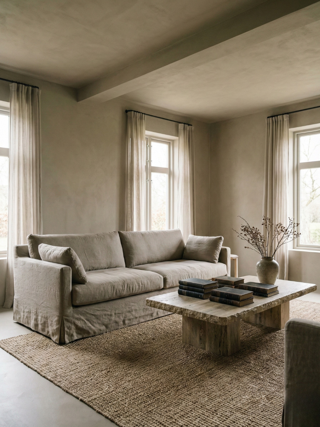
I keep my walls warm and bring in cooler tones through stone, ceramics, and certain textiles. The cooler elements feel grounding without disrupting the overall warmth. A gray linen sofa works in a room with warm walls because the temperature difference is bridged by texture and natural light.
The Role of Materials
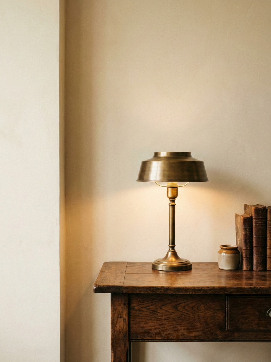
Materials carry temperature as much as paint does. Brass is warm. Chrome is cool. Oak is warm. Walnut can go either way depending on the finish. When I select hardware for cabinets or lighting fixtures, I consider how the metal temperature will interact with the wall color.
In my kitchen, the walls are a warm off-white, and the countertops are a cool gray marble. The contrast could feel jarring, but the brass fixtures and oak shelving tie the temperatures together. The warm metals echo the walls, and the wood softens the stone. The palette feels balanced because the materials create a transition.
When Mixing Fails
The failure happens when cool and warm tones are placed next to each other with no mediation. A cool gray wall next to warm oak flooring will make both look wrong. The gray appears too cold, and the oak appears too orange. This is where most people struggle.
I have seen this in rental apartments where the flooring and paint were chosen without coordination. The solution is not to repaint everything in one temperature. The solution is to introduce a third element that shares qualities of both. A rug with warm and cool tones, for example, or furniture with a neutral undertone that does not lean strongly in either direction.
Testing for Compatibility
I test colors against each other in natural light, not under store lighting. I place samples side by side on the wall and observe them throughout the day. If the combination feels uncomfortable at any point, I adjust.
When I was choosing a paint color for the bedroom, I tested it next to the existing linen curtains, which have a cool undertone. The first two warm grays I tried clashed. The third, which had a hint of gray-green, worked. The slight coolness in the paint harmonized with the linen without matching it exactly. That small shift made the difference.
Establishing Your Dominant Temperature
I recommend deciding early whether your home will lean warm or cool overall. This does not mean every surface must be the same temperature, but there should be a clear preference. My preference is warm with cooler accents, which aligns with the natural materials I gravitate toward.
Once the dominant temperature is set, the cooler tones can be introduced strategically. A cool-toned throw pillow on a warm sofa. A piece of cool gray pottery on a warm wood shelf. These moments of contrast feel intentional, not accidental.
Balancing warm and cool is not about achieving perfect equilibrium. It is about creating enough contrast to keep the eye engaged while maintaining enough consistency to feel resolved.