
The Psychology of a Resolved Home Paint Palette
There is a specific feeling that comes from walking into a home where the colors work together. Not matching, not overly coordinated, but resolved. The palette feels complete. You stop noticing the individual colors and start noticing the atmosphere they create.
I experienced this clearly when I repainted my home after living with a patchwork of colors for two years. Each room had been painted independently, without consideration for what came before or after. The result was technically fine. Each color looked acceptable in isolation. But moving through the space felt disjointed. My eye kept adjusting, recalibrating.
When I repainted with a cohesive palette, the difference was not visual. It was psychological. The space felt quieter.
What a Resolved Palette Does
A resolved palette reduces cognitive load. Your brain does not have to process competing visual information. The colors support each other rather than demand attention individually. This creates a sense of calm that has nothing to do with minimalism or sparseness. A maximalist room can feel just as calm if the colors are resolved.
In my living room, I have layered patterns and textures across multiple surfaces. Printed textiles, wood grain, ceramic glazes. The palette holds it all together because every color shares a common undertone. The eye can move freely without friction. The space feels full but not chaotic.
How Color Transitions Affect Mood
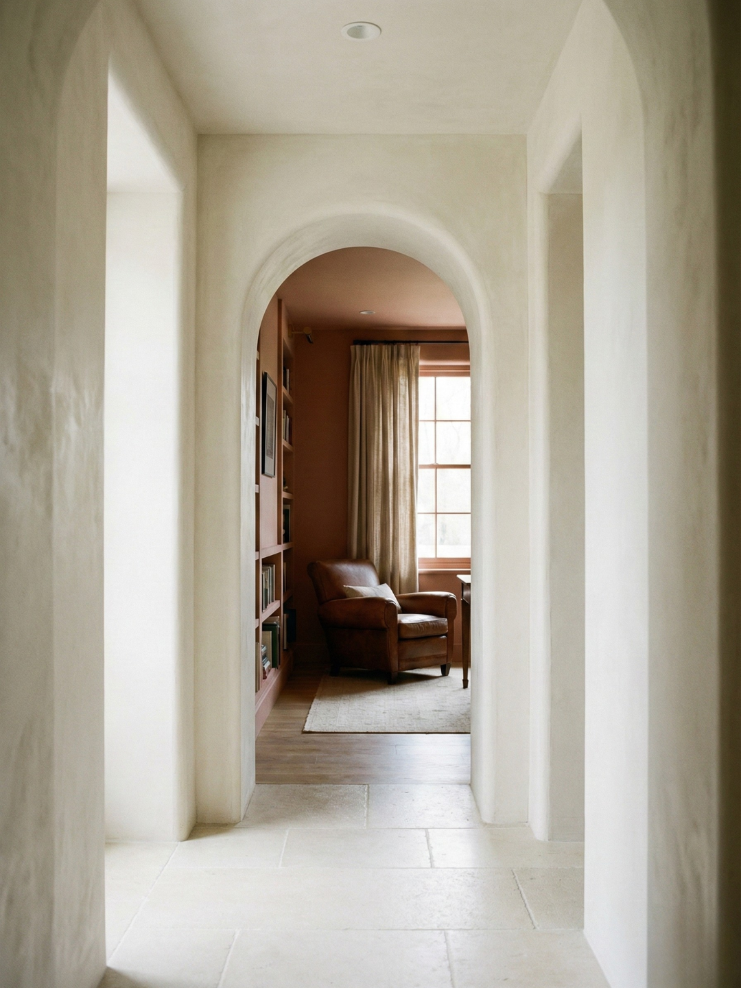
The transition from one room to another is where most palettes fail. If the shift is too abrupt, it feels like moving between separate homes. If there is no shift at all, it feels monotonous. The goal is a gentle gradient, a progression that feels natural.
I have noticed this in my own space. The hallway is the lightest color. The bedroom is slightly deeper. The bathroom is deeper still. Each transition is subtle, but together they create a sense of movement. Walking from the hallway to the bathroom feels like descending into something more private, more contained. The color supports that shift without announcing it.
The Effect of Repetition
Repeating a color in multiple rooms reinforces the sense of cohesion. I use the same warm white in the kitchen, the hallway, and the office. It appears in different contexts, under different lighting, but the repetition creates continuity. Your eye recognizes the color even if you do not consciously register it.
This is different from painting every room the same color, which can feel too uniform. The warm white is the thread, not the entire fabric. Other colors build on it, but the baseline remains consistent.
Contrast Without Conflict
A resolved palette can include contrast, but the contrast should feel intentional. I have one wall in my office painted a deep charcoal. It stands out, but it does not clash. The charcoal shares the same cool undertone as the lighter grays in the adjacent rooms. The contrast is in value, not temperature.
When contrast feels wrong, it is usually because the colors are fighting on multiple levels. Different hues, different temperatures, different saturation levels. That is too much information. Good contrast isolates one variable. Lighter versus darker. More saturated versus less saturated. Warm versus cool. Not all three at once.
The Role of Saturation
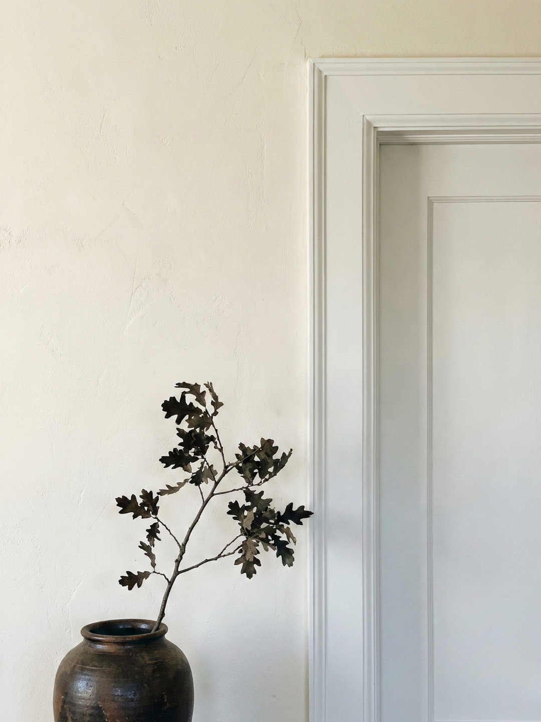
Saturation affects psychology as much as hue does. Highly saturated colors demand attention. Desaturated colors recede. I prefer a low-saturation palette because it allows the architecture and objects to stand out. The color supports the space rather than dominates it.
When I introduce a more saturated color, it is usually through something temporary. A vase, a throw, a piece of art. These objects can carry more intensity because they are small and changeable. The walls and larger surfaces stay quiet.
Living Inside a Resolved Palette
The benefit of a resolved palette is that it becomes invisible. You stop thinking about color and start inhabiting the space. The palette recedes into the background, which is exactly where it should be.
I notice this when I return home after traveling. The first thing I feel is not the color, but the calm. The palette has done its work. It has created an environment where my attention can focus on what matters rather than on constant visual adjustment.
A resolved palette is not about perfection. It is about coherence. It is about creating a space where the colors support each other and, by extension, support you.