
Color as an Architectural Tool in Your Home
Paint is the least expensive way to change the structure of a room. Not the actual structure, but the perceived one. Color can make a ceiling appear higher, a narrow room feel wider, a cluttered corner recede. It can emphasize architectural details you want to showcase or hide the ones you do not.
I use color this way constantly. When I cannot physically alter a space, I alter how it reads. The transformation is immediate and reversible, which makes it a practical tool for anyone living in a rental or working with a fixed layout.
Highlighting What Works
Some architectural features deserve attention. Original molding, built-in shelving, a well-proportioned window frame. These elements often get lost when painted the same color as the walls. I prefer to differentiate them, not dramatically, but enough to acknowledge their presence.
In my living room, the baseboards and door frames are painted in a slightly brighter white than the walls. The difference is subtle, maybe a half shade lighter, but it creates definition. The trim stands out just enough to frame the room without competing with it. If I had used the same color for both, the architectural details would have disappeared.
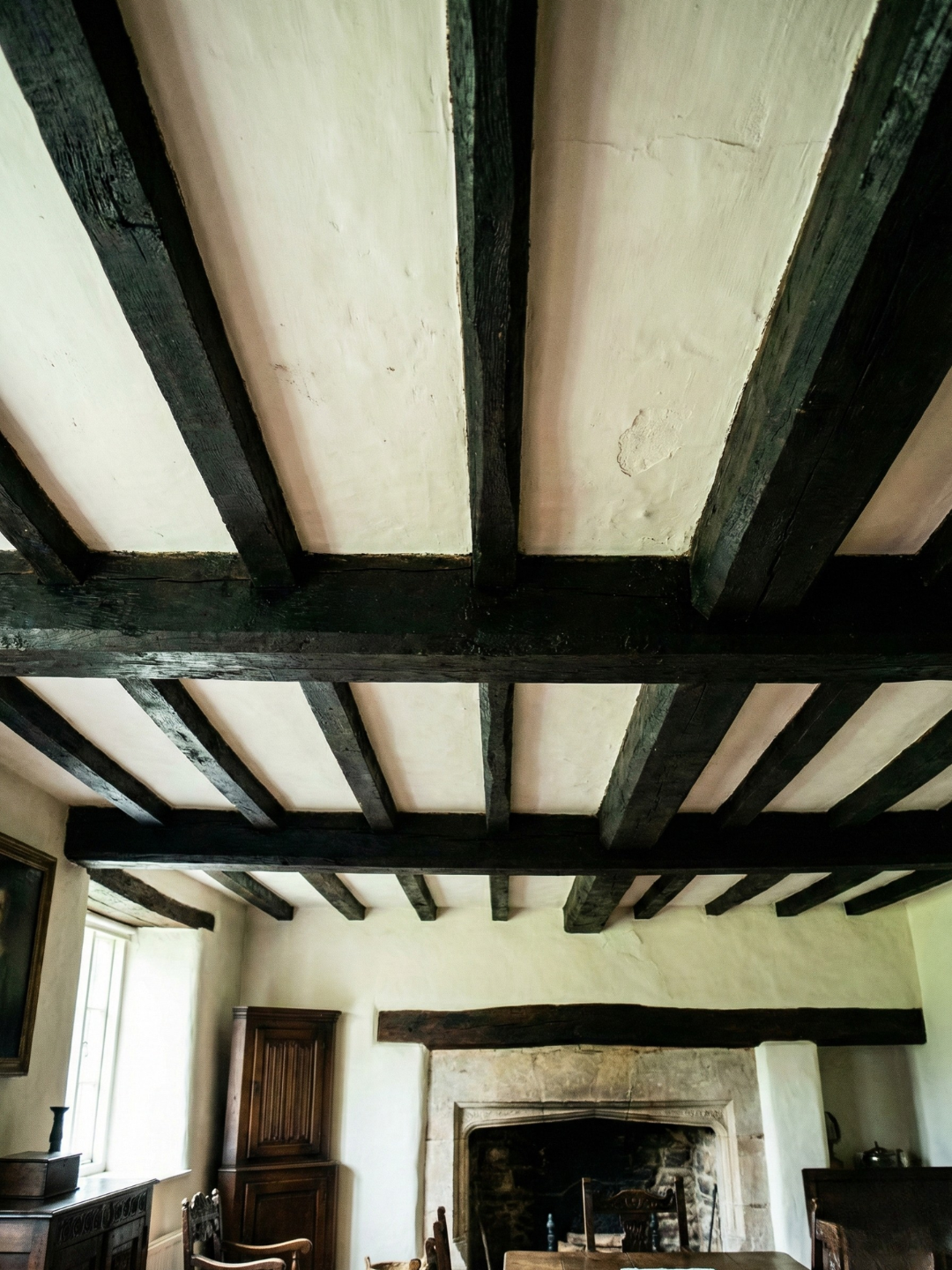
When to Use Contrast
High contrast works when the architecture is strong. I have seen this done well in homes with original Victorian molding or Craftsman-style woodwork. Painting the trim white and the walls a deeper tone makes the craftsmanship visible. The contrast draws your eye to the detail.
In my own space, which has minimal architectural detail, I use low contrast instead. The walls and trim are close in value, which keeps the focus on furniture and objects rather than on the walls themselves. The room feels cohesive without drawing attention to its lack of ornamentation.
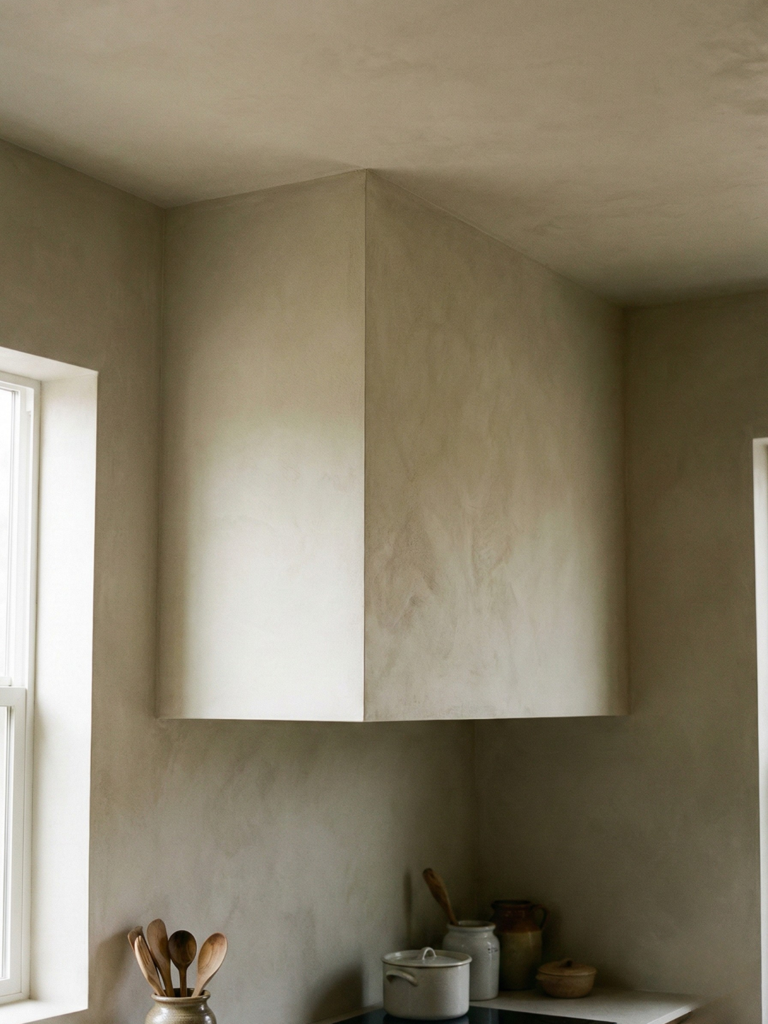
Hiding What Does Not
Not every architectural feature is worth highlighting. Awkward soffits, exposed pipes, mismatched ceiling heights. These elements can be minimized with color. Painting them the same color as the walls makes them recede. The eye skips over them.
I have a bulkhead in my kitchen that houses ductwork. It is structurally necessary but visually disruptive. I painted it the same warm white as the ceiling. It still exists, but it no longer dominates the room. If I had painted it a contrasting color or left it as exposed metal, it would have been the first thing you noticed.
Adjusting Proportions
Color can alter the perceived proportions of a room. A low ceiling feels higher when painted lighter than the walls. A narrow room feels wider when the end wall is painted a slightly darker tone, which makes it appear to recede. These adjustments are optical, not structural, but they change how the space feels.
In my hallway, which is long and narrow, I painted the far wall a deeper shade of the same color used on the side walls. The gradient is gentle, but it shortens the visual length of the space. The hallway feels more balanced, less like a tunnel.
The Effect of Ceiling Color
Ceilings are often painted white by default, but this is not always the right choice. A white ceiling in a room with darker walls creates a strong horizontal line that can make the ceiling feel lower. I prefer to bring the wall color onto the ceiling, either fully or halfway, to soften that boundary.
In my bedroom, the walls are a soft gray-green, and the ceiling is a lighter version of the same color. The transition is seamless. The room feels taller because the eye does not stop at the ceiling line. The color continues upward.
Working with Natural Light
Color interacts with light in ways that affect how a room functions. A north-facing room with cool light benefits from warmer wall colors, which counterbalance the blue cast. A south-facing room with intense light can handle deeper, more saturated colors without feeling dark.
My office faces north and receives limited direct sunlight. I painted it a warm beige with a slight yellow undertone. The color compensates for the cool light and makes the room feel more hospitable. If I had chosen a cool gray, the space would have felt dim even on bright days.
Creating Zones Within Open Plans
In open-plan spaces, color can define areas without walls. I use this approach in my kitchen, which flows into the dining area. The kitchen walls are a warm off-white, and the dining area walls are a deeper greige. The shift is subtle but effective. You know you have moved from one zone to another without a physical barrier.
This technique works best when the colors share the same undertone. If the shift is too dramatic, it feels fragmented. The goal is to create distinction without disruption.
The Practical Application
Using color as an architectural tool requires observation. You need to understand what the space is doing naturally before you decide how to intervene. Is the ceiling too low? Is the room too narrow? Are there features worth highlighting? The answers will guide your color choices.
I approach this methodically. I measure the room, note the light direction, identify the architectural elements. Then I test colors in context. The goal is not to impose a color I like, but to find the color that solves the problem the room presents.
Color is architecture when it changes how you experience a space. It becomes part of the structure, not just decoration applied to it.