
Transitioning Between Spaces: Color Flow
The way color moves from one room to another determines whether a home feels cohesive or fragmented. The transitions matter more than the individual colors. A poorly managed shift between rooms creates visual friction. A well-managed one feels natural, almost inevitable.
I have spent considerable time refining these transitions in my own home. The goal is not to make every room the same color, but to create a logical progression. Each room should feel distinct while remaining connected to what comes before and after.
Understanding the Flow
I start by mapping the physical flow of the home. Which rooms connect directly? Which ones you pass through to reach others? This determines where the transitions need to be smoothest. A hallway that connects multiple rooms needs careful attention because it serves as a visual bridge.
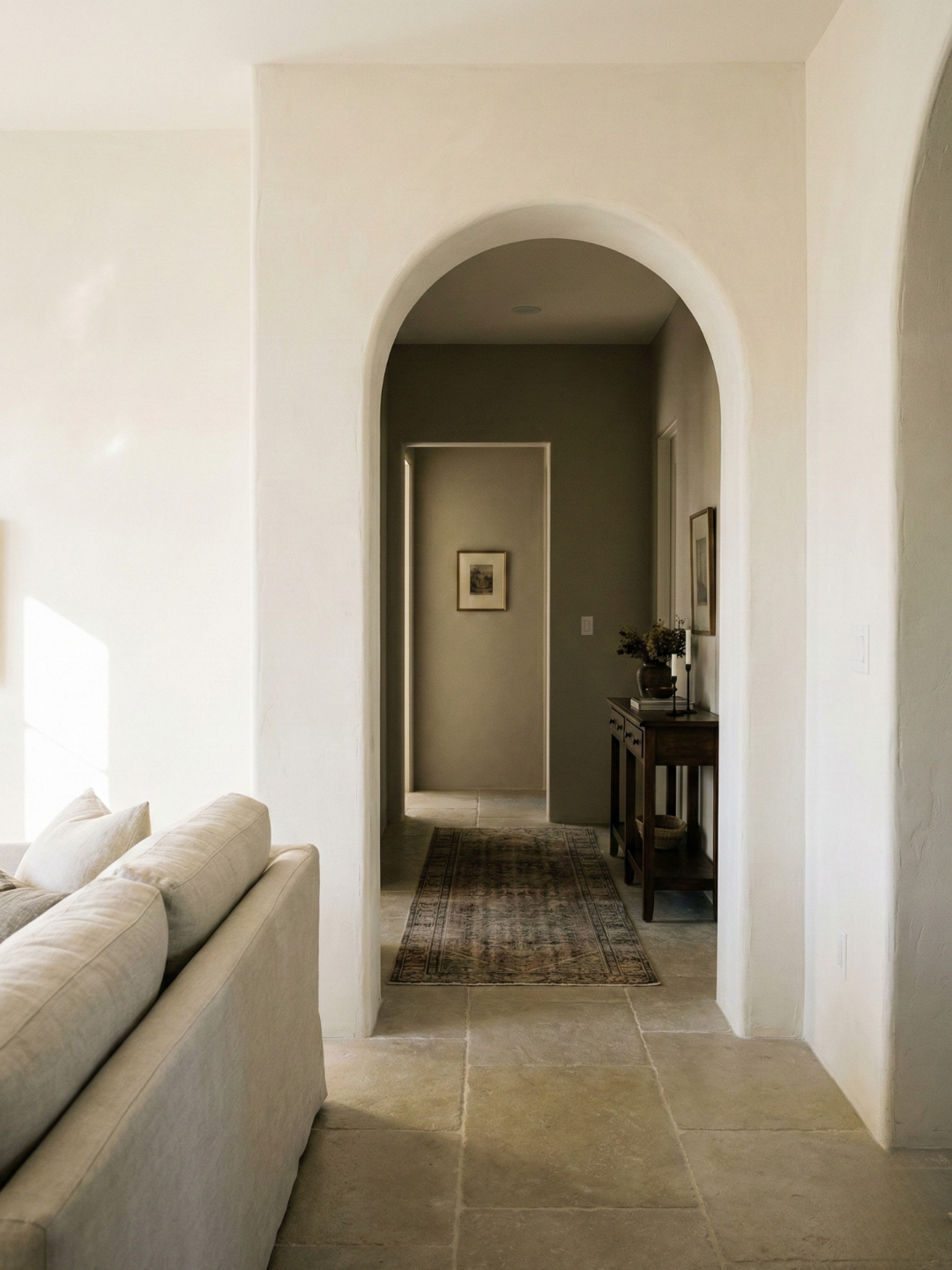
In my home, the hallway is the central artery. It connects the bedroom, bathroom, and kitchen. I painted it the lightest color in the palette, a warm off-white. The rooms that branch off it use deeper variations of the same base tone. Walking through the hallway feels like moving through a neutral zone before entering more specific spaces.
Light to Dark Progressions
I prefer a gradual shift from lighter to darker as you move deeper into the home. Public spaces stay lighter. Private spaces can be deeper. This mirrors the psychological shift from open to intimate.
The living room is the lightest space, painted in a barely-there greige. The bedroom is several shades deeper, a true mid-tone gray with warmth. The bathroom, which is accessed through the bedroom, is deeper still, almost charcoal on one wall. The progression feels deliberate. You are moving from public to private, from exposed to enclosed.
The Role of Doorways
Doorways act as transition points. What you see through a doorway from one room prepares you for the next. If the color shift is too abrupt, it feels jarring. I test this by standing in one room and looking into the next. The colors should relate to each other, even if they are different.
From my living room, you can see directly into the hallway. The living room walls are a soft warm gray. The hallway is a lighter warm white. The difference is noticeable but not shocking. The undertones align. Your eye does not have to adjust dramatically when you move between the two spaces.
Managing Undertone Consistency
The most important element in successful transitions is consistent undertone. If every color in the home shares the same temperature, you can vary the depth, saturation, and hue without breaking the continuity.
All the colors in my home have a warm undertone. The living room is a warm gray. The bedroom is a warm greige. The kitchen is a warm off-white. Even the darker bathroom color has warmth beneath the surface. This consistency allows me to use a range of values without the palette feeling disjointed.
When to Break the Progression
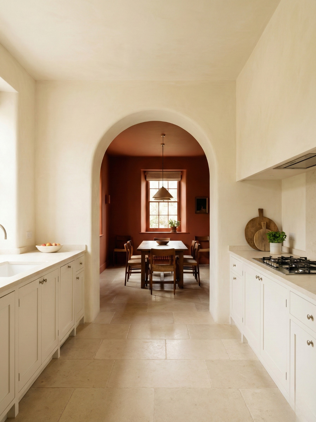
There are moments where breaking the progression makes sense. A powder room, for example, can be treated as an independent space because it is entered and exited quickly. You are not moving through it to reach somewhere else. I painted mine a deep green, which does not align with the rest of the palette. It works because the room is small and self-contained.
The key is knowing when a room can afford to be different. If it interrupts the flow between other rooms, it needs to stay within the palette. If it stands alone, it has more freedom.
Testing Transitions in Context
I always test transitions by painting samples in both rooms and observing them from multiple angles. I stand in the doorway and look both ways. I walk from one room to the other. I check the transition in morning light and evening light. If the shift feels uncomfortable at any point, I adjust.
When I was choosing the bedroom color, I tested three options. Two of them looked fine in the bedroom itself but felt wrong when viewed from the hallway. The third created a smooth transition. The difference was slight, but it mattered.
The Impact of Flooring and Ceilings
Flooring and ceilings affect how transitions read. If the flooring changes between rooms, the wall color transition needs to be more gradual to compensate. If the flooring stays consistent, you have more flexibility with wall color.
In my home, the flooring is consistent oak throughout the main living areas. This continuity allows me to vary the wall colors without the transitions feeling disjointed. The floor acts as a unifying element.
Ceilings work similarly. If the ceilings are all white, the wall transitions are more noticeable. If you carry the wall color onto the ceiling, even partially, the transitions soften. I use both approaches depending on the room and the desired effect.
Maintaining the Narrative
A successful palette tells a story as you move through the home. The story does not have to be literal, but it should have a clear arc. Beginning, middle, end. Lighter to darker. Public to private. Open to enclosed. The transitions support this narrative.
In my home, the narrative is about gradual retreat. You enter through light, neutral spaces. As you move deeper, the colors deepen, the mood shifts. The bathroom, the most private space, is the darkest. This progression mirrors how I use the spaces. It feels intuitive because it aligns with function.
Transitions are where a palette proves itself. If the colors work together as you move between rooms, the palette is resolved. If they do not, no amount of perfection within individual rooms will fix it.