
My Approach to the Baseline Tone for a Home
The first color decision I make for any home is the one that matters most. Not the accent wall in the living room, not the tile in the kitchen. The baseline tone is the color that appears in multiple rooms, the one that holds everything else together. It sets the temperature, the mood, the framework.
When I moved into my current home, the walls were a generic builder beige. I spent three months testing samples before committing to anything. That might sound excessive, but the baseline tone is not a decision you want to reverse.
Starting with Light, Not Color
I look at how light moves through the space before I consider hue. A north-facing room reads cooler, even if you paint it warm. A south-facing room will intensify whatever you choose. I have learned to work with this, not against it.
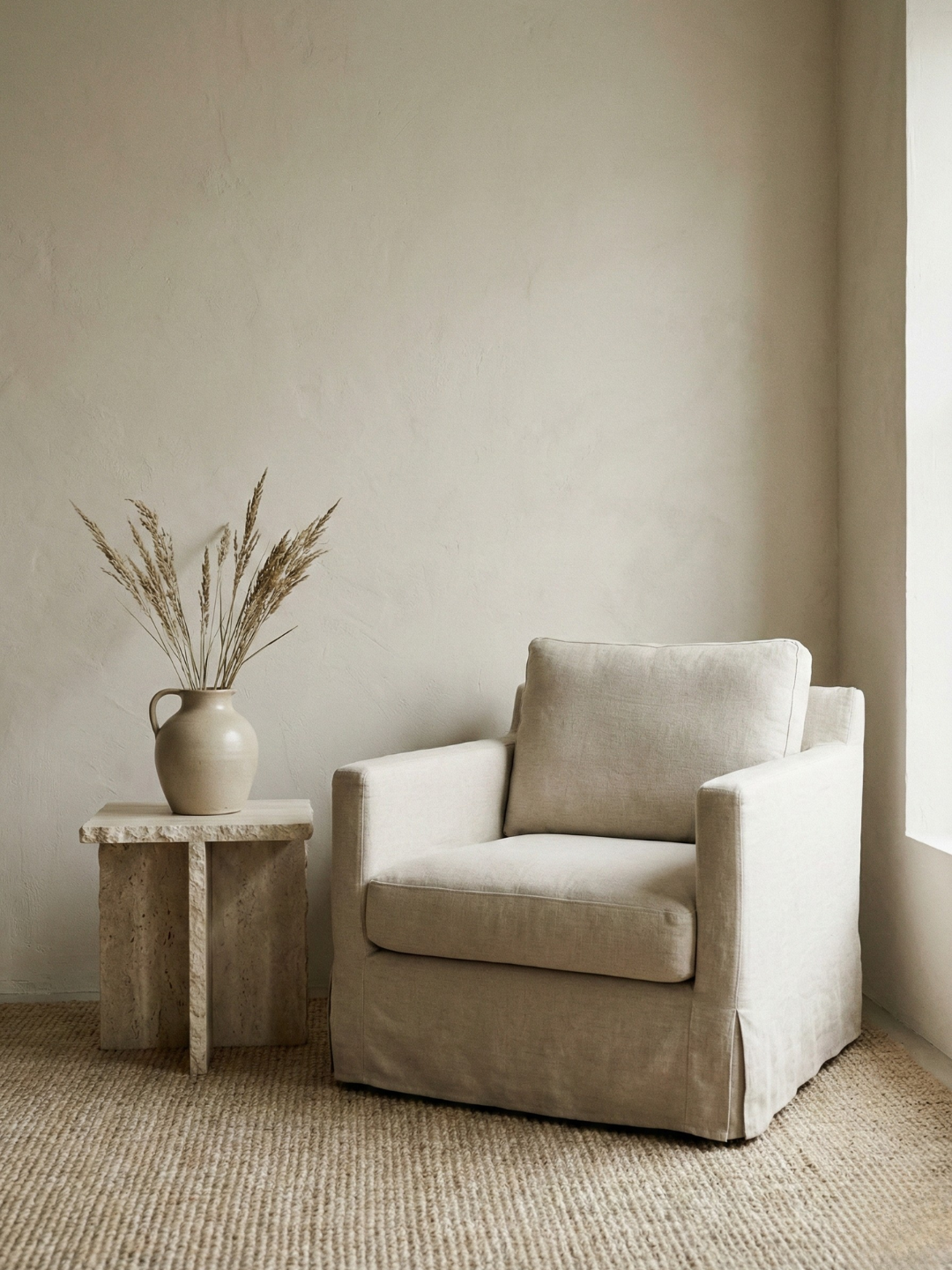
In my home, the north-facing hallway connects the bedroom to the kitchen. I needed a color that would feel consistent in both natural light and lamplight, in morning and evening. I selected a warm greige with just enough gray to stay neutral but enough warmth to keep the space from feeling cold when the sun is low.
The same color appears in three rooms now. It reads differently in each one, but the transitions are seamless. That is what a good baseline tone does.
Choosing Between Warm and Cool
Most people believe they are choosing between beige and gray, but they are actually choosing between warm and cool undertones. This distinction changes everything.
I lean toward warm neutrals because they feel more forgiving with natural materials. Wood, linen, and stone all have warmth in them. A cool gray baseline can make these materials look disconnected. I have seen it happen in too many homes where the paint fights the furniture.
Testing in Real Conditions
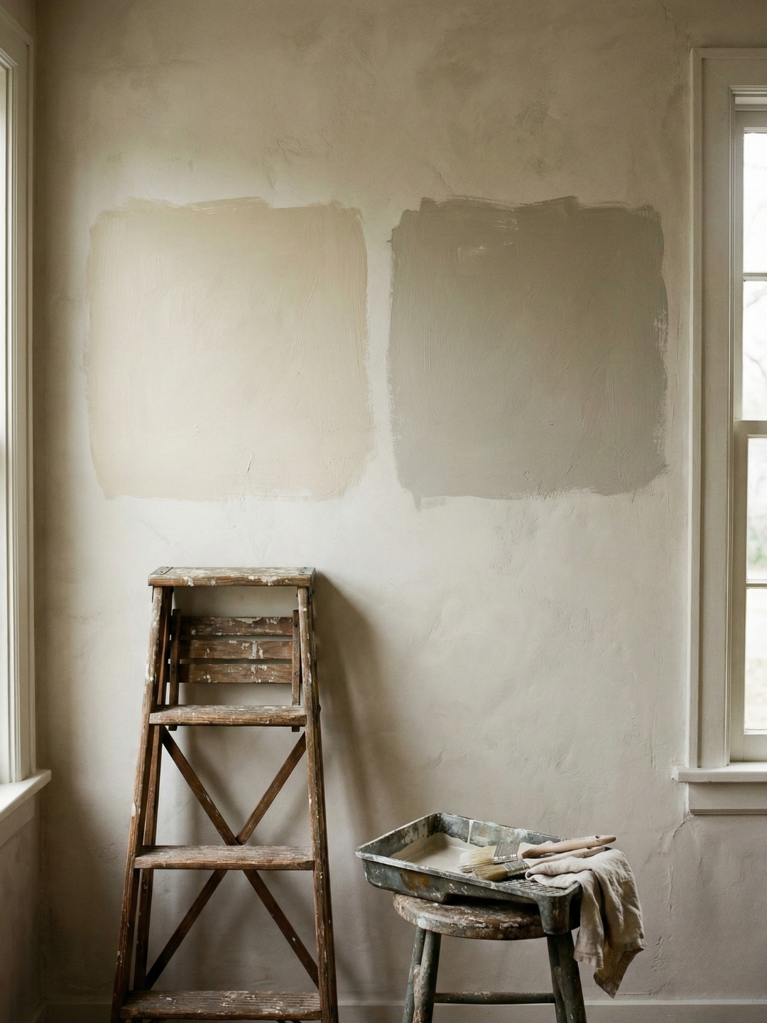
I paint large swatches directly on the wall, at least two feet by two feet. Paint samples on boards are useless because they do not account for how the color interacts with the room itself. I observe them at different times of day. Morning light in my home is blue-toned. Evening light is amber. A color that looks balanced at noon can turn sickly at 7 PM.
When I tested Farrow & Ball Cornforth White in the bedroom, it looked perfect in daylight. By evening, it had gone lavender. I repainted with a warmer alternative. The time spent testing is time saved from repainting.
Living with the Choice
Once the baseline tone is set, every other color decision becomes easier. I know what will work because I have established the temperature. If I bring in a deeper tone for a feature wall, it needs to share the same undertone. If I add textiles, they need to harmonize with the baseline, not compete with it.
The baseline tone should be almost invisible. It should feel like the natural color of the walls, not something imposed on them. When people walk into my home, they do not comment on the paint color. They say the space feels calm. That is the goal.
What Works for Me
I prefer colors with names that describe their origins rather than aspirational moods. Limestone, Elephant's Breath, String. These names suggest a color derived from something real, not invented to sell paint.
My baseline tone is Benjamin Moore Revere Pewter in most rooms. It is a greige that leans warm without reading beige. It works with oak, with brass, with linen. It holds up next to white trim without looking muddy. It is the color I keep returning to, the one that feels like home.
The baseline tone is not about being safe. It is about being intentional. It is the anchor that allows you to take risks elsewhere.