
The Logic of a Unified Home Color Palette
A cohesive color palette is not about using the same color everywhere. It is about creating a system where every color relates to the others in a deliberate way. When a palette is unified, you stop noticing the individual colors and start experiencing the atmosphere they create together.
I approach color as infrastructure, not decoration. The palette is the framework that allows everything else to work. Furniture, textiles, art, objects. They all depend on the colors beneath them. When the foundation is resolved, the rest becomes easier.
The Baseline Tone
The first decision is the baseline tone. This is the color that appears in multiple rooms, the one that holds the palette together. It sets the temperature and establishes the framework for every other color choice. I spend more time selecting this color than any other because it is the hardest to reverse.
I test baseline tones in real conditions, painting large swatches directly on the wall and observing them at different times of day. Morning light in my home is cool and blue-toned. Evening light is warm and amber. A color that looks balanced at noon can turn completely different by 7 PM. The baseline needs to work in all conditions. Read more on Baseline Tone
Warm and Cool Balance
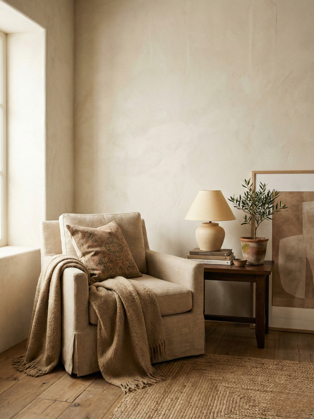
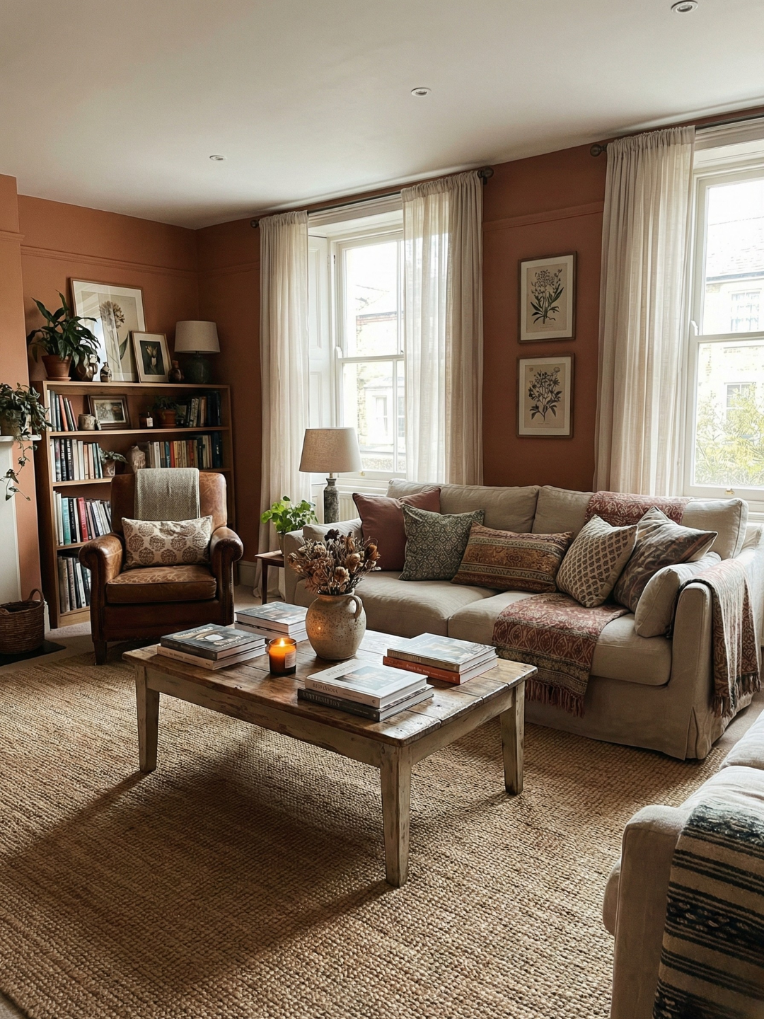
The undertone temperature determines how colors interact. Mixing warm and cool tones is possible, but it requires precision. The most successful approach is to establish one dominant temperature and use the other sparingly. I keep my walls warm and bring in cooler tones through stone, ceramics, and specific textiles. The contrast feels intentional rather than accidental.
Materials carry temperature as much as paint does. Brass is warm. Chrome is cool. Oak is warm. When I select hardware or lighting, I consider how the metal temperature will interact with the wall color. In my kitchen, warm brass fixtures bridge the gap between warm walls and cool marble countertops. The materials create the transition. Read more on Balancing Warm and Cool Undertones
The Psychology of Resolution
A resolved palette reduces cognitive load. Your brain does not have to process competing visual information. The colors support each other rather than demand individual attention. This creates a sense of calm that has nothing to do with minimalism. A maximalist room can feel just as calm if the colors are resolved.
When I repainted my home with a cohesive palette after living with mismatched colors, the difference was psychological. The space felt quieter. I had not removed anything or simplified the furnishings. I had only aligned the colors. That alignment changed how the entire home felt. Read more on a Resolved Paint Palette
Color as Architecture
Paint can alter the perceived structure of a room. A low ceiling feels higher when painted lighter than the walls. A narrow room feels wider when the far wall is painted slightly darker. These adjustments are optical, but they change how the space functions.
I use color to highlight architectural details worth showcasing or hide elements I cannot change. In my living room, the trim is painted a brighter white than the walls. The difference is subtle but it creates definition. In my kitchen, an awkward bulkhead is painted the same color as the ceiling so it recedes. Color becomes a tool for editing the architecture without physical construction. Read more on Color as an Architectural Tool
Transitions Between Rooms
The way color moves from one room to another determines whether a home feels cohesive or fragmented. Transitions matter more than individual room colors. A poorly managed shift creates visual friction. A well-managed one feels natural.
I prefer a gradual progression from lighter to darker as you move deeper into the home. Public spaces stay lighter. Private spaces can be deeper. In my home, the hallway is the lightest color, a warm off-white. The bedroom is several shades deeper. The bathroom is deeper still. The progression mirrors the shift from public to private, from open to enclosed.
The most important element in successful transitions is consistent undertone. If every color shares the same temperature, you can vary depth and saturation without breaking continuity. All the colors in my home have a warm undertone. This consistency allows me to use a range of values while maintaining a unified palette. Read more on Color Flow
Building the System
A unified palette is built methodically. Start with the baseline tone. Establish the dominant temperature. Test transitions between rooms. Use color to adjust the architecture. The result should feel inevitable, as if the colors were always meant to be there.
The benefit of this approach is freedom. Once the palette is resolved, you can bring in texture, pattern, and objects without creating chaos. The color system holds everything together. That structure is what allows a home to feel both curated and livable.