
Five Color Combinations to Style Your Terrace This Summer
Last June I spent an evening on a friend's terrace in the south of Spain, the kind of evening that doesn't really want to end. Nothing about the space was expensive. A second-hand sofa, a string of paper lanterns she'd bought years ago, a few terracotta pots she'd dragged home from a market. But she'd been quietly deliberate about one thing: colour. Everything sat in the same warm, sun-faded family, and the effect was almost absurdly inviting. As the light dropped and the lanterns came on, the whole corner seemed to glow from the inside. We stayed until well past midnight, and I remember thinking that a terrace doesn't need much to feel magical. It mostly needs a point of view.
That's really what colour gives an outdoor space. Not a rulebook, but a mood, a thread that ties the cushions to the umbrella to the glass in your hand and makes the whole thing feel intentional rather than accumulated. So this summer I've been collecting combinations I keep falling for, five palettes with five very different personalities. Some are soft and dreamy, some are bold enough to wake the neighbours. Here's the first.
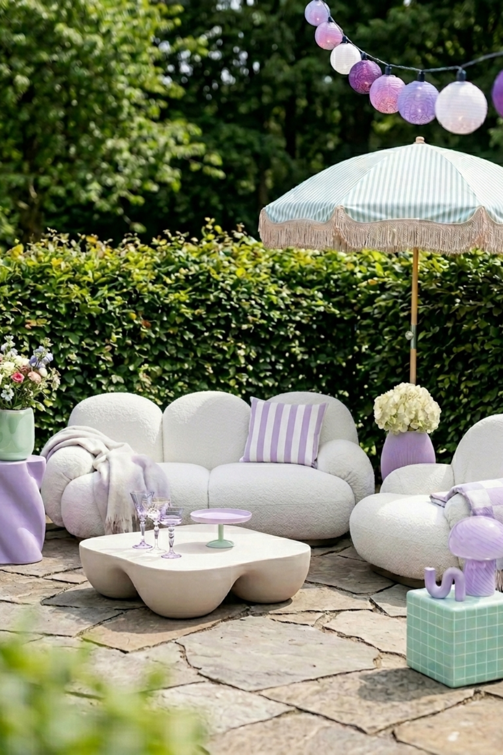
Lavender and Mint
Soft, playful, and a little dreamlike. Lavender and mint together are the colour equivalent of a sorbet on a hot afternoon, cool and sweet and impossible to take too seriously. There's something joyful about a palette this unapologetically pretty, and the trick to keeping it grown-up rather than girlish lies in the shapes and textures you build around it. Think rounded bouclé seating, milky white forms, a fringed mint-stripe umbrella tilted against the sun. The softness does the talking.
It comes alive in a leafy garden setting, where all that green grounds the pastels and stops them floating away. Set a cluster of plump, cloud-like chairs on old stone paving, add a lilac side table and a handful of mismatched purple glasses catching the light, and you've made a corner that feels like a daydream, somewhere you'd happily lose an afternoon with a book and a cold drink. This is a palette for the unhurried end of summer: gentle, a little romantic, and far more considered than it first lets on.

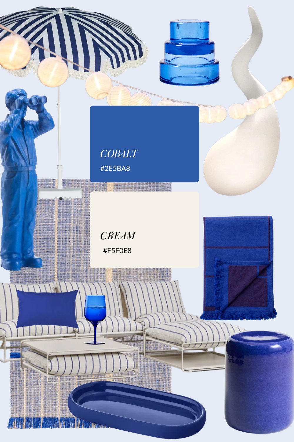
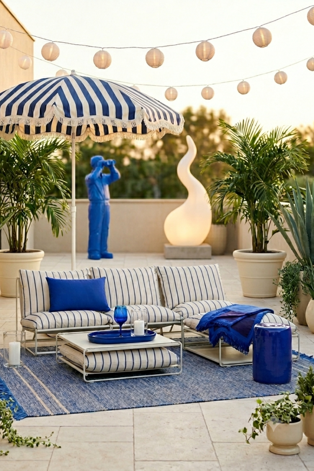
Cobalt and Cream
Crisp, confident, and unmistakably Mediterranean. There's a reason cobalt and white never really go out of fashion, two colours that carry the whole memory of a Greek island between them. The cream is what makes it liveable, softening all that intensity just enough so the scheme feels fresh rather than fancy-dress nautical. Pair it with a bold striped umbrella, a glossy ceramic stool, and linen that's been washed soft, and you have something that looks effortless but reads beautifully put-together.
It belongs on a sun-drenched rooftop or any terrace lucky enough to have a view. Against pale stone or travertine the blue turns architectural and clean, echoing the sky during the day and catching the warmth of the light as the evening comes in. There's a quiet glamour to it, the kind that doesn't try too hard. Light a candle, pour something cold into a blue glass, and let the palette do what it does best: make an ordinary evening feel like a holiday.
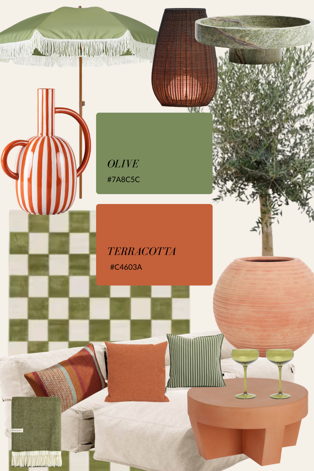
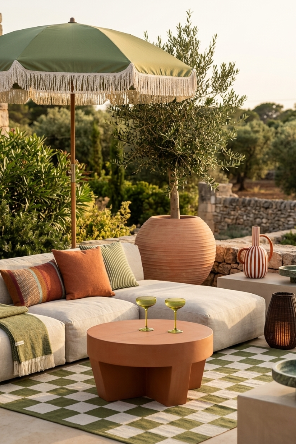
Olive and Terracotta
Warm, earthy, and quietly grown-up. If lavender and mint is a sorbet, this is a glass of something amber at sunset. It's the most timeless of the five, borrowed straight from the Mediterranean landscape itself: olive groves, clay pots, stone walls baked all day in the sun. There's nothing loud about it, which is exactly its strength. It feels rooted, settled, like it has always been there.
It suits a rustic terrace with honest materials, raw plaster, weathered wood, a muted green checkerboard underfoot. A potted olive tree and a rounded terracotta table do most of the heavy lifting, and a few green-stemmed glasses and striped ceramics finish the thought. This is the palette that ages best of all, growing more characterful the more it's lived in. It's for slow evenings and long dinners, the terrace you never quite want to leave because it has started to feel like part of the house.
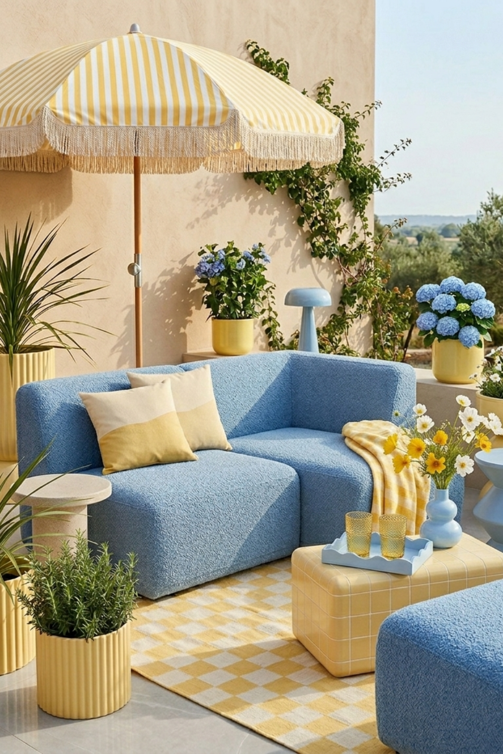
Dusty Yellow and Cool Blue
Cheerful without ever being loud. This is the friendliest combination of the bunch, a gentle, faintly retro pairing that feels like a clear morning before the heat sets in. The dusty yellow keeps everything warm and sunny while the cool blue holds it steady, and together they have the easy charm of a vintage postcard. Hydrangeas were practically invented for this palette, and a few in a sunny pot will do more than any amount of styling.
It works best on a bright, open terrace where the light can bounce around and lift the colours. Soft modular seating, fluted planters, a little gingham or checkerboard, nothing here demands attention, and that's the appeal. It's an optimistic, good-natured scheme, the kind that makes a space feel welcoming the moment you step into it. Easy to live with, easy to love, and very hard to get wrong.

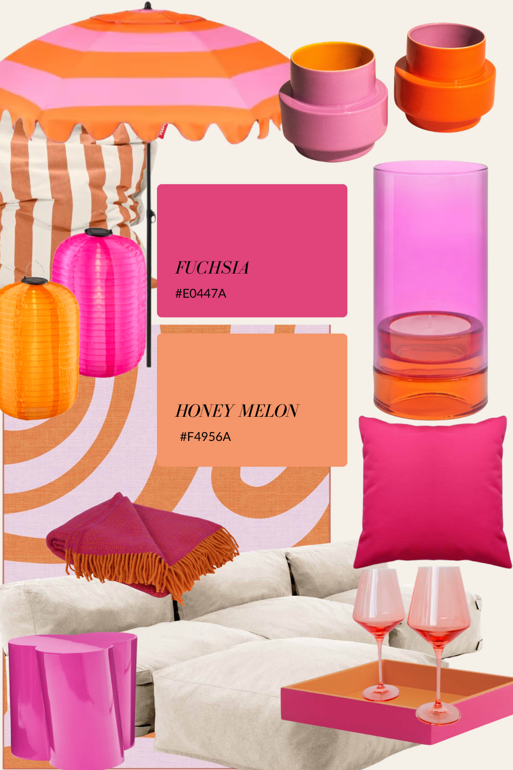
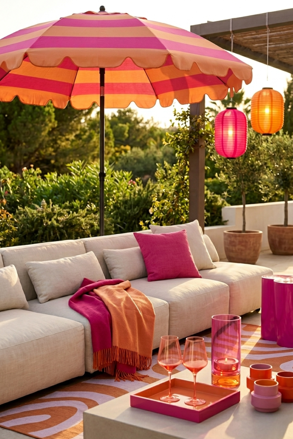
Fuchsia and Honey Melon
Bold, sun-soaked, and made for golden hour. This is the palette for anyone who doesn't want their terrace to whisper. Hot pink and warm orange together are pure holiday energy, the colours of a Mallorcan sunset and a very good cocktail, and they come alive the moment the evening light hits them. The secret to wearing them well is restraint in the background: let a neutral linen sofa carry the weight so the colour can pop without tipping into chaos.
It's made for a rooftop or open terrace, where warm sand and stone give all that brightness room to breathe. Bring in paper lanterns, a scalloped striped umbrella, tinted glassware that glows when the candles come on, and lean fully into the drama. There's nothing shy about this one, and that's the whole point. It's a confident, joyful scheme best enjoyed in the last hour of light, with a drink in hand and good company that's in no hurry to go home.
Whichever way you lean, the principle stays the same: choose two colours you love, let one lead and the other support, and build your textures and materials around them. Summer is short. Your terrace should feel like exactly the place you want to spend it.