
Sherin Williams Mauve Finery Color Review
A Warm, Expressive Sherwin-Williams Shade Worth Trying
Today I want to talk about a color that's been catching my eye lately. It's Mauve Finery by Sherwin-Williams. This shade has a way of feeling both timeless and fresh, and if you're looking to move beyond safe neutrals without diving headfirst into bold brights, this could be your perfect in-between.
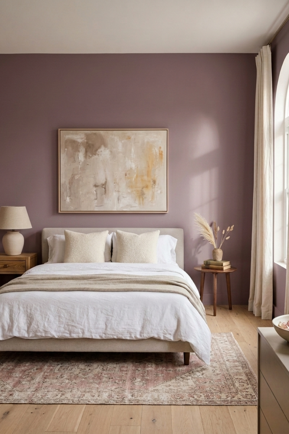
Sherwin-Williams' Mauve Finery (SW 6282) is a dusty mauve that adds a touch of softness and quiet sophistication to any room. I love it for spaces that want to feel styled and soulful.
What Does Mauve Finery Look Like?
Mauve Finery is best described as a faded dusty mauve, somewhere between blush and lavender, with a soft, almost stone-like quality. It has a refined, slightly vintage feel that brings depth without overwhelming the space.
Depending on the light and what it's paired with, it can feel modern or classic. In my experience, it walks the line between relaxed and refined.
What Are the Undertones?
This color has a balanced mix of muted purple and gray undertones, which means it behaves differently depending on its surroundings. In natural light, you'll see warmth come through, a soft pink leaning forward. In dimmer or north-facing light, the gray takes over and it reads cooler and more lavender.
Because of this, it pairs beautifully with both warm and cool palettes. It's a shape-shifter in the best way.
What Is the LRV of Mauve Finery?
The Light Reflectance Value (LRV) of Mauve Finery is 51, which means it reflects and absorbs light in roughly equal measure. It works well in rooms with decent natural light and brings a settled, grounded feel without making a space feel dark.
Is Mauve Finery Warm or Cool?
Mauve Finery leans warm. The base is a dusty pink before it's anything else, with gray and a touch of purple keeping it from feeling sweet or juvenile. It doesn't scream one way or the other, which makes it versatile, especially layered with natural materials and texture.
What Lighting Directions Work Best?
Light changes everything, and here's how Mauve Finery tends to shift based on the room's exposure:
North-facing rooms: Appears cooler and more lavender-gray
South-facing rooms: Becomes warmer and pinker
East-facing rooms: Morning light brings out the pink, afternoon light settles it into something more neutral
West-facing rooms: Cooler and grayer in the morning, warmer by late afternoon
Tip: Always test a sample in your space before committing. Light can play tricks with this one.
Best Rooms to Use Mauve Finery In
Some of my favorite rooms for Mauve Finery:
Bedrooms: Soft and restful for winding down
Living Rooms: A grounded, elegant backdrop for relaxed gatherings
Dining Rooms: Adds intimacy without feeling heavy
Home Offices or Reading Nooks: Calm without being sleepy
Accents: Try it on a powder room, built-ins, or a single statement wall
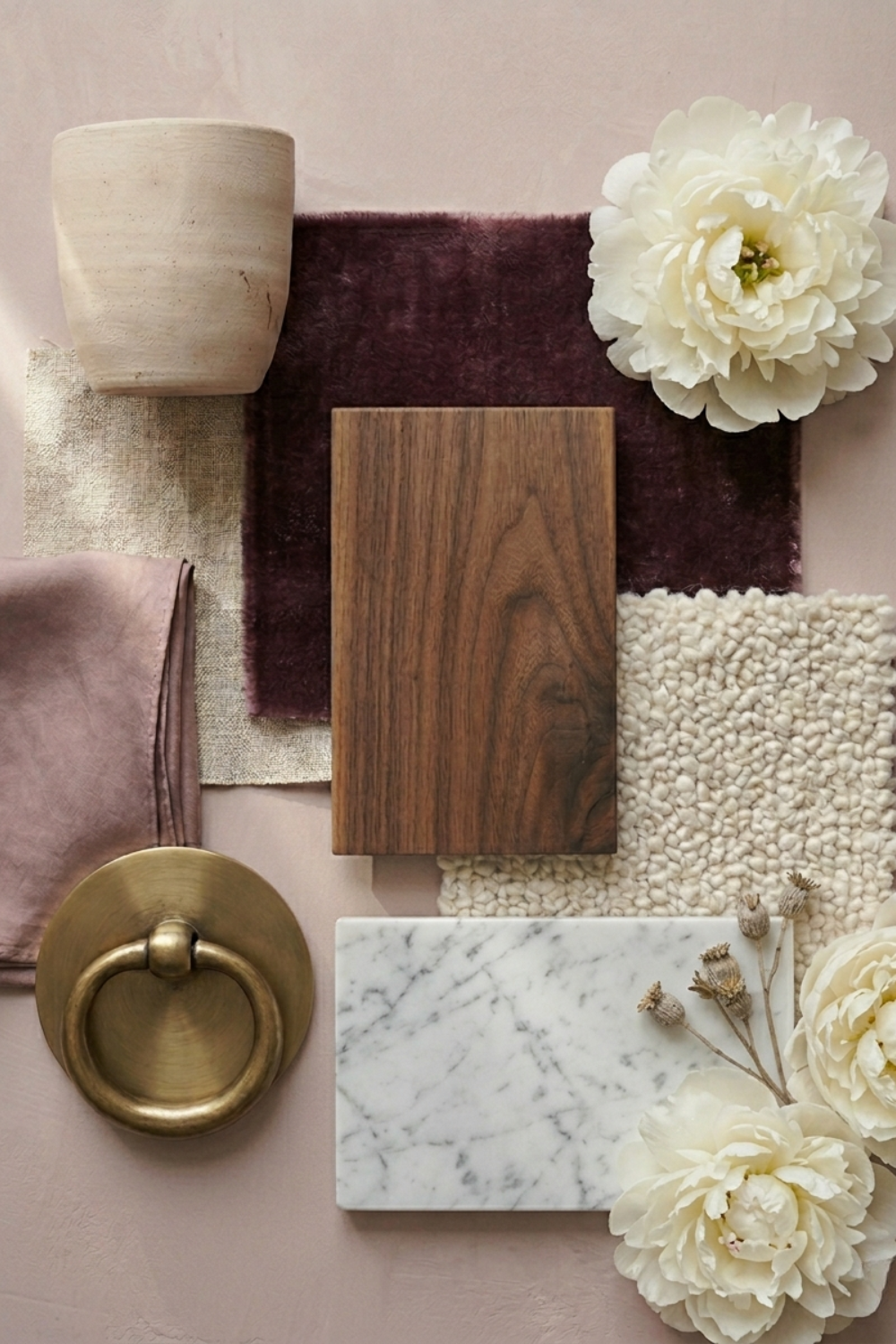
What Wood Tones Pair Beautifully?
Mauve Finery looks especially lovely with:
Light oak or whitewashed wood: For a soft, Scandinavian feel
Walnut or mid-tone wood: Adds warmth and richness, keeps the mauve from feeling flat
Rustic or reclaimed wood: Leans into the earthy side of the gray undertone
What Materials and Finishes Complement It?
This color shines when paired with:
Linen and other natural textures: Keeps it soft, not slick
Velvet or boucle: Brings out its vintage character
Stone and marble in warm tones: Echoes the gray without going cold
Brass and aged metals: Adds polish without feeling formal
What Colors Pair Well With Mauve Finery?
This color plays well with:
Warm whites and creams: Let the mauve be the focus
Warm grays and greiges: Grounds it without competing
Deep blue-gray: Sophisticated contrast, especially in small doses
Near-black or deep brown: Adds definition on trim or a door
Soft golds or buttery yellows: For a warmer, more playful pairing
What Styles Work Best with This Color?
Mauve Finery feels right at home in:
Modern European: Especially with older or antique pieces
Quiet Luxury: It has the restraint this style is built on
Transitional: Adds warmth without clashing with traditional furniture
Modern Romantic: This is its natural home
Would I Use This for Trim or Doors?
Selectively. Mauve Finery makes a quiet, elegant statement on an interior door or a set of built-ins. As an all-over trim color across a whole house, it risks feeling too soft over time. For one room, or one accent, it earns its place.
Who Is Mauve Finery Best For?
This shade is perfect for:
Anyone who wants their home to feel considered without looking like it tried too hard
People who like color but aren't ready for a bold commitment
Anyone building a room around warmth, texture, and a bit of quiet drama
Final Thoughts
Mauve Finery is one of those colors that feels considered and effortless at the same time. It doesn't need to shout to make a room feel finished. Whether it's a bedroom wall, a dining room, or a single accent, it earns its place.
If you're thinking of trying it, grab a sample and live with it for a few days before committing. Light has opinions about this color, and you'll want to see them play out in your space first.
Want the Full Mauve Finery Guide?
This post only scratches the surface. The full Mauve Finery guide covers 8 coordinating colors, has styled room ideas, undertone breakdowns for every color, and pairing notes for wood, metal, and fabric, everything you need to actually commit to this color with confidence. Grab it on Etsy.
