Harmonizing Styles Through a Unified Color Story in Your Home
Why a disciplined palette can do the work that matching furniture never quite manages.
I have seen rooms where every piece of furniture was from the same collection, the same designer, the same decade, and the result was somehow less interesting than a room assembled from entirely different sources. The problem in those cases was usually color: a palette that had been left to chance, or that defaulted to the color of whatever material the furniture happened to be made from, without any thread running through it.
Color is the most powerful tool available for making different pieces cohere. It works below the level of conscious analysis. When the colors across a room share an undertone, the eye reads the whole as unified even when the furniture is from entirely different periods, traditions, and materials.
Undertone Is Everything
The concept that matters most in palette-building is undertone: the warm or cool quality beneath the surface color. A beige with a pink undertone and a beige with a green undertone are both beige, but they do not sit happily together. A warm cream, a warm terracotta, a warm grey-brown, and a warm aged brass will all coexist because they share a yellow or orange base. A cool sage, a cool slate, and a cool bleached linen share a blue or grey base and will do the same.
The mistake I made most often early on was choosing colors I liked individually without checking whether they shared an undertone. Each one was fine in isolation. Together they created a low-level visual discord that was hard to name but impossible to ignore. Once I started working from undertone first, palette decisions became much more reliable.
The eye reads an undertone before it reads a color. That is where to start.
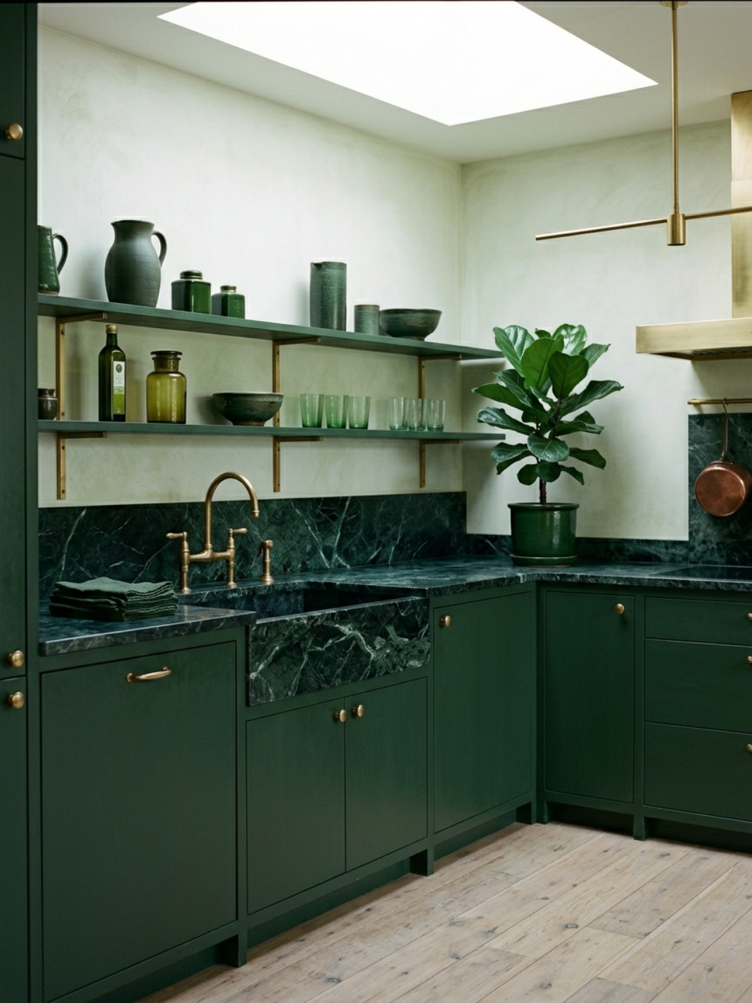
How a Palette Bridges Disparate Pieces
A few years ago I furnished a small study with pieces that had no obvious relationship to each other. An early twentieth-century wooden writing desk with turned legs. A low, contemporary upholstered bench. A raw oak shelving unit. A deep armchair in aged leather.
What held them together was a palette that I had worked out before buying any of them: warm white on the walls, the wood tones kept consistently in the amber-to-honey range, the soft furnishings in two shades of dusty warm grey, and a single note of dark terracotta in a ceramic lamp and a small stack of cloth-bound books. Every piece was chosen to fit within that palette, which meant pieces that were otherwise quite different in character could coexist without any of them looking lost.
The desk and the contemporary bench would have looked incongruous together in a room without a strong palette. In that room they looked considered, because the color running between them was doing the work that stylistic similarity would otherwise do.
Keeping the Palette Coherent as the Room Evolves
A room rarely arrives finished all at once. Pieces come in over time, things change, new finds displace older ones. The risk is that each addition makes sense in isolation but the palette drifts slowly over years until the room has lost whatever coherence it started with.
The way I manage this is to keep a loose record of the palette I am working with: not a formal document, but a physical reference of swatches and samples that I can hold up against anything I am considering bringing in. When a new piece reads against those references and the undertone holds, I know it will work. When it does not, that tension is visible immediately, before the piece is in the room.
Color is one of the few things in interior design that is easier to get right before you commit than to correct afterward. The palette is worth deciding early, and worth protecting.
Disclaimer: AI-assisted writing applied.