How to create an Elevated Fall Home Decor Look
Elevated Fall Home Decor: Start With Your Home, Not a Trend
My birthday falls right when summer loosens its grip. Every year the same thing happens: I stop wanting to travel, I want to be home, closet swapped, candles lit, dog curled up next to me.
Elevated fall home decor isn't about spending more or buying a specific set of items. It means every piece you bring into your home this season is intentional: it fits your home's existing colors, it's made of something real instead of mass-produced plastic, and it earns its place instead of just filling a shelf. Getting there starts before you buy anything, with identifying the aesthetic your home is already leaning toward.
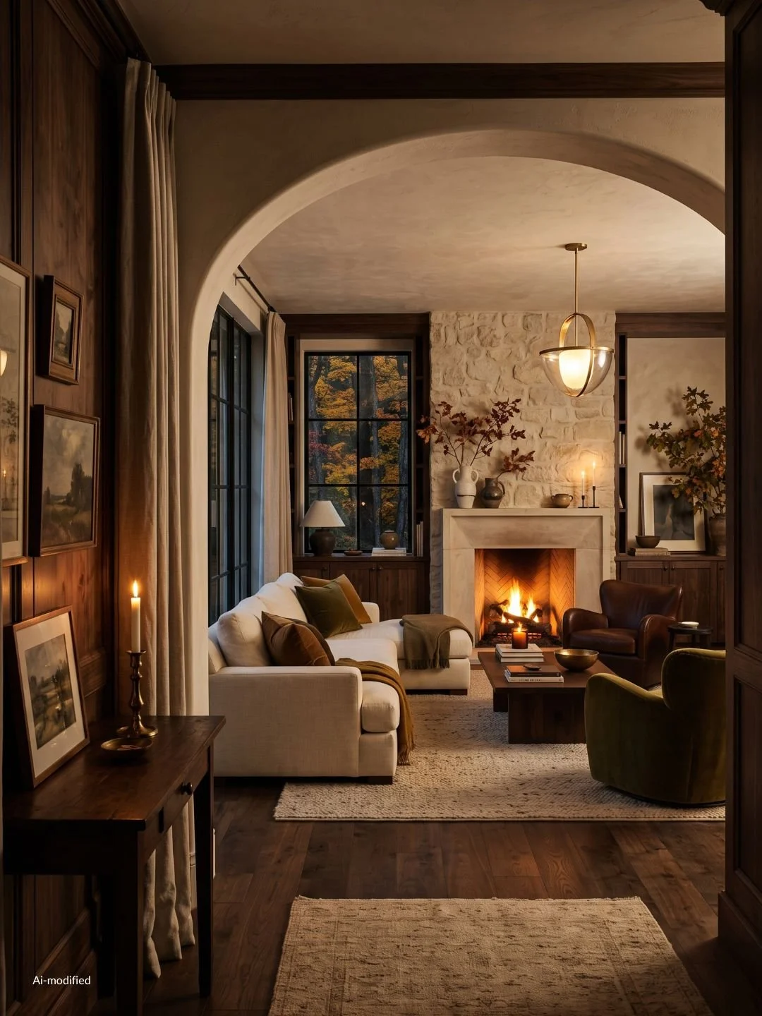
Finding your Fall aesthetic
Most homes sit somewhere on two spectrums. First, light versus moody: does your space feel bright and neutral, or does it want to lean into deeper, richer tones once the days get shorter? Second, minimal versus traditional: do you gravitate toward clean lines and restraint, or does your home already feel gathered, layered, a bit more ornate?
What your answers point to
Bright and minimal points toward Scandi fall or organic modern, depending on whether you lean more pared-back Nordic or warm and earthy. Bright and traditional splits into modern farmhouse, if your home feels rustic and lived-in, or classic New England, if it feels more polished and coastal. Moody and minimal is dark academia territory. Moody and gathered is cottagecore.
None of this is about forcing your home into a label. It's about noticing which direction it's already pulling, so the color palette and materials in the next sections work with it instead of against it.
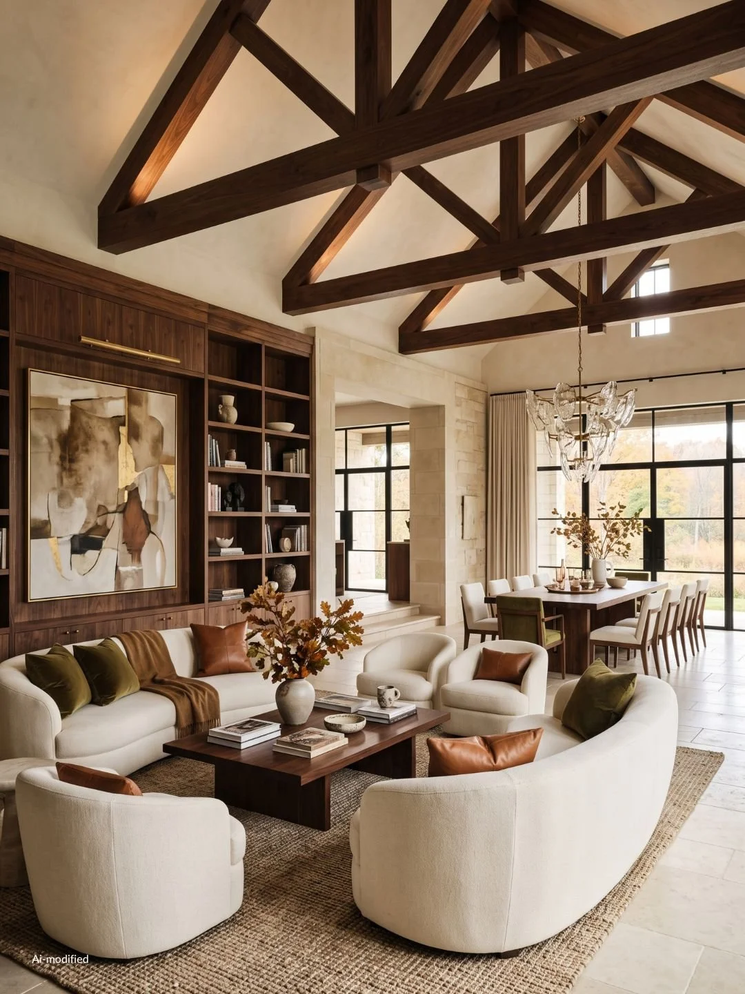
How to Build a Fall Color Palette That Matches Your Home
A fall color palette only works if it comes from colors already in your home, not from a seasonal trend chart. The fastest way to find yours: look at your walls, your flooring, and your largest piece of furniture, and name their undertone. Warm undertones (cream walls, honey-toned wood, warm gray) pull toward camel, cinnamon, and rust. Cool undertones (true white walls, ash wood, cool gray) pull toward deeper greens, plums, and charcoal instead of orange-heavy tones. Neutral undertones can go either way, which gives you the most flexibility.
From there, layer in depth rather than swapping colors outright. Take the lightest color already in your room and keep it as your base. Add one mid-tone that deepens it for the season (a tobacco brown instead of tan, a moss instead of sage), then one deeper accent color used sparingly, on a throw, a vase, a few pillows, not repainted across the whole room. Three tones total: base, mid-tone, accent. That's a fall palette that reads as an extension of your home instead of a costume on top of it.
If your home leans Scandi fall or organic modern from section one, your undertones are likely warm-neutral, and your mid-tones and accents should stay muted rather than saturated. If you're in modern farmhouse territory, a warmer, more rustic accent like rust or terracotta reads as intentional. If you're in classic New England territory, a cooler, more polished accent like navy or oxblood does the same. Cottagecore and dark academia homes usually run richer already, so your accent color can go darker, moss, plum, or ink, without fighting the base.
Once your palette is set, the next question is what it actually gets applied to, which is where materials come in.
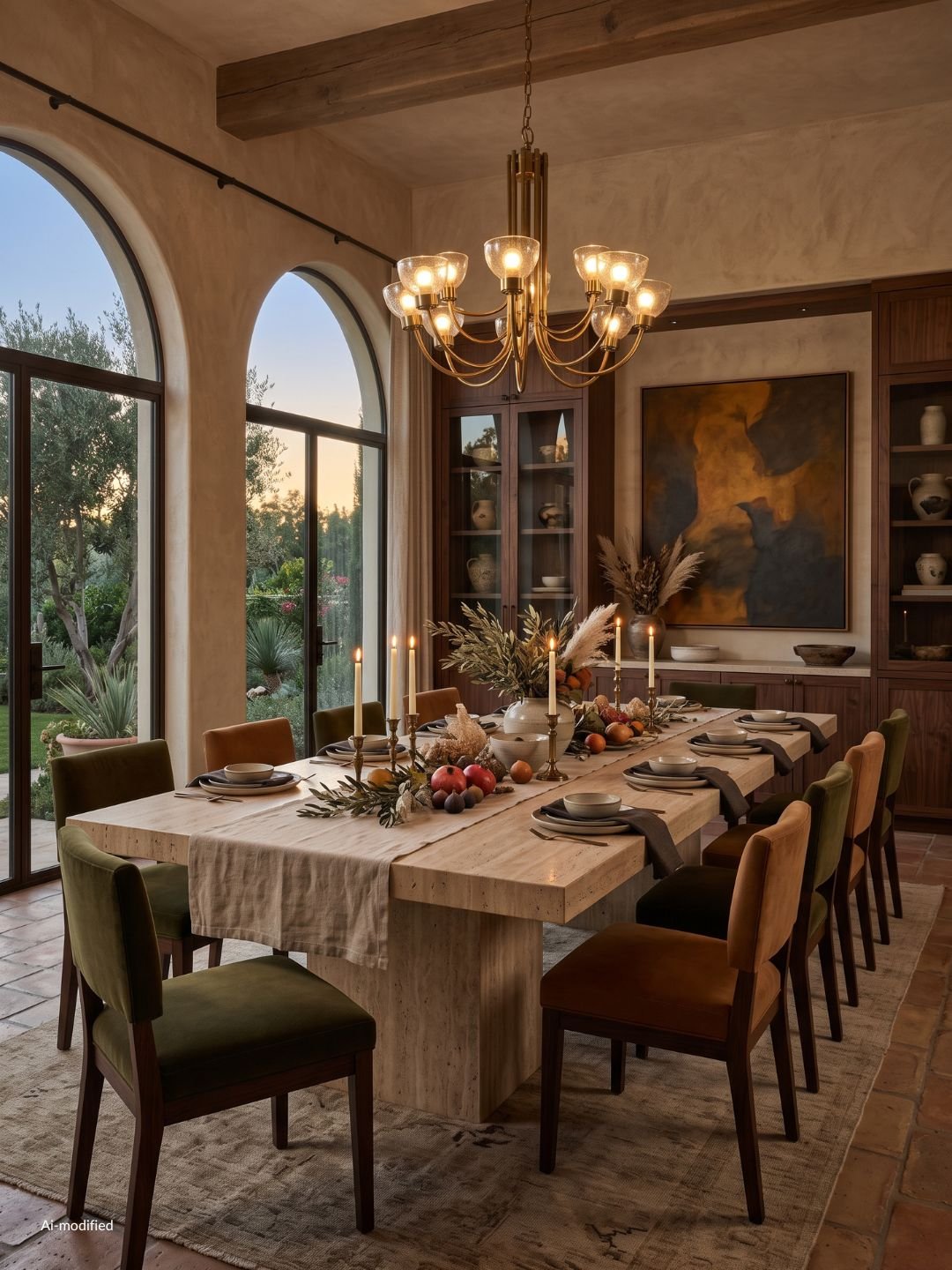
Materials That Make Fall Decor Look Elevated
The material something is made from does more to make fall decor look elevated than the color or the shape ever will. A cream throw in polyester and a cream throw in raw linen photograph almost the same. In your hand, and over a full season of use, they're not close. Elevated fall home decor leans on wool, raw linen, velvet, stoneware, brass, and real wood, and skips plastic pumpkins, polyester "fall" throws, and printed felt banners almost entirely.
This isn't about spending the most money on every item. A single wool throw or a set of stoneware mugs does more for a room than five plastic accessories bought for the same total price, because natural materials hold texture, age well, and carry over into next year instead of getting thrown out with the rest of the seasonal decor in December.
A quick way to check anything before you buy it: would this still look good on a shelf in July, minus the pumpkin shape? If the answer is yes, the material and craftsmanship are doing the work, not the season. If the answer is no, it's probably a costume piece dressed up as decor.
With your palette and materials both set, the next layer is how those materials actually get combined in a room, which comes down to texture.
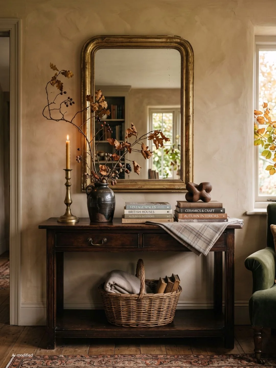
How to Layer Textures for an Elevated Fall Home Decor Look
A room can have the right palette and the right materials and still look flat if everything in it has the same texture. Fall decor gets its depth from contrast: something smooth next to something rough, something matte next to something with a bit of sheen. A stoneware vase next to a chunky knit throw reads as styled. Two matte cotton pieces next to each other just reads as beige.
A simple way to layer without overthinking it: pick one soft texture (wool, mohair, a chunky knit), one hard or structured texture (stoneware, wood, woven baskets), and one texture with a little shine or weight (velvet, brass, smoked glass). Use all three in a space, in different proportions, rather than three of the same. A sofa with a wool throw, a coffee table with a stoneware bowl, and a lamp with a brass base is already three textures working together without any of them competing.
The mistake to watch for is matching sets. A throw, pillow, and rug all in the same fabric from the same collection will look staged rather than styled, because nothing in it was actually chosen, it was just bought as a bundle. Mixing textures forces you to make small decisions about what goes where, and that's exactly what makes a room look considered instead of decorated from a catalog page.
Once the palette, materials, and texture are working together, the next step is figuring out where in your home to actually use them.
Elevated Fall Home Decor Starts With What You Already Own
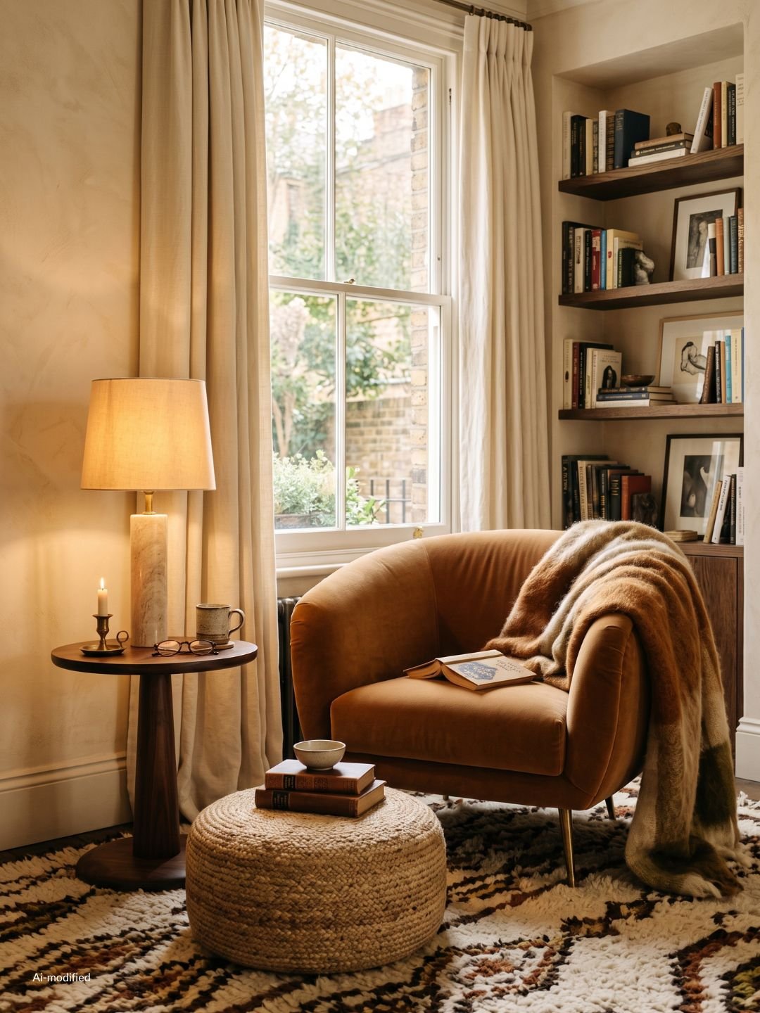
The most elevated fall decor is often decor you already own, styled with intention instead of pushed to the back of a closet. Before adding a single item to your cart, walk through your home and pull anything that already fits the palette and materials you've settled on: a stoneware bowl from the kitchen, a wool throw from the bedroom, a brass candlestick that's been sitting in a drawer. These pieces cost nothing and already belong in your home, which is exactly why they read as intentional rather than seasonal.
Next, walk each room and pick the two or three spots that actually need something new, rather than defaulting to every shelf, mantel, and console table. A single well-placed vignette on an entryway table does more than five scattered touches spread across a room. Write down only those specific spots and what each one needs, a taller vase here, a darker throw there, before you start browsing anywhere.
That short, specific list is your actual shopping list. Anything that doesn't fill one of those named spots isn't worth buying yet, no matter how good it looks on its own.
With your spots identified, the next step is applying all of this room by room.
Elevated Fall Home Decor Room by Room
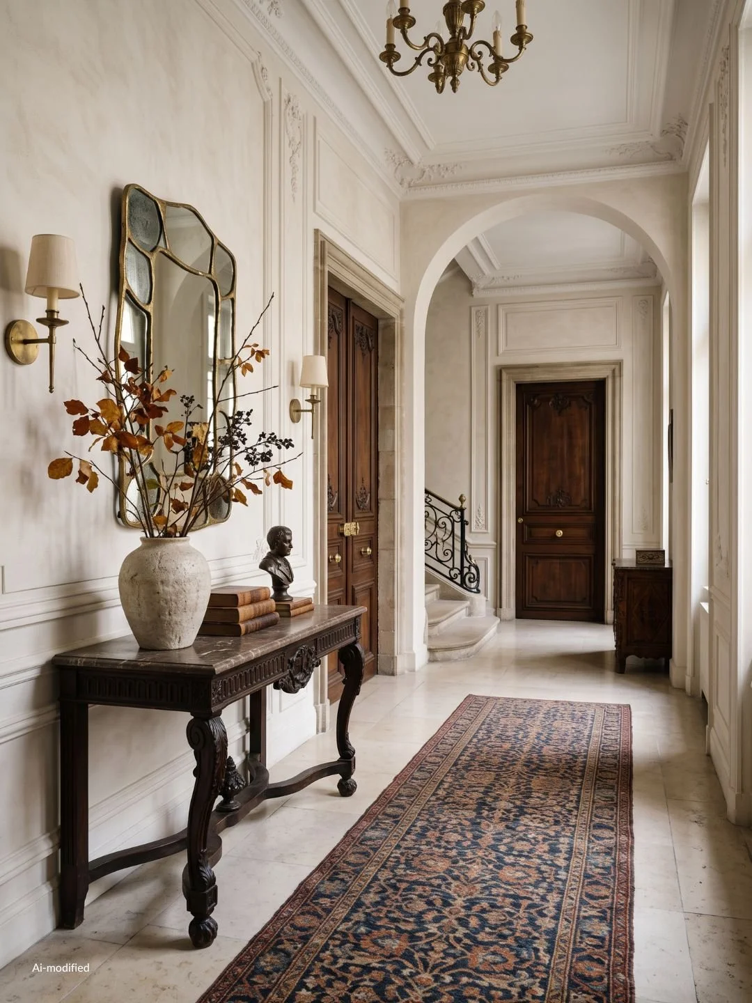
Entryway. This is the first impression, so it earns one strong moment rather than several small ones. A stoneware bowl of small heirloom pumpkins or gourds, a simple dried-branch wreath on the door, and a woven basket for mail or shoes cover the palette, materials, and texture in one small footprint.
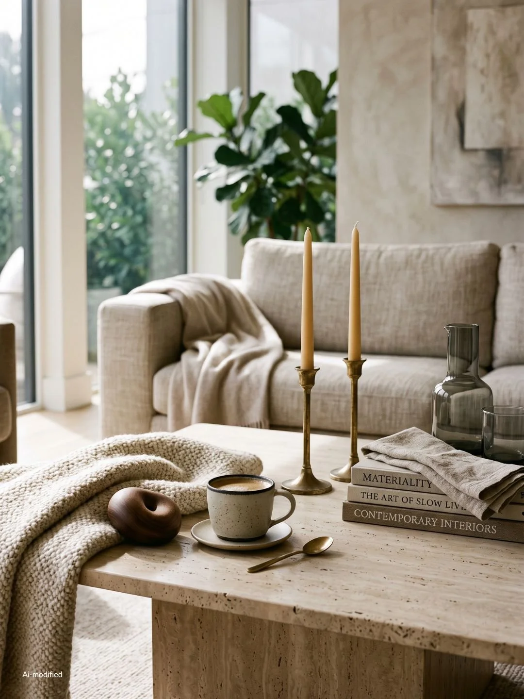
Living room. Layer the sofa with one or two textured pillows and a chunky throw rather than a full pillow swap. Add a bowl of pinecones or small gourds to the coffee table, and swap any bright summer candles for something in a deeper, warmer scent and color.
Dining table. A runner in a heavier fabric, a low arrangement of dried florals or branches so it doesn't block sightlines across the table, and brass or matte black candlesticks instead of anything glossy or pastel.
Kitchen. A stoneware bowl of seasonal produce, apples, pears, small squash, in your palette's tones instead of bright market colors, a bundle of dried herbs or cinnamon sticks tied and set on the counter, and cloth napkins swapped into a deeper fall color. Keep it to one or two touches so the space still feels functional.
Bedroom. Swap a lightweight summer duvet cover for something heavier in a deeper tone, add a knit throw at the foot of the bed, and switch out any bright accent pillows for ones in your fall palette.
Small spaces and rentals. Focus on textiles first, throws, pillow covers, a runner, since they require no commitment and can layer over whatever's already there. A single seasonal-scented candle or a small bowl of gourds does more in a small space than several scattered pieces, and everything here still moves with you if you relocate.
Once each room reflects the same palette and materials, a few small habits keep the whole look feeling intentional as the season goes on.
What Keeps Elevated Fall Home Decor Looking Intentional
Scent matters more than people give it credit for. One signature fall candle or diffuser per main living area does more than several competing scents fighting each other room to room. Pick one and let it carry.
Curated beats matched. A vase, a bowl, and a candle that were each chosen on their own will always look more considered than a boxed three-piece set from the same collection, even when the set costs more.
And less surface coverage reads as more expensive. A single styled vignette on one console table has more visual weight than the same items spread thin across every flat surface in the room. Give your fall pieces room to breathe rather than filling every available inch.
With the styling itself settled, the last practical question is what actually carries into winter and what doesn't.
What Carries Into Winter and What Doesn't
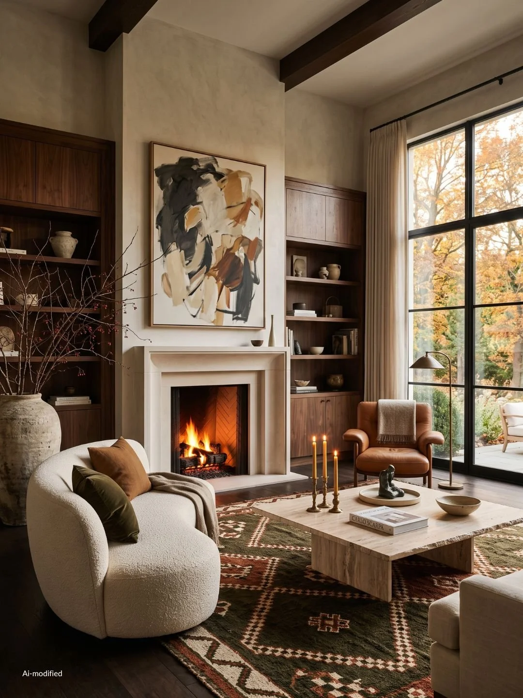
Materials and palette are what determine whether something transitions or needs to be swapped out again in a few weeks. Wool throws, brass, stoneware, and deep tones like plum, charcoal, or oxblood carry straight into winter with no changes needed, since they read as cold-weather staples rather than anything tied specifically to fall. These are the pieces worth investing in first, since they're doing double duty across two seasons.
What doesn't carry over is anything explicitly tied to harvest imagery: pumpkins, gourds, dried corn, wreaths built around autumn leaves. These read as fall specifically and start to feel out of place once the calendar turns, so they're the pieces to treat as seasonal rather than permanent.
A useful way to think about it while buying: if a piece is a color or material choice, it likely carries forward. If it's a literal harvest object, it's fall-only. Buying with that distinction in mind means less gets swapped out or stored away in a few weeks, and more of the budget goes toward pieces that earn their place across two seasons instead of one.
With the full approach laid out, here's the whole process condensed into one checklist you can work through room by room.
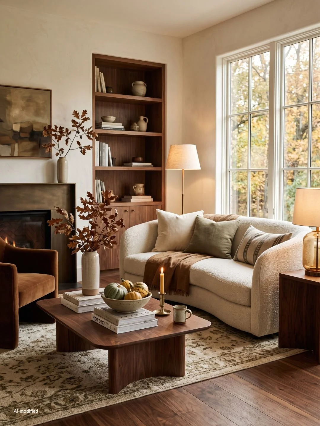
Your Elevated Fall Home Decor Checklist
Name your aesthetic. Light or moody, minimal or traditional, using the two-question method from earlier.
Build your palette. One base color already in your home, one deeper mid-tone, one accent used sparingly.
Choose real materials. Wool, raw linen, velvet, stoneware, brass, real wood, over plastic and polyester.
Layer three textures per room. One soft, one structured, one with shine or weight.
Shop your house first. Pull anything you already own that fits before buying anything new.
Pick two or three spots per room. Skip every shelf and surface in favor of a few intentional ones.
Style room by room. Entryway, living room, dining table, kitchen, bedroom, adapted for small spaces where needed.
Sort by season. Keep materials and palette pieces for winter, treat harvest-specific pieces as fall-only.
Work through it in order, and what you end up with is a home that looks like it was always heading toward fall, not one that was decorated for it.
*AI-assisted writing applied