What Is Mid-Century Modern? The Complete Guide
Mid-century modern is the style I keep returning to. Not as a phase, and not only because it is having another moment, though it is. It is the one visual language I can look at for years without wanting to rearrange anything.
Some of that is proportion. Some of it is the wood. Most of it is that these pieces were drawn by people who believed a single chair was worth years of their working life, and it shows in the way the arm meets the frame.
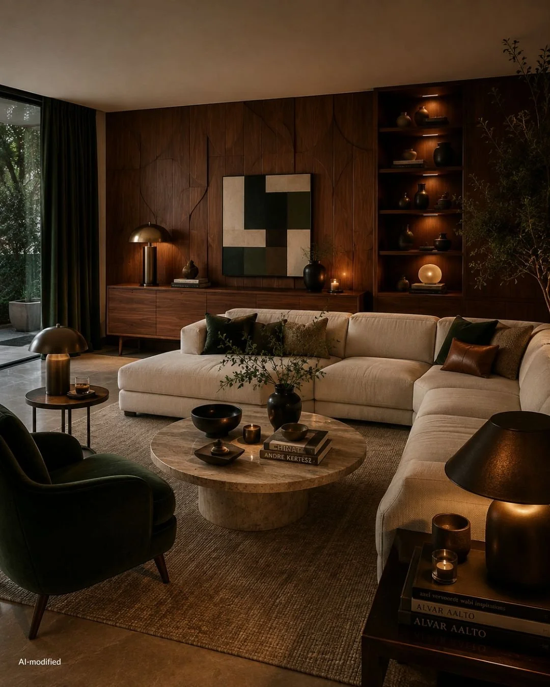
What is happening in interiors right now has made the style newly relevant rather than merely nostalgic. After a decade of pale oak and soft white, people want their rooms to say something specific about who lives in them. Warmth is back. Color is back. So is the pleasure of owning something that was found rather than ordered. Several design languages are reviving at the same time, which has quietly given everyone permission to pick one and commit to it instead of blending them into a safe average.
Mid-century modern is the one I chose, and there is a practical reason as well as an aesthetic one. The supply exists. You can build the room one piece at a time, over seasons, and the searching is genuinely part of the enjoyment. A room assembled that way looks like it happened to someone. It never looks like it arrived on a Tuesday.
This guide covers what the style actually is, where it came from, what defines it, the materials and colors that carry it, and how to live inside it now without turning your home into a period set.
AI-modified
What Is Mid-Century Modern Interior Design?
Mid-century modern is a design movement built on clean geometry, honest materials, and furniture that sits low and light in a room. It favors function you can see, wood you can feel, and forms that are sculptural without being decorative. Nothing is applied. The shape of the object is the ornament.
The easiest way to recognize it is by what the furniture does to the space around it. A mid-century sofa sits low and shows its base, so the eye reads the wall behind it and the floor beneath it. Rooms feel larger and calmer than their square meters suggest, which is why the style suits apartments as beautifully as it suited the Californian houses it was made for.
When the Mid-Century Modern Period Was
The period is usually dated from around 1945 to 1965, with its roots reaching back into the 1930s and its tail running into the early seventies. The name itself is much younger than the furniture. It entered common use after Cara Greenberg published Mid-Century Modern: Furniture of the 1950s in 1984, which is worth knowing because it explains why the label covers such a wide range of work. It was applied retrospectively, to a moment, not chosen at the time by a movement.
Where Mid-Century Modern Design Came From
Three currents met after the war.
European modernism arrived in America with the architects and teachers who emigrated in the 1930s, bringing Bauhaus thinking about function, structure and mass production with them. Scandinavian design arrived alongside it, carrying something modernism on its own lacked: a craft tradition, an affection for wood, and an insistence that a room should be comfortable to sit in for an entire winter.
The third current was manufacturing. Molded plywood, fiberglass, foam and new adhesives had been developed or refined under wartime pressure, and afterwards those techniques were pointed at domestic life. Curves that had been impossible to make in quantity suddenly cost very little to produce. That is why so much of the furniture looks like it is bending. The material had just learned how.
All of it landed in a decade of new houses with open plans, wide glazing and lower ceilings, which needed furniture drawn to a different scale than anything inherited from before the war.
The Mid-Century Modern Designers Worth Knowing
You do not need a full syllabus, but a handful of names will teach your eye more quickly than any list of rules.
Charles and Ray Eames for molded plywood and the idea that a chair should fit a body before it flatters a room. Eero Saarinen for sculptural form. George Nelson for the wit in storage and clocks. Florence Knoll for interiors that made the whole language work in serious rooms. Hans Wegner and Finn Juhl for what Danish hands did with teak. Arne Jacobsen for shape reduced to a single gesture. Isamu Noguchi for the point where furniture becomes sculpture and stops apologizing for it.
Herman Miller and Knoll are the two manufacturers whose catalogs define the American side of the story. Fritz Hansen and Carl Hansen & Søn define much of the Danish one.
The Key Characteristics of Mid-Century Modern Design
Clean Lines and Low, Horizontal Proportions
Mid-century furniture sits low. Sofa backs are shallow, credenzas are long, and the strongest line in the room is horizontal. This is the single characteristic that does the most work, because it keeps the wall above eye level open and makes a ceiling read as higher than it is.
It is also the reason the style photographs so well and lives so well. Long, low, and unbroken gives the eye somewhere to rest.
Visual Lightness, and What Legs Are Actually For
Tapered legs are the detail everyone can name, and they are genuinely characteristic. Slim, angled, often set slightly inward, usually in a darker wood than the frame above them.
The reason matters more than the shape. The goal was to lift furniture off the ground so the floor runs unbroken beneath it, and so no piece reads as a solid block. Saarinen pursued the same goal from the opposite direction with his pedestal tables and chairs, removing legs entirely to clear the tangle underneath. Different solution, identical intention. Once you understand that the point is lightness rather than legs, you can mix a splayed-leg credenza with a pedestal table and the room will still read as coherent.
Organic Curves Against Straight Geometry
The style is rarely purely rectilinear. A strict grid of a wall unit is set against a rounded lounge chair. A rectangular sofa faces a biomorphic coffee table with no straight edge anywhere in it.
That tension is the aesthetic. If a mid-century room feels stiff, it usually has too much geometry and not enough curve. If it feels unresolved, it is often the reverse.
Wood as the Main Material, Not a Finish
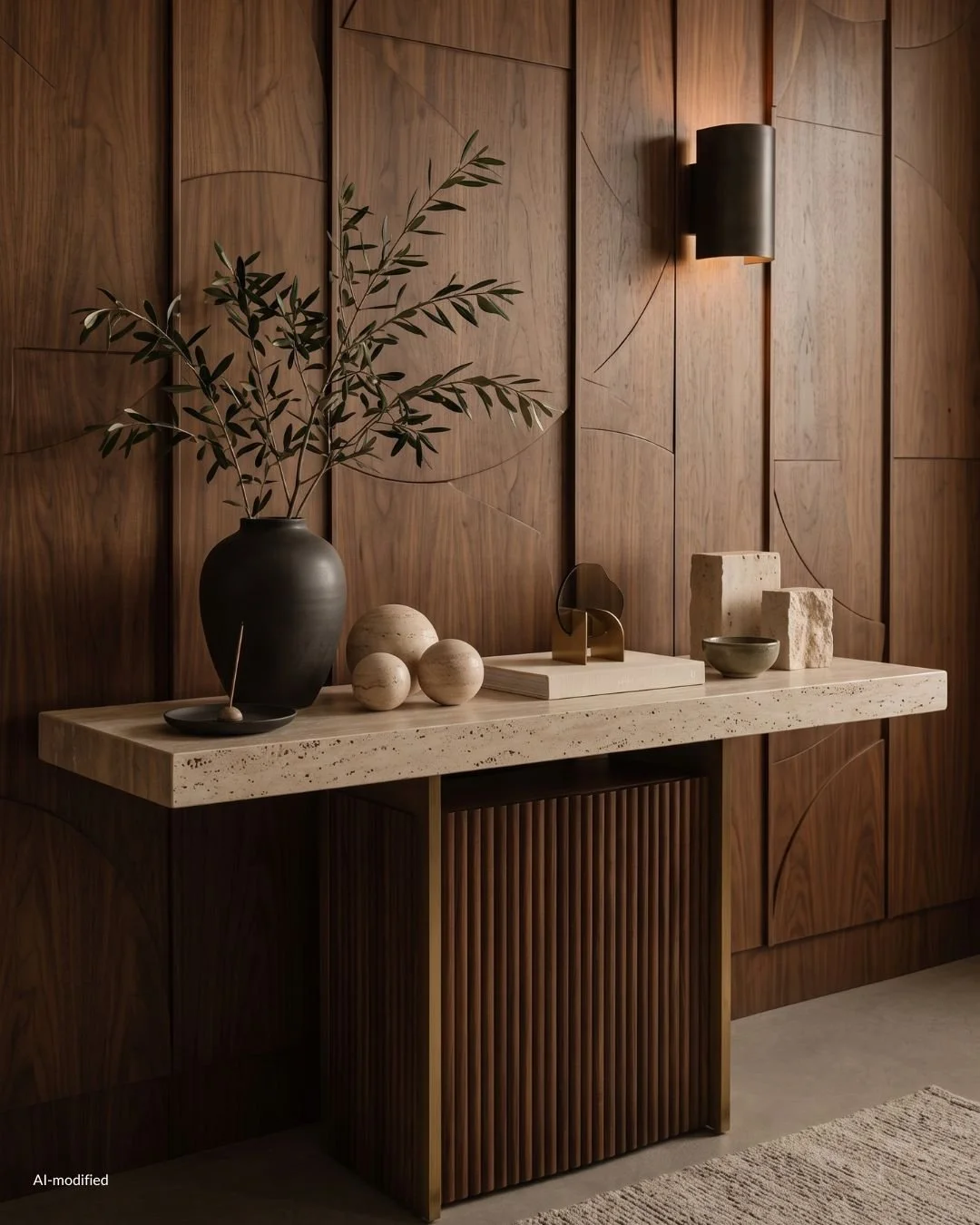
Wood is structural here, and it is meant to be seen. Grain runs across a credenza door as a deliberate composition. Edges are solid rather than banded. Finishes are oiled or lightly lacquered so the surface still reads as wood rather than as coating.
This is the characteristic that separates the real thing from the reference. Tapered legs on a laminate box is a shape. A walnut case with book-matched grain is the style itself.
Function You Can Read
Joints are visible. Hardware is integrated into the door rather than screwed on top of it. A shelf is held up by something you can see holding it up. Nothing pretends to be older, heavier, or more elaborate than it is.
That honesty is why the furniture has aged so gracefully. There was no decorative fashion layered on top to date it.
Is Mid-Century Modern Still in Style?
Yes, and it is in a stronger position now than it has been in years, because the wider mood of interiors has moved toward it rather than the other way around.
The last stretch of design was pale, quiet and beautifully disciplined. Light oak, soft white walls, very little on the surfaces. That look earned its place. It taught an entire generation how to edit a room, how to leave space empty on purpose, and how much calm a restrained palette buys you. Almost everything good happening now is built on that lesson.
What people want on top of it is a room that could only be theirs.
Why Mid-Century Modern Is Trending Again
The appetite has shifted toward character. Individuality over the algorithm, warmth over neutrality, and pieces that were found and chosen rather than selected from one page in one order.
Several things are pulling in the same direction.
Wood tones have gone deep again. Walnut, teak and warm brown are back in the center of the conversation after a decade at the edges of it, and that alone reactivates an enormous amount of mid-century furniture.
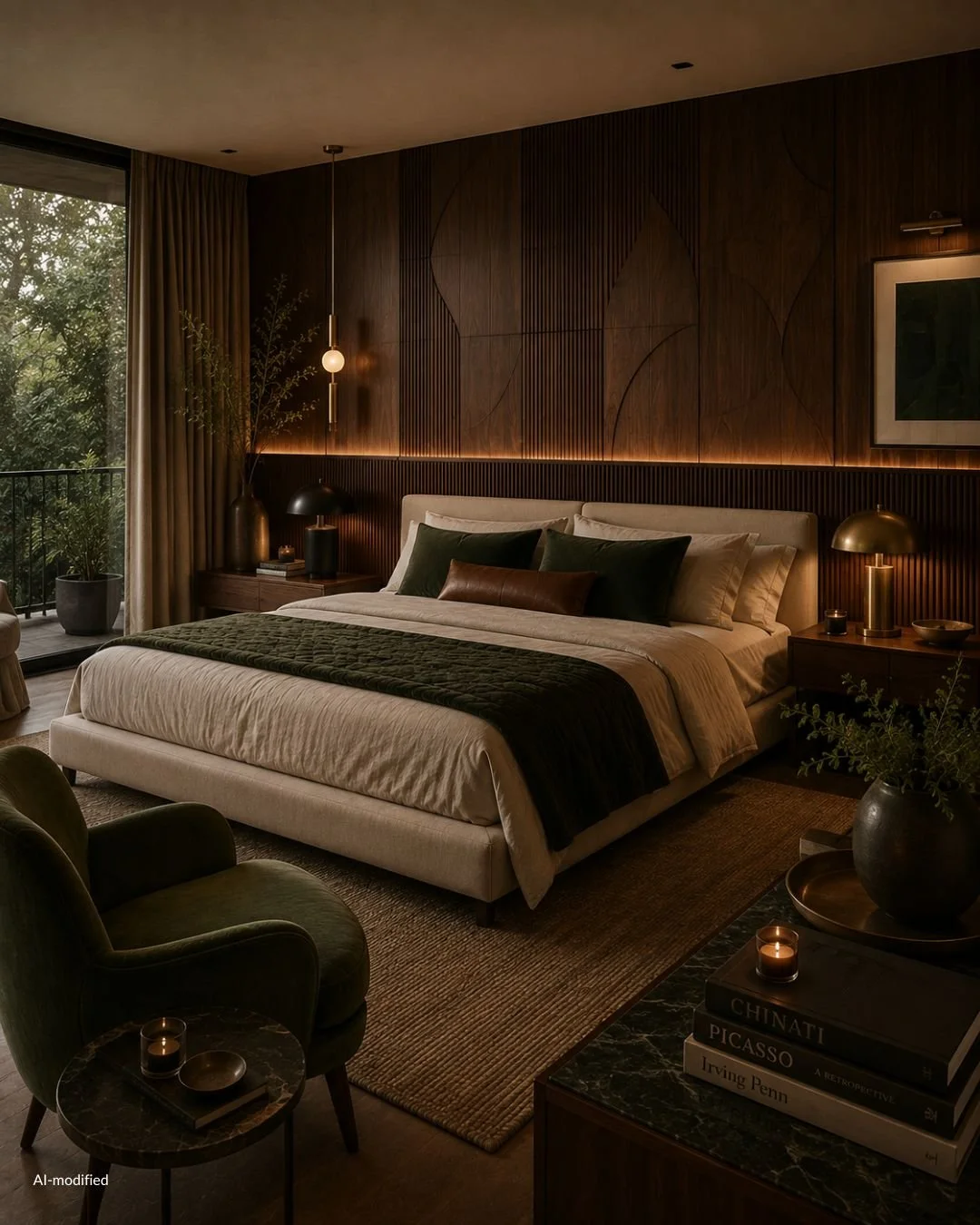
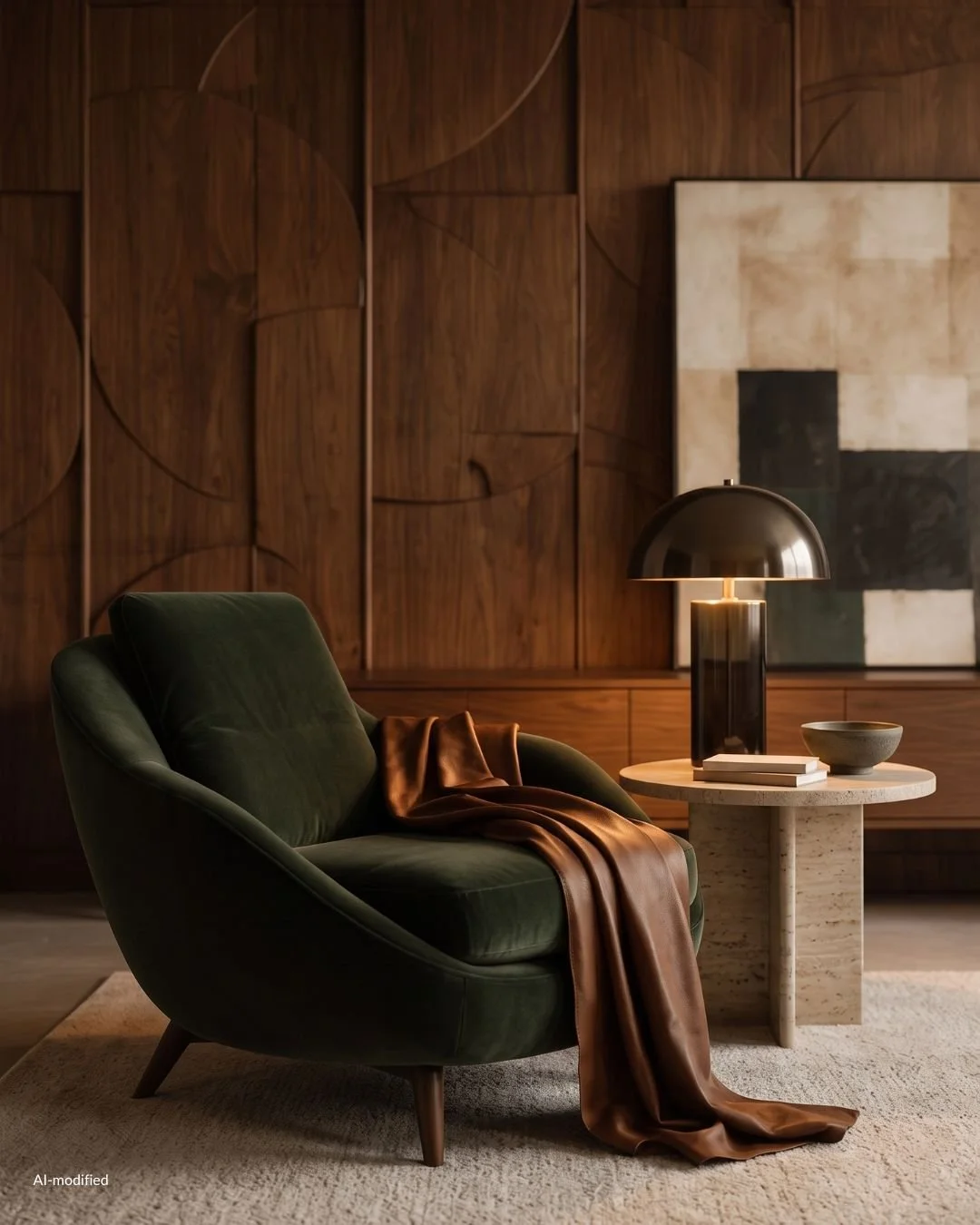
Color has returned to walls. Olive, oxblood, petrol and ochre read as confident rather than risky, and every one of them sits inside the mid-century palette already.
Material is being valued for how it ages. Solid wood, wool, leather, travertine and cane all improve with time rather than degrade, and people are choosing them deliberately, wanting a home that gets better rather than one that stays new.
And there is the pleasure of the search. Mid-century supply exists, one piece at a time, through dealers, auctions, flea markets and the occasional extraordinary stroke of luck. A room built that way looks like it belongs to a person with a long attention span. That is the look everyone is actually after: the sense that someone with real taste spent years on the space.
Several styles are reviving simultaneously right now, and that is the quiet gift in all of it. Neo deco, seventies chrome, brown furniture, warm minimalism, mid-century modern. When no single language dominates, there is no default to fall into, and choosing one and committing to it becomes the interesting move.
What the New Version of Mid-Century Modern Does Differently
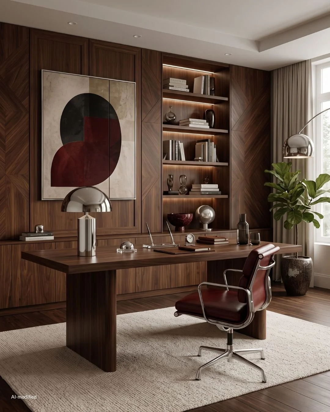
The style as it is being used now is warmer, darker and far less literal than the version that circulated widely a decade ago.
Walls carry color. Deep green, clay, tobacco, ink. The furniture reads better against a saturated wall than it ever did against white, because the wood has something to warm up.
Wood tones are mixed rather than matched. A walnut credenza, an oak floor and a teak chair in one room is now considered correct rather than careless, as long as the undertones agree.
Chrome and brass appear together. The strict single-metal rule has relaxed, and a chrome arc lamp beside a brass table lamp looks intentional.
The reference is thinner on the surface and heavier underneath. Fewer starbursts, fewer atomic prints, fewer boomerang shapes. More attention to proportion, grain and silhouette, which is where the real quality of the period always lived.
And it is being mixed. A single mid-century lounge chair in an otherwise contemporary room does more for the space than a full suite ever could, because it arrives as a personality rather than a set.
How This Revival Differs From the Last One
The previous wave was largely about shape. Tapered legs appeared on everything, in every showroom, often in materials that had nothing to do with the original intent.
This one is about substance. Solid wood over veneered board, real leather over vinyl, one considered piece over a coordinated room. It rewards patience, and it rewards the eye rather than the checklist.
Which is why it holds up. A room built on proportion and material does not go out of style, because it was never in fashion in the first place.
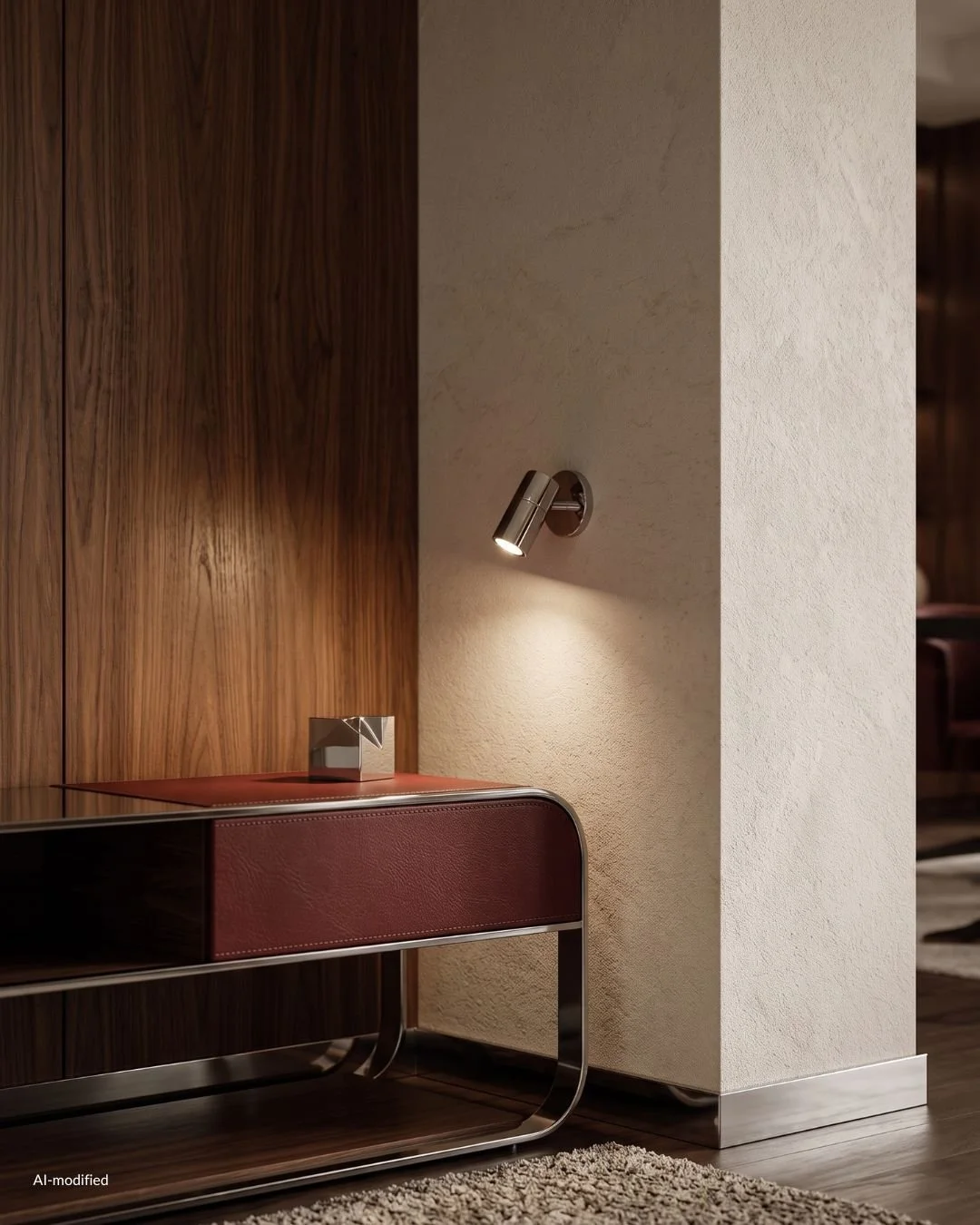
Mid-Century Modern vs Scandinavian, Bauhaus and Seventies Design
These four get used interchangeably, and they overlap genuinely, but each one produces a different room. Knowing where the lines sit makes shopping far easier.
Mid-Century Modern vs Scandinavian Design
This is the closest relationship of the four, because Danish modern is part of mid-century modern rather than an alternative to it. Wegner, Juhl and Jacobsen sit inside both stories.
The confusion comes from what "Scandinavian" means now. Contemporary Scandi is a later, lighter reading of that tradition: pale ash and birch, white walls, minimal contrast, soft textiles, almost no metal.
The mid-century Danish work it descends from was much warmer. Teak and rosewood, deeper tones, more sculptural joinery, more visible craft.
The practical difference in a room: Scandinavian aims for softness and light. Mid-century aims for warmth and contrast. If your walls are white and your woods are pale, you are in Scandi territory. Add a walnut case piece and a saturated wall and the room moves.
Mid-Century Modern vs Bauhaus
Bauhaus came first and thought differently. It was a German school, and its work is more industrial and more rigorous: tubular steel, primary color used as a signal rather than a mood, form derived strictly from function, very little interest in the comfort of a long evening.
Mid-century modern took those principles and warmed them. Wood replaced steel as the primary material. Curves entered. Upholstery got generous. The idea that a home should be pleasant to live in, not only correct to look at, is the mid-century contribution.
In a room: Bauhaus reads as architecture. Mid-century reads as a home.
Mid-Century Modern vs 1970s Design
The seventies picked up mid-century and turned every dial up.
Volumes got bigger and lower. Upholstery became deeper and softer. Chrome and smoked glass moved to the front. Burl wood, travertine and heavy texture arrived. Palettes went into rust, mustard, avocado and chocolate.
Mid-century is more restrained and more architectural. Seventies is more indulgent and more tactile.
The two mix beautifully, and a lot of the best rooms being made right now sit exactly between them. A slim teak credenza with a chrome arc lamp and a deep boucle sofa is the combination doing the most work at the moment.
Mid-Century Modern vs Contemporary
Contemporary is not a period. It means whatever is being made now, which makes it a moving target rather than a vocabulary.
Mid-century is fixed. It has defined proportions, materials, silhouettes and designers, and that is precisely why it is useful. You can learn it, apply it, and be confident it will still make sense in ten years.
Most homes end up as a contemporary shell with a mid-century sensibility inside it. That is not a compromise. It is the version that actually works in a house built long after the period ended.
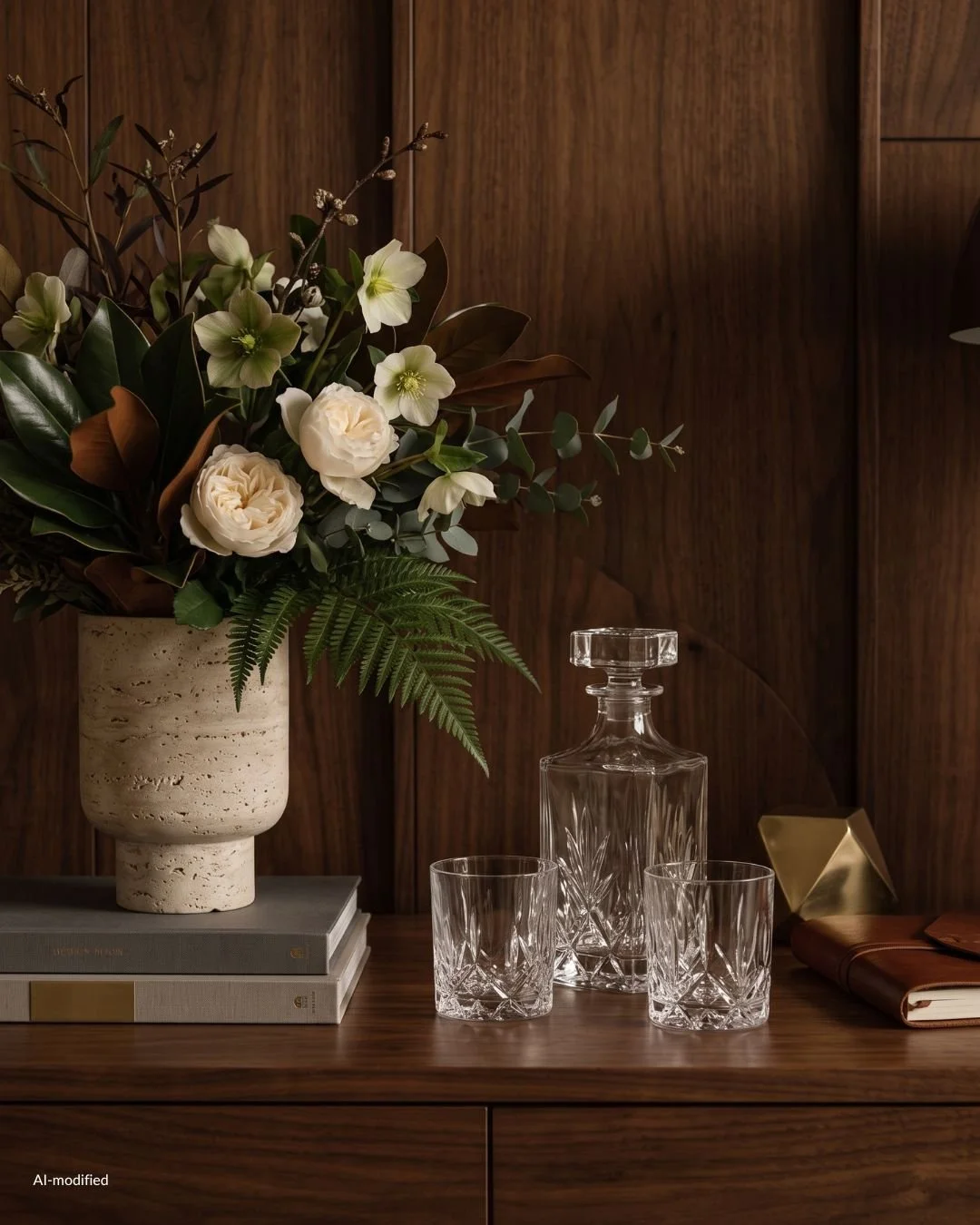
Mid-Century Modern Materials: Wood, Metal, Stone and Textile
If you get the materials right, the room reads as mid-century even when very little of the furniture is. If you get them wrong, a room full of correct silhouettes still feels like a showroom.
This is the part I care about most, because material is what makes a home feel like it has a temperature.
Mid-Century Modern Wood Types Explained
Wood is the spine of the style. Four species do almost all of the work, and they behave differently enough that it is worth knowing which one you are looking at.
Walnut is the American signature. Chocolate brown with a straight, quiet grain and occasional darker streaking, it is the wood behind most of the Herman Miller and Knoll case pieces people picture first. It mellows with light over the years, losing some depth and moving toward a warmer, softer brown. That aging is part of its appeal. A walnut credenza that has sat in a bright room for decades looks better than one that has not.
Teak is the Danish signature. Golden brown, higher in natural oil, with a grain that catches light and shifts as you move past it. Teak deepens rather than fades, which is why vintage Danish pieces have that honeyed warmth new furniture struggles to imitate. It also takes an oiled finish beautifully, which is how most of it was originally made.
Oak was used throughout the period and has been unfairly filed under Scandinavian. Paler, with prominent open grain and a slightly cooler cast, it works when you want the architecture of the style without the depth. It is also the most forgiving wood if your floors are already light.
Rosewood is the rare one. Dramatic, near-black streaking across a reddish ground, and unmistakable once you have seen it. Brazilian rosewood has been protected under CITES since the early nineties, so new production essentially does not exist and everything on the market is vintage. Prices reflect that. One rosewood piece is enough for a whole apartment.
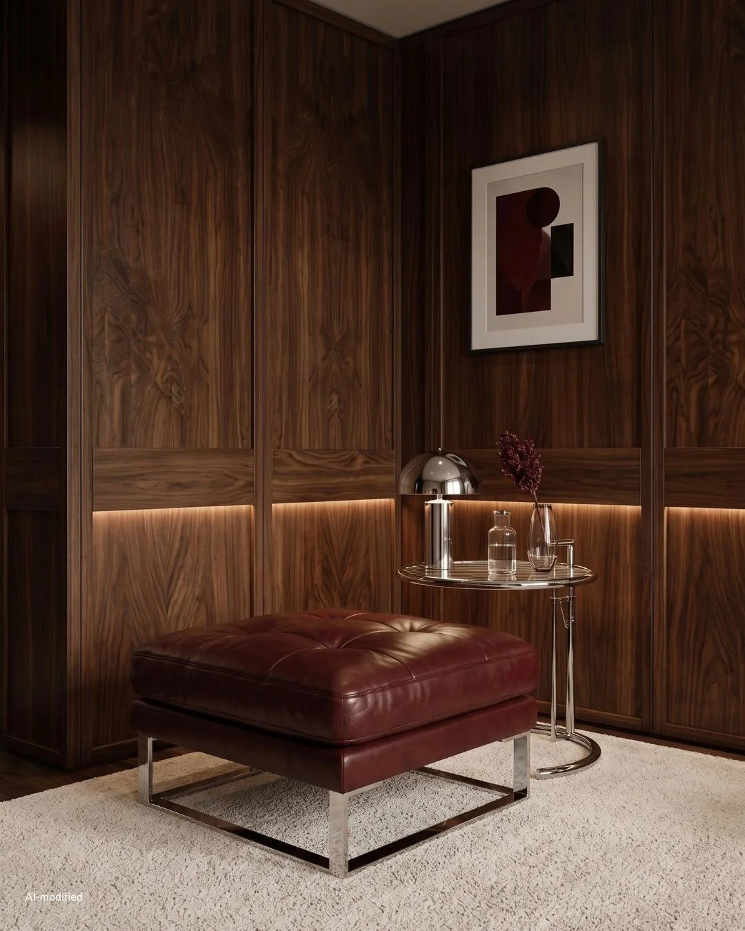
How to Mix Wood Tones in One Room
Matching every wood in a room is a habit inherited from furniture sets, and mid-century never worked that way. Danish interiors mixed teak against oak against painted surfaces constantly.
What I follow:
Agree on undertone, not on shade. Walnut, teak and warm oak all sit on the warm side and will get along at any distance apart. Introduce a cool gray-washed oak into that group and it will read as a mistake, because it is the only one arguing.
Keep it to two or three woods. Beyond that the room loses its center.
Repeat each tone at least twice. A single teak side table in a walnut room looks stranded. The same table plus a teak lamp base or picture frame looks intentional.
Let the floor sit out of the argument. Floors are large, fixed and rarely a perfect match to anything. Treat the floor as the ground the woods stand on rather than as a wood tone to coordinate with, and stop worrying about it.
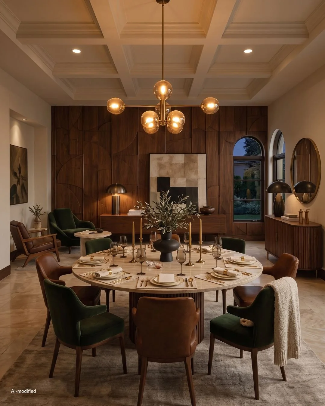
Oiled Finishes vs Lacquered Finishes
Most original Danish work was oiled. The surface is matte, the grain is open, and the wood feels like wood under your hand. Oil needs attention every year or two, and in exchange it can be repaired. A ring or a scratch sands out and disappears back into the surface.
Lacquered pieces are sealed under a film. Harder, glossier, far more resistant to a wet glass, and much less pleasant to touch. Damage sits on top of the finish rather than in the wood, which means repair usually means refinishing the whole panel.
I choose oiled every time and accept the maintenance, because the tactility is most of the point.
Metals in Mid-Century Interiors
Chrome is the metal having the loudest moment right now, and it belongs here properly rather than as a borrowed seventies flourish. Flat-bar chrome frames, tubular chrome bases and slim chrome arc lamps run straight through the period. It is cool, reflective and slightly hard, which is exactly why it works against warm wood. The contrast is the effect.
Brass does the opposite job. Warm, soft and quietly luxurious, it appears in lamp bases, hardware, hairpin details and the caps on tapered legs. Unlacquered brass patinas as it is handled, going deeper and less yellow over time, and I prefer it that way.
Blackened and brushed steel is the quiet one. It disappears into the room and lets the wood carry the weight, which makes it useful for shelving, table bases and anything you want structural rather than decorative.
How to Mix Metals Without It Looking Wrong
Mixing metals is fine and always was. The rule that saves it is hierarchy rather than balance. Pick one metal to lead, give it roughly two thirds of the metal in the room, and let the second appear as an accent that repeats at least twice.
Chrome leading with brass accents feels sharp and slightly cinematic. Brass leading with chrome accents feels warmer and more domestic. Both are correct. An even split between the two is the only version that reads as indecision.
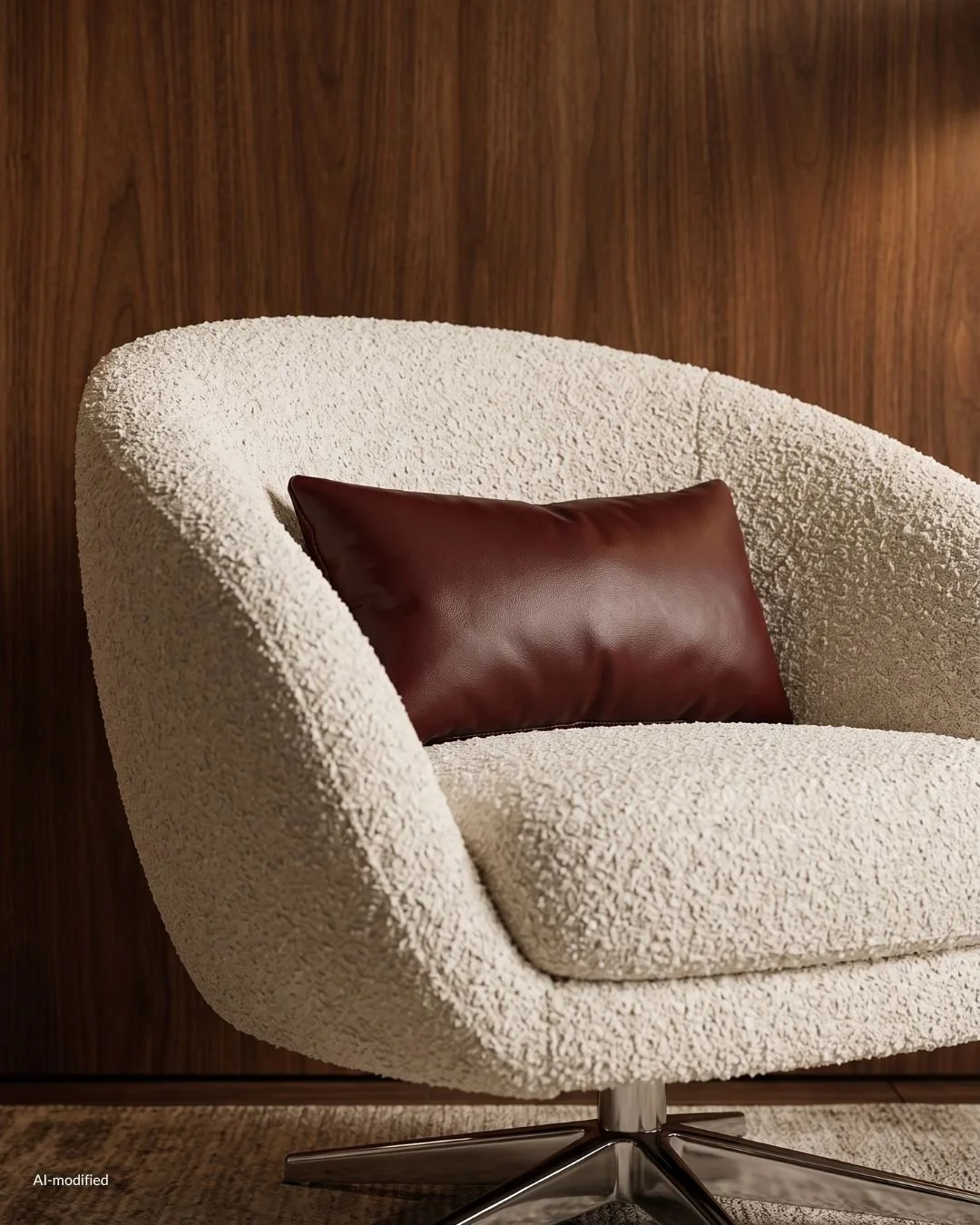
Stone and Glass in Mid-Century Design
Travertine is the stone of the moment and a genuine period material. Warm cream to soft beige, with those characteristic open pores running through it in bands. Unfilled travertine has texture you can feel and a matte, almost chalky presence. Filled and honed is smoother and more practical for a dining surface. Either way it does something no other stone does: it brings pale into a warm room without introducing anything cold.
Marble appears mostly in table tops and on Saarinen pedestals. Keep the veining calm. Heavy dramatic veining pulls the room toward a different, more contemporary language.
Smoked glass is the detail that changes a room fastest. A bronze or gray-tinted glass top over a chrome base darkens and softens everything reflected in it, and it stops a glass table from reading as clinical.
Ribbed and reeded glass in cabinet doors and sconces breaks light into vertical bands and adds texture where a room has gone too smooth.
Mid-Century Modern Textiles and Upholstery
This is where warmth actually enters. Wood and metal give you structure, but the room only becomes comfortable at the point you sit down.
Wool is the workhorse. Densely woven wool upholstery in olive, rust, camel or charcoal is the most period-correct choice available and the most durable one.
Mohair is the upgrade. It has a short, dense pile with a subtle sheen that shifts as light moves across it, and it makes an ordinary sofa shape look considered.
Boucle is the contemporary addition and it earns its place, because the looped texture reads soft against all that hard geometry. Keep it to one large piece. Two boucle items in one room starts to look like a trend rather than a choice.
Leather is the material I would spend on first. Aniline and semi-aniline leather in cognac, chocolate or oxblood develops a patina that no new piece can fake, softening and marking where it is used most. It is the one upholstery that is genuinely better in year fifteen than in year one.
Cane and paper cord are the light relief. Cane webbing in a chair back or a cabinet door lets air and shadow through a solid form. Danish paper cord seats do the same thing structurally, and they age to a soft honey that sits perfectly against teak.
Linen is the neutral that keeps everything else from feeling heavy. Rumpled, matte and slightly imperfect, it belongs on curtains and cushions more than on primary seating.
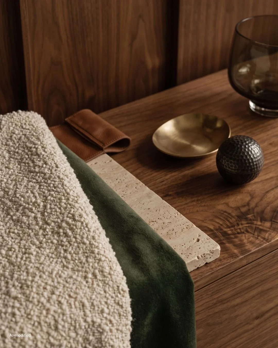
Mid-Century Modern Lighting Ideas
Lighting is where mid-century stops being furniture and becomes sculpture. The period treated a lamp as an object worth looking at when it is switched off, which is a standard almost nothing sold today attempts.
It is also the fastest way into the style. One good light changes a room more than a sofa does, and it does it without asking you to move anything.
Arc and Sculptural Floor Lamps
The arc lamp is the single most useful mid-century light. A weighted base on one side of the room, a long curve overhead, and a shade delivering light where a pendant cannot go. It puts illumination over a sofa or a reading chair without touching the ceiling, which makes it the answer for rentals and for rooms where the wiring is where it is and will stay there.
In chrome it is graphic and slightly glamorous. In brass it warms the whole corner. Either version does structural work in a room, because the curve draws a line through empty air and the space above the seating stops feeling unresolved.
Sputnik and Globe Pendants
The sputnik is the shape everyone recognizes. Radiating arms from a central sphere, bulbs at the tips, no shade to hide behind. It is confident and it is very easy to overdo. One in a dining room or an entry is enough for a whole home.
Globe pendants are the quieter option and the one I reach for more often. Opal glass spheres, singly over a table or in a cluster at staggered heights, give soft diffused light and a shape that never argues with anything else in the room.
Mushroom and Dome Table Lamps
The mushroom lamp is the most forgiving mid-century light there is. A rounded dome shade over a matching base, in glass, metal or ceramic, throwing light downward onto the surface it stands on.
It works because it is a pure form with no detail to date it, and because low pooled light at table height is what makes a room feel like evening. A pair of them on a credenza will do more for a living room than an overhead fixture ever will.
How to Layer Lighting in a Mid-Century Room
The period understood something that got lost: a room needs several low sources rather than one bright one.
Three or four points of light at different heights is the working formula. A floor lamp at standing height, a table lamp at seated height, something low or wall mounted to catch a corner, and the overhead used sparingly if at all.
Warm bulbs throughout, all dimmable. Cool white light flattens walnut and makes brass look yellow, and it undoes the material work the rest of the room is doing.
Leave shadow in the room. Even illumination is for offices. A mid-century interior at night should have bright pools and dark corners, and the contrast between them is most of the atmosphere.
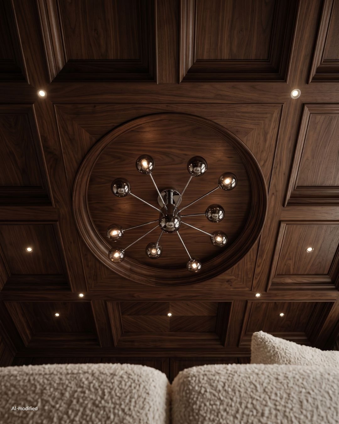
Mid-Century Modern Art and Wall Decor
Walls in this style are held deliberately quiet. The furniture is doing the talking, and a crowded wall competes with it.
What Kind of Art Works
Abstract work in flat planes of color sits most naturally, because it shares a vocabulary with the furniture. Hard-edged geometry, soft organic shapes, anything with a confident single gesture.
Architectural and landscape photography works, particularly in black and white, and gives the eye somewhere quiet to rest between wood tones.
Textile art has come back properly. A woven wall hanging or a small tapestry in wool adds warmth and absorbs sound, and it belongs to the period rather than referencing it.
Ceramics deserve wall space too. A group of small vessels on a shelf reads as collected in a way a print never quite does.
What I avoid is the literal reference. Atomic starburst prints and reproduced period advertising turn a room into a theme, and the style is strong enough that it does not need the label.
Scale and Hanging Height
Go larger than feels comfortable. One substantial piece above a credenza looks resolved. Three small frames in a row above the same credenza looks like hesitation.
Hang low. Mid-century furniture sits low, and art hung at conventional gallery height floats away from it. Bringing a piece down so the gap above the credenza is small pulls the two together into one composition.
Gallery walls are not really part of this language. If you want several pieces, lean them along a shelf or a picture rail instead and let them overlap.
Framing Choices
Thin frames in walnut, teak, oak or black metal. The frame should be a line around the work rather than an object in itself.
Generous mounts in warm white rather than bright white, which reads cold against wood.
Museum glass if the budget allows it, because the whole point of a low-light mid-century room is undone by a sheet of glass reflecting the window back at you.
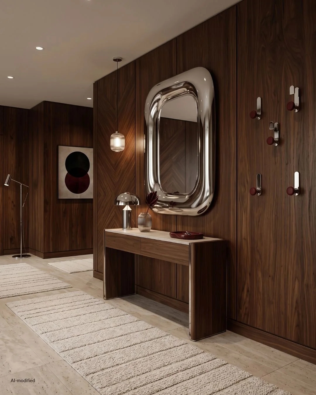
Mid-Century Modern Color Palette
Color is where this style becomes personal, and it is the part most people get wrong by going either too pale or too literal.
What Colors Were Popular in Mid-Century Modern Design
The period palette is warmer and deeper than the pastel version that circulates online.
The foundation is earth. Ochre, mustard, rust, terracotta, tobacco and every brown between camel and chocolate.
Green runs through everything, in olive, moss and sage rather than in anything bright.
Deep reds appear as accents. Oxblood, burgundy and a burnt orange that sits closer to clay than to neon.
Blues are muted and dusty. Petrol, teal and a grayed slate.
The neutrals are warm rather than cool. Cream, oatmeal, bone and warm gray, never a stark white.
Black is used structurally, in a lamp base, a chair frame, a leg, an edge. Small quantities, doing precise work.
How to Build a Mid-Century Modern Color Scheme
The approach that has never failed me is to let one color lead and keep everything else in service to it.
Choose the anchor first. One saturated color that will carry the walls or the largest upholstered piece. Olive, oxblood, petrol, tobacco. This is the decision the room is built around, and making it early prevents everything after it from becoming a compromise.
Set the warm neutral second. Cream, oatmeal or bone, covering the largest areas that are not the anchor.
Let the wood be a color, not a background. Walnut and teak are saturated warm browns and they occupy real space in the scheme. Count them.
Add one accent, used three times. A single ochre cushion is an accident. The same ochre in a cushion, a ceramic and a spine of a book on the shelf is a palette.
Keep black to the edges and the details.
Should You Paint Mid-Century Modern Walls Dark or Light?
Both work, and they produce genuinely different rooms.
A saturated wall gives the furniture something to sit against. Walnut against a deep olive or a warm clay reads richer and more intentional than the same piece against white, because the wall meets the wood at a similar depth instead of throwing it into relief. Dark walls also flatter low furniture, since the horizontal line of a credenza reads as a graphic against color.
A warm light wall gives the furniture more room to be sculptural. Silhouettes stand out, the space feels larger, and a strong piece becomes the single focus. The only requirement is warmth. Cool white walls take all the honey out of teak and make brass look thin.
North-facing rooms take the warm deep colors best, because there is no direct sun to lift a pale wall and it will otherwise read gray all day. South-facing rooms can carry lighter warm neutrals without flattening.
My own bias is toward color on the walls. It is the least expensive decision in the entire room and the one that changes the most, and a considered paint color does more for a mid-century interior than an additional piece of furniture will.

How to Decorate a Mid-Century Modern Home Now
Everything up to here is vocabulary. This is the part about actually living in it, in a home that was almost certainly not built in 1958.
How to Mix Mid-Century Modern With What You Already Own
The style is unusually generous about this, because it was designed to be compatible. Low, light, unornamented furniture sits comfortably next to almost anything.
Start with one piece that carries real weight. A credenza, a lounge chair, a dining table. One object of genuine quality in an otherwise ordinary room changes the reading of everything around it, because the eye goes to the best thing present and judges the rest by its company.
Give that piece space. A significant object surrounded by clutter is just more clutter. The clearing around it is what announces it.
Then let the room catch up slowly. A lamp. A rug. A ceramic. Each addition chosen against the anchor rather than against a plan.
What I would not do is replace everything at once. A room bought in a single afternoon looks like it was, no matter what it cost, and the whole appeal of this style now is the opposite impression.
Mixing Vintage and New
The best rooms in this language are mixed, and the mix follows a fairly reliable division.
Buy vintage for the case pieces and the chairs. Credenzas, sideboards, dining chairs, lounge chairs, side tables. These are the objects where the original craft is visible and where a reproduction usually reveals itself in the joinery and the veneer.
Buy new for the things you sit on for hours and for anything that touches water. Sofas, mattresses, kitchen surfaces. Original upholstery rarely survives in a state you want to live with, and reupholstering a period frame in a good wool or mohair is often the better route anyway.
The ratio that works is roughly one third vintage. Enough for the room to have provenance, not so much that it tips into period set.
Mid-Century Modern Living Room Layout
The living room is where the low horizontal line does its best work.
Float the seating off the walls if the room allows it. Mid-century furniture was designed to be seen from all sides, and pushing everything against the perimeter hides the legs and the profiles that make it worth owning.
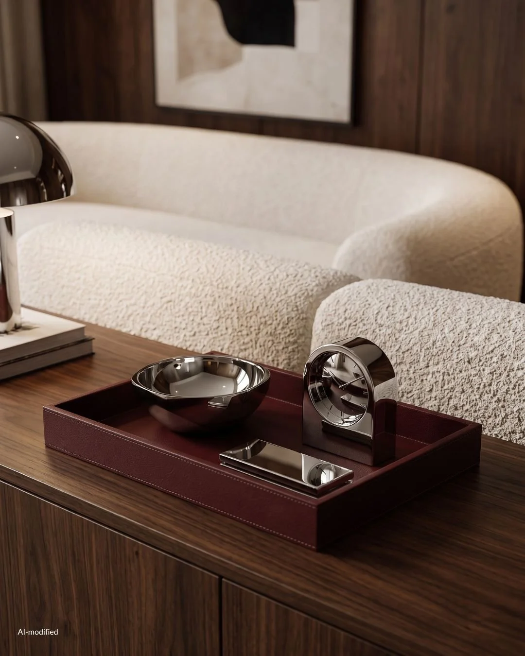
Keep one long unbroken run. A credenza along the main wall, ideally with nothing stacked on top of it beyond a lamp and one object. That single horizontal is the strongest architectural move available in most rooms.
Use a large rug and put the front legs of the seating on it. A rug that floats in the middle with everything standing off it shrinks the room. A generous one holds the arrangement together as a single zone.
Leave one corner deliberately empty, or give it a single tall plant. Mid-century rooms breathe. Filling every corner is what makes an otherwise correct room feel heavy.
Mid-Century Modern in a Small Apartment
This is where the style genuinely outperforms, and it is worth saying plainly: mid-century furniture was designed for smaller postwar homes, not for mansions.
Everything sits on legs, so the floor runs continuously underneath and the eye reads the full footprint of the room rather than a series of blocks.
Backs are low, so sightlines stay open across the space.
Pieces are modest in depth. A period sofa is often considerably shallower than a contemporary one, which is the difference between a room that works and a room you edge around.
In a small apartment I would spend the budget on one exceptional piece and keep the rest quiet. Scale down the quantity, never the quality.
Mid-Century Modern in a New Build or a Rental
Most people applying this style are working with white walls, a laminate floor and a ceiling light in the middle of the room. All three are solvable without touching the structure.
Paint is the first and largest move, and it is reversible. A single saturated wall color turns a neutral box into a room with a position.
Rugs handle the floor. A large wool rug in a warm tone covers the majority of an unsympathetic surface and changes the temperature of the entire space.
Lamps handle the lighting. An arc floor lamp and two table lamps make the central fixture redundant, which is exactly what you want.
Textiles handle the rest. Full-length linen or wool curtains hung high and wide will do more for the proportions of a plain room than any piece of furniture.
Where to Find Mid-Century Modern Furniture
The searching is the pleasure. I mean that seriously. A room assembled over two years from things you tracked down is a different object from a room delivered in a week, and everyone who walks into it can tell.
Specialist dealers are where the properly restored pieces live. You pay for the restoration and the certainty, and for a significant purchase that is usually money well spent.
Auction houses are where the value sits, particularly regional ones outside the design capitals. Lots often go unnoticed simply because the catalog photography is poor.
Flea markets and estate sales are the slowest route and the most rewarding. Nothing else produces the piece you were not looking for.
Online marketplaces are worth checking regularly rather than occasionally. Set the alerts and let them run in the background for months.
Reissues from the original manufacturers are legitimate and worth considering when the vintage version is unattainable or unusable. A licensed reissue is the design as intended, made to the drawings, with a warranty.
What to Check Before You Buy Vintage
Veneer first. Look at the edges and corners for lifting or chips, since veneer repair is the most common problem and the most expensive to do well.
Then the joints. Gently rock a chair. Loose joints can be reglued, but a cracked frame is a different conversation.
Then the finish. Water rings and light scratches in an oiled surface are cosmetic and will sand out. Deep gouges through veneer will not.
Then the smell, which sounds unserious and is not. Pieces stored in damp basements carry it in the wood, and it does not always leave.
Ask what has been done to it. A properly refinished piece is a good buy. A piece stripped and re-lacquered by someone in a hurry is not, and the surface will tell you which one you are looking at.
How to Keep Mid-Century Modern From Looking Like a Theme Room
The failure mode of this style has never been restraint. It is enthusiasm.
Keep the references thin on the surface. Starbursts, atomic prints, boomerang shapes and period advertising are the shorthand, and a room only needs one of them at most.
Let contemporary things be contemporary. Your television, your kitchen and your bathroom do not have to participate. A mid-century room with a modern kitchen off it reads as a home. A fully committed period reconstruction reads as a set.
Mix the eras deliberately. A single antique, a contemporary artwork, something with no lineage at all. The mid-century pieces get stronger in mixed company, not weaker.
Let quality carry the style rather than the silhouette. Solid wood, real leather, good wool, honest metal. A room built from those materials will read as mid-century even when half the furniture is not, because the feeling was always in the substance rather than the shape.
Why I Keep Coming Back to It
Because it is the rare style that improves as you live in it. The leather softens, the brass darkens, the teak deepens, the wool wears in at the arm of the chair where your hand goes.
And because it is buildable. You do not need a decorator or a budget approved in one go. You need an eye, some patience, and the willingness to wait for the right credenza rather than accept the available one.
That is the whole method. One piece at a time, each one chosen properly, until the room could not belong to anyone else.