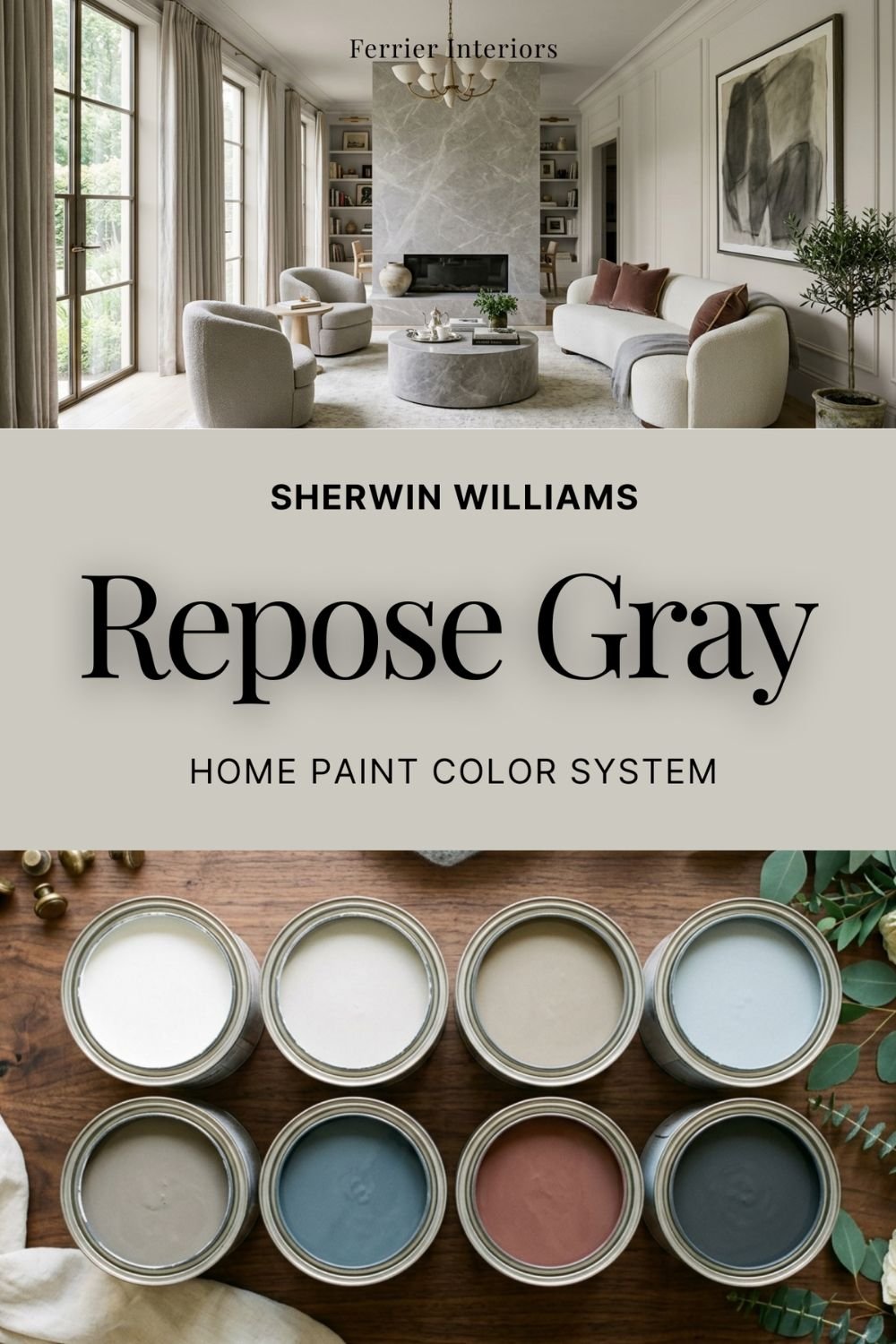
Sherwin Williams Repose Gray Color Review
Repose Gray: A Balanced, Versatile Sherwin-Williams Shade Worth Trying
Gray was supposed to be over. Designers declared it, the warm-neutral wave rolled in, and yet one gray kept getting specified, sampled, and painted on more walls than almost any color Sherwin-Williams makes. That color is Repose Gray, and it survived the purge for a simple reason: it was never really the cold gray everyone got tired of.
Sherwin-Williams' Repose Gray (SW 7015) is a light greige, a gray with a quiet beige undercurrent that keeps it from ever feeling stark. It has sat near the top of Sherwin-Williams' bestseller list for a decade now, and colors don't stay there by accident.
What Does Repose Gray Look Like?
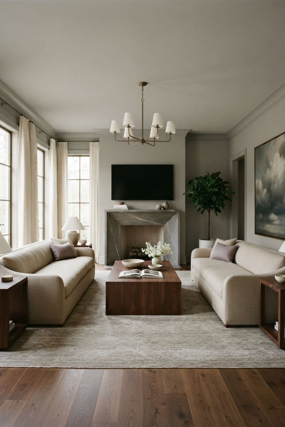
On the wall, Repose Gray reads as a soft, light gray with warmth underneath. It's not silver, not concrete, and not beige either. It holds the middle ground so precisely that people standing in the same room will disagree about which side of the gray-beige line it falls on.
If you're comparing it to Agreeable Gray, the other greige on every shortlist, the difference is direction: Agreeable Gray leans a step toward beige, Repose Gray stays a step closer to true gray. Choose Repose Gray when you want your neutral to read gray first and warm second.
What Are the Undertones?
The main undertone is a soft brown-taupe, and it's what gives the color its warmth. There's also a faint violet note hiding in the base, and being honest about it matters: in dim light or deep shadow, Repose Gray can flash slightly purple-taupe. Most rooms never show it. Some north-facing corners do.
That's not a reason to skip the color. It's a reason to sample it in the darkest part of your room instead of the brightest, because that corner is where the undertone will speak up if it's going to.
What Is the LRV of Repose Gray?
The Light Reflectance Value (LRV) of Repose Gray is 58. That's squarely in the light range, bright enough to keep rooms open, but with enough pigment that walls read as an actual color instead of a white that gave up. LRV 58 is close to ideal for main living areas: it bounces plenty of daylight around while still giving trim, art, and furniture something to stand against.
Is Repose Gray Warm or Cool?
Warm, but only just, and that restraint is the entire point. Put it next to a steel gray and it looks warm. Put it next to a cream and it looks gray. This balancing act is why it works in houses full of mixed finishes, where a committed warm beige would fight the cool tile and a cold gray would fight the wood floors. Repose Gray shakes hands with both.
What Lighting Directions Work Best?
Light changes everything, and here's how Repose Gray tends to shift based on the room's exposure:
North-facing rooms: Reads at its grayest and coolest, and this is where the taupe-violet undertone is most likely to show. Sample here first
South-facing rooms: The warmth comes forward and the color feels soft and even all day. Its best exposure
East-facing rooms: Warmer and creamier in the morning light, settling into a truer gray by afternoon
West-facing rooms: Grayer through the morning, then warming toward taupe as the evening sun comes in
Tip: Sample Repose Gray on at least two walls, one facing the window and one in shadow. This color's whole reputation is built on shifting gracefully between gray and greige, so you want to see both versions in your own house before you commit.
Best Rooms to Use Repose Gray In
Some of my favorite rooms for Repose Gray:
Whole-Home Main Walls: This is its true calling. It runs through open floor plans without hitting a room where it fails
Living Rooms: Neutral enough to host any furniture, present enough to keep white trim looking crisp
Bedrooms: Calm and shadowy in the evening without turning cold
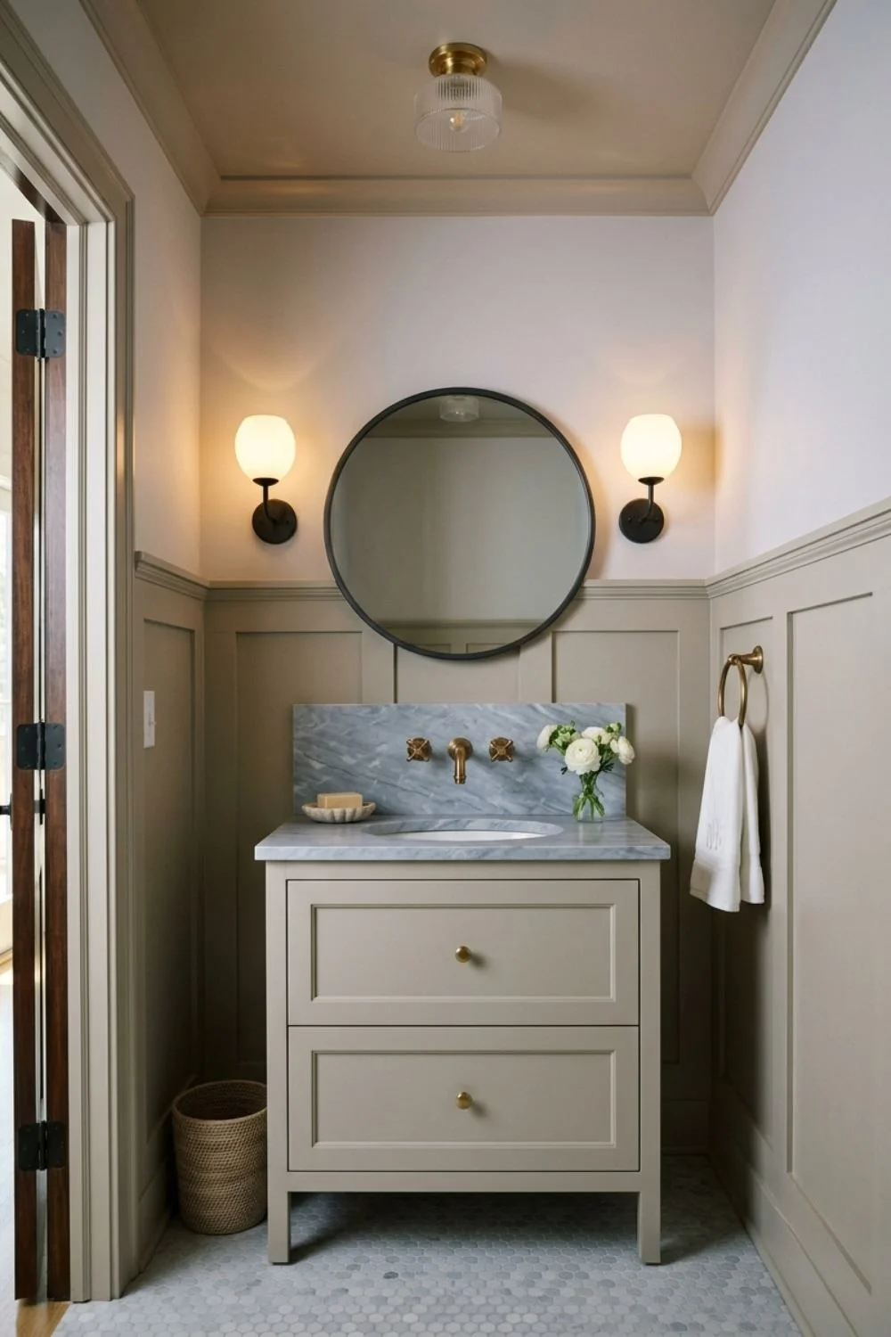
Bathrooms: Works with both marble and warm wood vanities, which few grays can claim
Hallways and Connecting Spaces: Mixed and borrowed light is where trickier neutrals fall apart, and this one holds steady
What Wood Tones Pair Beautifully?
Repose Gray looks especially lovely with:
White oak and light natural wood: The definitive modern pairing, light on light with just enough temperature contrast
Walnut and mid-tone wood: The gray sharpens the grain and the wood keeps the room from cooling off
Espresso and dark-stained wood: High contrast that feels tailored, especially in offices and dining rooms
What Materials and Finishes Complement It?
This color shines when paired with:
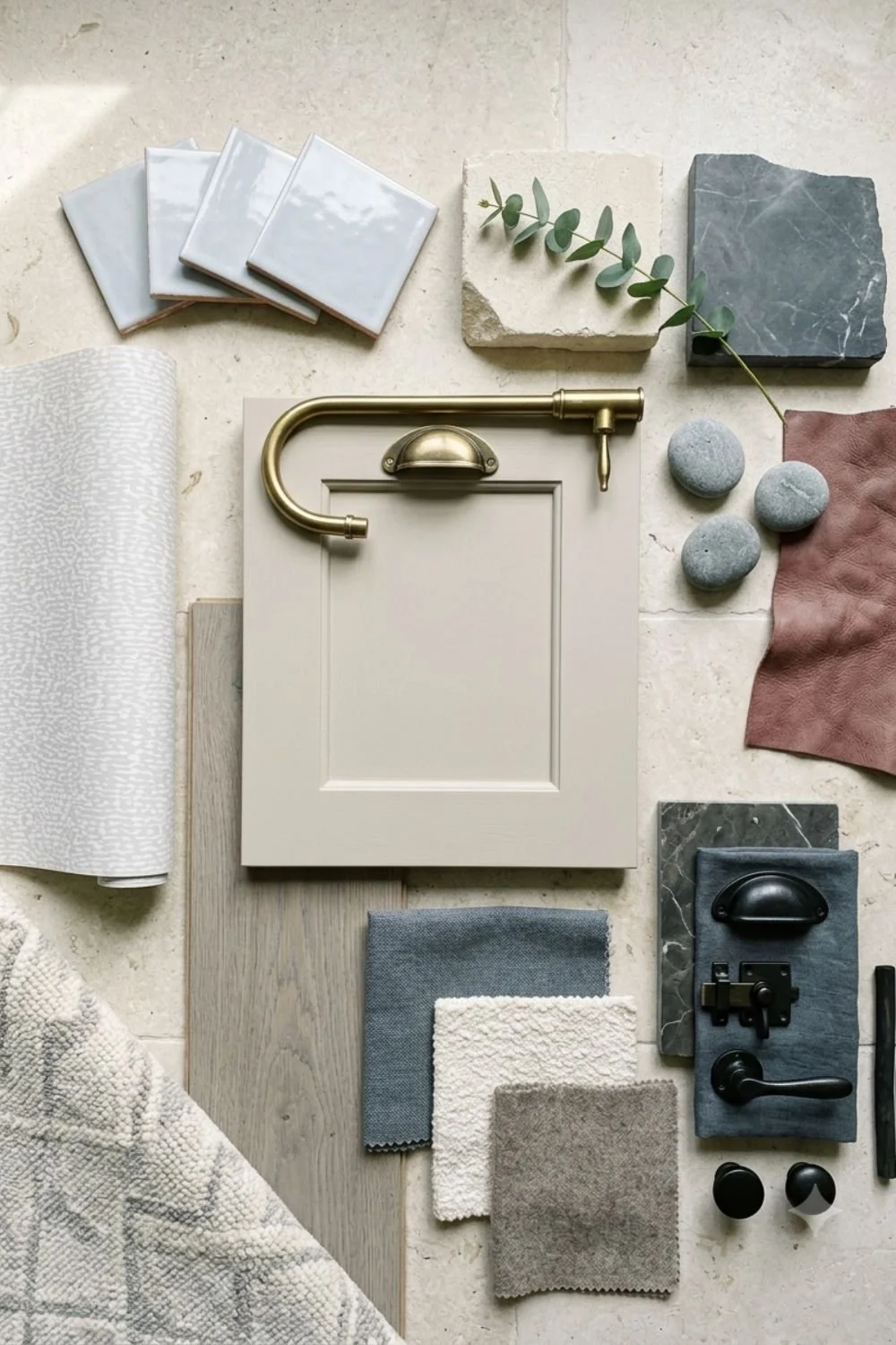
Marble and gray-veined stone: The rare case where a wall color and cool stone share an undertone family and it shows
Linen, boucle, and chunky knits: Texture gives a light gray room its softness and keeps it from feeling flat
Matte black hardware and fixtures: A little graphic edge that suits the gray side of its personality
Brushed nickel or aged brass: It genuinely takes both, cool metal for a modern read, brass to pull the warmth forward
What Colors Pair Well With Repose Gray?
This color plays well with:
Crisp neutral whites: For trim and ceilings, the pairing that makes the gray look intentional
Deeper charcoals and soft blacks: One dark element grounds all that lightness
Pale powdery blue-grays: A tonal, airy direction that stays serene
Deep muted blue-grays: The moody accent route, beautiful on a bedroom wall or a bathroom vanity
Dusty chestnut and clay tones: The unexpected pairing, and the one that makes a greige scheme feel designed rather than defaulted
What Styles Work Best with This Color?
Repose Gray feels right at home in:
Transitional: Its natural habitat, bridging traditional bones and modern furniture
Modern Farmhouse: A softer wall than white, still clean against black windows and shiplap
Contemporary: Reads sleek without the chill of a true cool gray
Updated Traditional: Freshens heavy furniture and classic millwork without erasing them
New Build Neutral done right: Yes, builders love it, but that's evidence of reliability, not a mark against it
Would I Use This for Trim or Doors?
For interior doors, absolutely. Repose Gray doors against white walls and white trim is a quietly custom look that costs nothing extra. It also makes a graceful cabinetry color for anyone who wants gray kitchen lowers without committing to charcoal.
As a trim color it's a more careful call. Greige trim needs the walls to be clearly lighter or clearly darker, or the whole room blurs into one indecisive tone. If your walls are staying white, it works. If your walls are another light neutral, pick a different trim.
Who Is Repose Gray Best For?
This shade is perfect for:
Anyone repainting a whole house who wants one neutral that won't fail in a single room
People caught between gray and beige who genuinely cannot pick a side
Anyone painting to sell, because broad appeal is exactly what this color was born to deliver
Final Thoughts
Repose Gray is what a safe choice looks like when it's made well. It asks nothing dramatic of you, works with nearly everything you already own, and shifts between gray and greige so smoothly that the house feels cohesive at every hour. Trends moved on and this color didn't flinch.
Sample it big, check the darkest corner, and look again after sunset. If the shadowed version still reads calm to you, you've found your whole-house neutral.
Want the Full Repose Gray Guide?
Picking the greige is the easy half. The full Repose Gray guide covers the rest: a complete 8-color palette built around this gray, a full profile for every shade, styled combinations for each color, and exterior pairings so the outside of the house speaks the same language. Grab it on Etsy here.