White is the color people underestimate most, and the one that punishes that underestimation the hardest. Ask someone to pick a bold green or a moody navy and they'll deliberate for a week and land somewhere reasonable. Ask them to pick a white and they'll grab the first can labeled "white" and assume the job is done. It isn't. White has more range, more moods, and more ways to go wrong than almost any other color on the strip.
Here's the part most people miss: white isn't neutral. Every white is built on an undertone, a faint trace of another color hiding underneath the surface. Warm whites lean yellow or red. Cool whites lean blue or green. That undertone is invisible on the paint chip in the store, sitting under fluorescent lighting next to a hundred other chips. It becomes very visible once it's on your wall, reacting to your specific light, your floors, your furniture, your neighbor's house blocking the afternoon sun. A white that looks crisp and clean in a showroom can turn faintly pink in your hallway or faintly green in your bedroom, depending on what's feeding it light all day.
This is why the same white can be perfect in one client's living room and wrong in the next. It's not that one of them chose badly. It's that light is not a constant, and white is the color most sensitive to that fact.
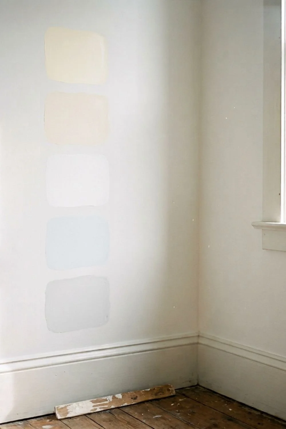
Why undertone is the whole game
Every white paint has a base pigment mixed in, even if it's a small amount. That base is what creates the undertone, and it's what determines whether a white reads warm, cool, or neutral once it's up on a wall.
The easiest way to actually see an undertone is to hold your paint chip against a piece of plain white printer paper. Printer paper is about as neutral as white gets, so it acts like a reference point. Look at the edge where the chip meets the paper. You'll usually catch a hint of yellow, pink, gray, or blue creeping in, something you'd never notice looking at the chip on its own. That faint hint is the undertone, and it's the single biggest factor in how a white will actually behave in your space.
Undertone matters more in white than in any other color because white has so little pigment to begin with. In a saturated color like terracotta or forest green, a slight shift in undertone barely registers. In white, that same shift is the entire story. It's the difference between a white that feels soft and inviting and one that feels sterile or slightly off in a way you can't quite name.
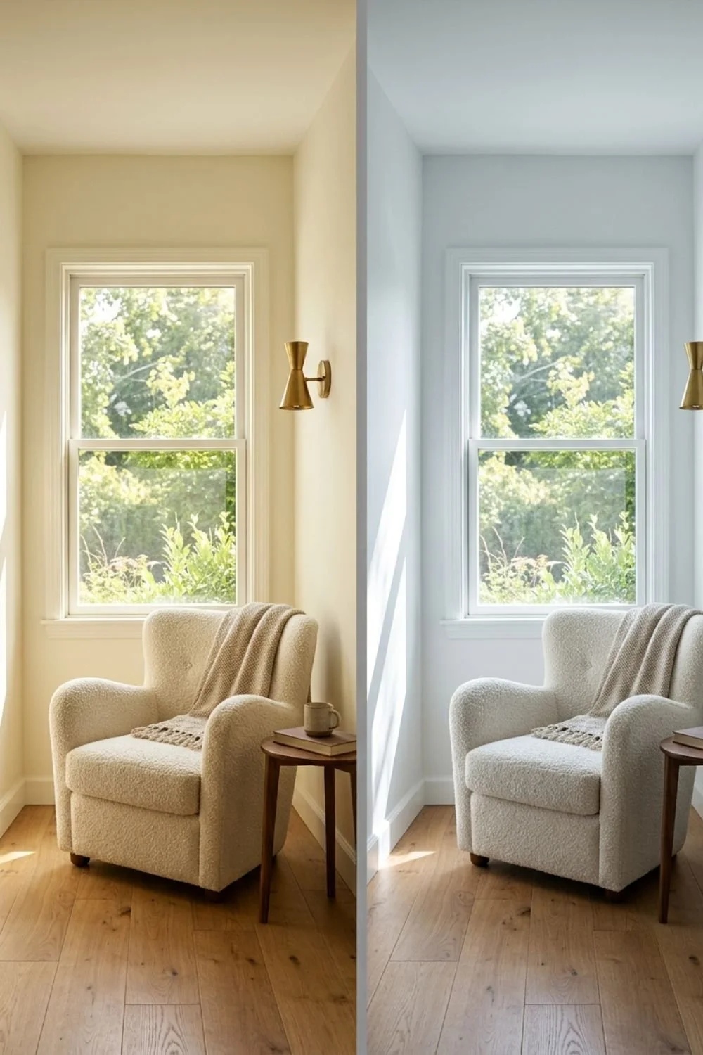
The light in your room decides more than the can does
This is the step people skip, and it's the one that actually matters most. The exact same paint can look like three different colors depending on which direction your windows face and what time of day you're looking at it.
North-facing rooms get the coolest, flattest light of any orientation, and it barely changes throughout the day. Cool-toned whites in a north-facing room can read gray, clinical, even slightly blue. A white with a warm undertone keeps the room feeling lived-in instead of like a waiting room.
South-facing rooms get strong, warm light for most of the day. Whites here can shift toward yellow or even look slightly dingy by afternoon if they already lean warm. A white with a touch of cool in it balances that out instead of amplifying it.
East-facing rooms run warm in the morning and cool by evening. West-facing rooms do the reverse, cool in the morning and warm by evening. A room with big swings like this needs a white with a very restrained undertone, because anything strong will look like a different color depending on what time someone walks in.
None of this is a minor detail to skip past. It's the actual foundation of the decision. A "good" white in the wrong light exposure will disappoint you every time, no matter how many five-star reviews it has online.
How to test it properly
Buy the sample pot. Don't paint the wall directly, and don't rely on a peel-and-stick swatch either, since both can behave differently than the finished paint film. Paint two coats onto a large piece of poster board or foam board instead, something you can carry around the room.
Then give it a full day. Prop the board against the wall in the morning, check it again at midday, and look at it once more in the evening under your lamps or overhead lighting. Move it to more than one wall in the room if the room has windows on more than one side. What you're watching for is whether the white holds steady across all of that, or whether it visibly shifts from warm to cool to something in between as the light changes.
This single step is the difference between a paint job you're happy with in six months and one you're already side-eyeing by the second week. A swatch under store lighting tells you almost nothing. A board tested across a full day and multiple times of light tells you the truth, because it shows you the white behaving exactly the way it will once it's permanent.
If you're testing more than one white at a time, keep the boards in the same room, in the same spots, so you're comparing them under identical conditions rather than trusting your memory of how one looked yesterday.
A few whites worth starting with
Sherwin Williams Alabaster is one of the most forgiving warm whites available, and it holds up well across mixed or shifting light, which makes it a safe starting point if you're not sure what exposure you're dealing with yet. Pure White, also Sherwin Williams, stays clean and true without tipping stark, and works as a genuine wall color rather than only a trim white. Sherwin Williams High Reflective White is about as close to a true, crisp white as you'll find, best kept for rooms that already get strong natural light.
From Benjamin Moore, White Dove is the warm, soft choice people reach for when a room needs to feel welcoming rather than clinical. Chantilly Lace is their cleanest, brightest option, closer in feel to High Reflective White.
Valspar's Swiss Coffee is another warm, livable white worth considering, particularly if the first two brands aren't easily available where you're shopping.
Treat this as a starting shortlist, not a final answer. The right one still depends on your light, your room, and what you're testing it against.
The one thing to hold onto
Undertone decides more than the name on the can ever will. Two whites can look nearly identical sitting on a paint store shelf and completely different once they're up on your actual walls, in your actual light. Test before you commit, watch how the color moves across a full day, and let your room's light exposure guide whether you go warmer or cooler.
That's the whole method. It takes more patience than grabbing the first can labeled "white," but it's the difference between a wall you love and one you're quietly annoyed by every time the light changes.