




A Sherwin Williams color system for mid-century modern done warm, not costume-y. This guide gives you 8 coordinating colors, pulled from walnut, brass, copper, and cane rather than a trend board, with exact wall, trim, and accent placement so the look reads considered instead of themed. It's a 50 page instant digital download, yours to keep and reuse across every future project.
You want the warmth: open rooms, low furniture, light that moves through the day, materials that feel real. But lean too hard into the trend and you land somewhere between a hotel lobby and a costume. Play it too safe and you lose the character entirely, back to the same greige builder palette everyone already has.
Mid-century palettes live or die on undertone. Pick colors from different families and a room that should feel composed instead feels scattered, like every wall was chosen on a separate trip to the paint counter. That's the real risk here: wanting a home that looks like it was designed once, correctly, and getting a home that looks like it was decorated by committee instead.
8 coordinating Sherwin Williams colors, built on a single warm, golden-earth undertone so nothing fights across rooms
Detailed color profiles with placement tips, so you know exactly which color goes on walls, which on trim, which as an accent
Whole house color flow suggestions, so open-plan rooms and separate rooms alike read as one home
Wall, trim, and accent pairing combinations
3 exterior paint ideas to carry the palette outside
50 pages, instant digital download, yours forever
Every color in this palette was pulled from a material the style already depends on: plaster in afternoon light, oiled walnut, worn brass, burnished copper, woven cane. Match your furniture and finishes to the palette and the room settles into itself instead of announcing a theme. It works whether you're restoring an original mid-century house or just want that same warmth in a totally different kind of space.
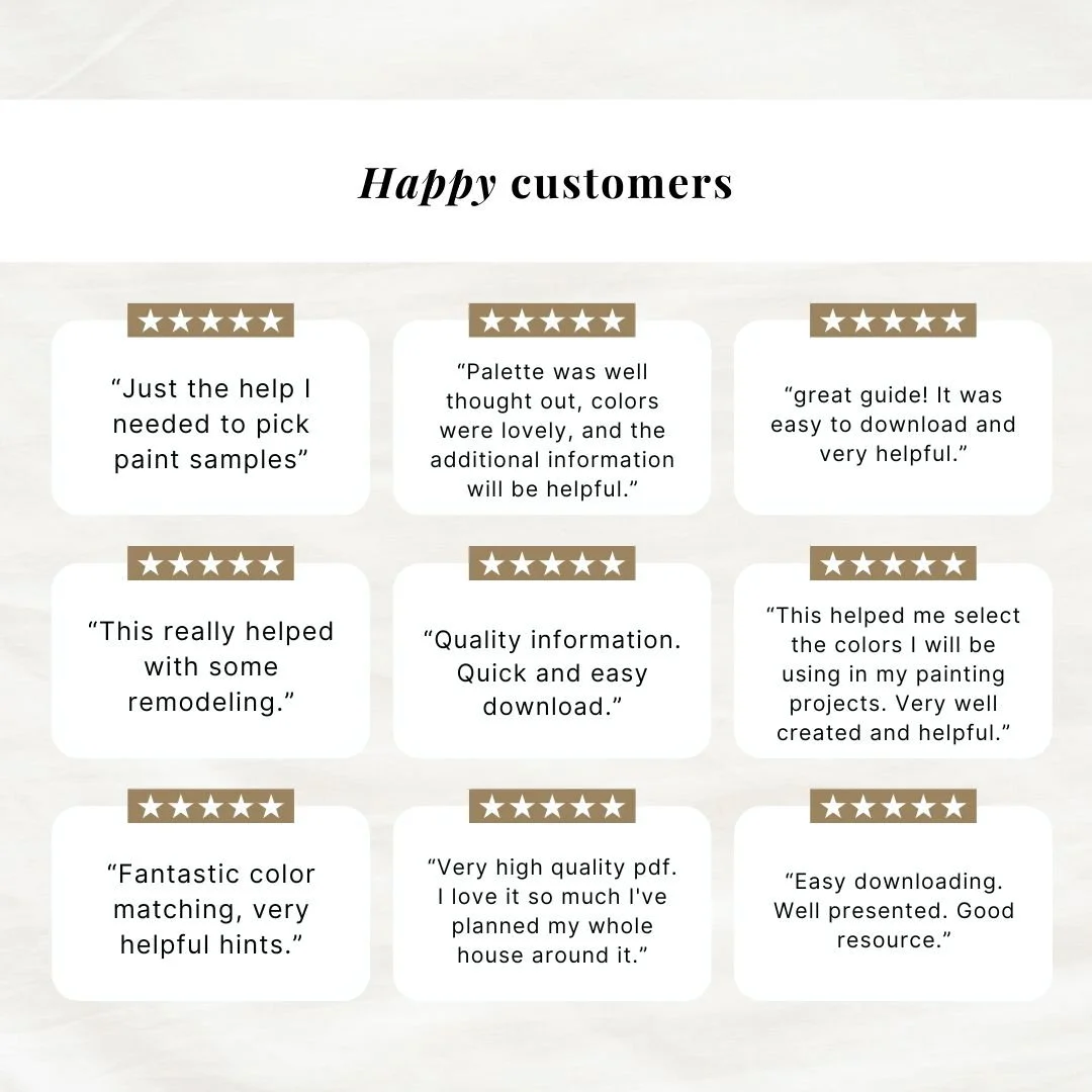
Buyers describe it as exactly the help they needed to pick paint samples, a well thought out palette with lovely colors, and a resource that made remodeling easier. One buyer said she loved it so much she planned her whole house around it.
The color research, palette curation, and placement guidance in this guide are mine, built from years of interior design work. AI tools assist with drafting the written content, and the room imagery throughout is AI-generated to show the palette in real spaces. Every color, pairing, and recommendation is chosen and reviewed by hand before it makes it into the guide.
Download it, open it next to your favorite room, and know within minutes which colors belong in your home and where. No more test pots, no more repainting, just a plan that works the first time.
A Sherwin Williams color system for mid-century modern done warm, not costume-y. This guide gives you 8 coordinating colors, pulled from walnut, brass, copper, and cane rather than a trend board, with exact wall, trim, and accent placement so the look reads considered instead of themed. It's a 50 page instant digital download, yours to keep and reuse across every future project.
You want the warmth: open rooms, low furniture, light that moves through the day, materials that feel real. But lean too hard into the trend and you land somewhere between a hotel lobby and a costume. Play it too safe and you lose the character entirely, back to the same greige builder palette everyone already has.
Mid-century palettes live or die on undertone. Pick colors from different families and a room that should feel composed instead feels scattered, like every wall was chosen on a separate trip to the paint counter. That's the real risk here: wanting a home that looks like it was designed once, correctly, and getting a home that looks like it was decorated by committee instead.
8 coordinating Sherwin Williams colors, built on a single warm, golden-earth undertone so nothing fights across rooms
Detailed color profiles with placement tips, so you know exactly which color goes on walls, which on trim, which as an accent
Whole house color flow suggestions, so open-plan rooms and separate rooms alike read as one home
Wall, trim, and accent pairing combinations
3 exterior paint ideas to carry the palette outside
50 pages, instant digital download, yours forever
Every color in this palette was pulled from a material the style already depends on: plaster in afternoon light, oiled walnut, worn brass, burnished copper, woven cane. Match your furniture and finishes to the palette and the room settles into itself instead of announcing a theme. It works whether you're restoring an original mid-century house or just want that same warmth in a totally different kind of space.
Buyers describe it as exactly the help they needed to pick paint samples, a well thought out palette with lovely colors, and a resource that made remodeling easier. One buyer said she loved it so much she planned her whole house around it.
The color research, palette curation, and placement guidance in this guide are mine, built from years of interior design work. AI tools assist with drafting the written content, and the room imagery throughout is AI-generated to show the palette in real spaces. Every color, pairing, and recommendation is chosen and reviewed by hand before it makes it into the guide.
Download it, open it next to your favorite room, and know within minutes which colors belong in your home and where. No more test pots, no more repainting, just a plan that works the first time.