
Mastering Balance in Room Layout
I spent days arranging and rearranging my living room before I understood what felt off. The furniture was good. The proportions were right. But something about the layout felt unresolved.
One side of the room felt heavy. The other felt empty. My eye kept getting pulled to the left where the sofa and credenza created visual density, while the right side, with just two chairs and a small side table, felt like an afterthought.
The problem wasn't symmetry. It was balance. Or the lack of it.
Visual Weight Over Literal Weight
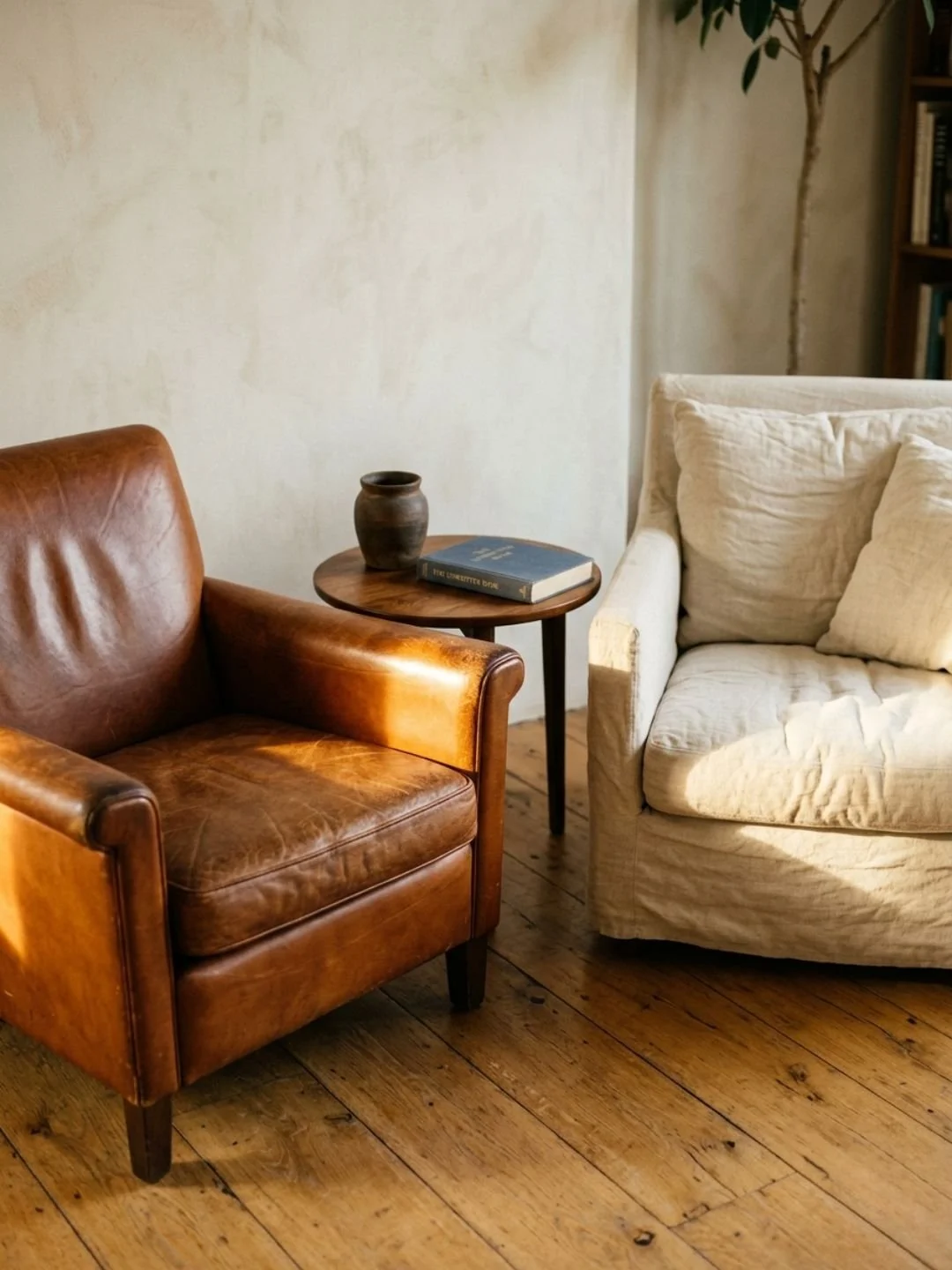
Balance isn't about matching. A sofa on one wall doesn't need an identical sofa on the opposite wall. It needs something with equivalent visual presence.
Visual weight comes from several factors: size, color, texture, height. A large object has more weight than a small one. A dark object has more weight than a light one. A textured surface has more weight than a smooth one. A tall piece draws the eye more than a low one.
Understanding this changes how you arrange furniture. A substantial sofa might be balanced by a bookshelf and two chairs on the opposite side. The literal weight is different, but the visual impact is similar.
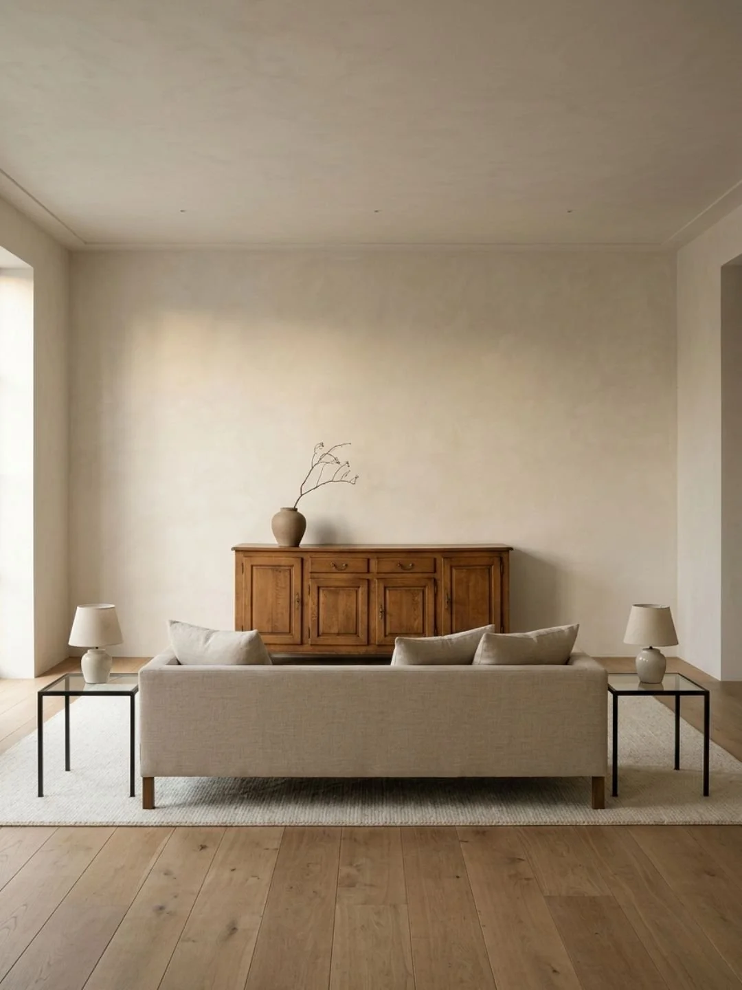
In my living room, the credenza is long and dark with pronounced wood grain. It has significant visual weight. To balance it, I placed a large floor lamp and a tall plant on the opposite wall. Together, they create enough presence to keep the room from feeling lopsided.
Working in Quadrants
I find it helpful to think of a room in quadrants. Not precisely divided, but loosely. Each quadrant should have roughly equivalent visual interest.
This doesn't mean placing the same amount of furniture in each area. It means distributing presence. One quadrant might have a single large piece. Another might have several smaller objects that together create similar weight.
I notice when one area is overloaded and another is sparse. The overloaded area draws attention disproportionately. The sparse area feels neglected. Adjusting the distribution brings the room into equilibrium.
Symmetry When It Serves
Symmetry can work when it reinforces the room's architecture. Matching sconces flanking a fireplace. Two identical nightstands on either side of a bed. A pair of chairs facing each other.
But symmetry for its own sake often feels forced. Especially in rooms without strong architectural features to support it. A symmetric arrangement in an asymmetric room creates tension rather than harmony.
I use symmetry selectively. In the bedroom, the bed is centered with matching nightstands. This feels appropriate because the bed is the focal point and the nightstands serve identical functions. But in the living room, where the layout is more informal, strict symmetry would feel rigid.
Height Variation
Balance also works vertically. A room where everything is the same height feels monotonous. Too much variation feels chaotic.
I aim for a rhythm of high and low. A tall bookshelf balanced by a low credenza. A substantial sofa anchored by low side tables. A floor lamp adding vertical interest in a corner where furniture is otherwise horizontal.
This creates visual movement without instability. Your eye travels around the room at different levels, which makes the space feel more dynamic.
Testing the Balance
I test balance by sitting in different parts of the room and noticing where my eye goes. If it keeps returning to the same area, that spot is either too visually dense or too empty.
Sometimes the fix is adding something. A plant, a piece of art, a lamp. Sometimes it's removing something. An object that's creating clutter or drawing too much attention.
Balance is iterative. I'll move something and live with it for a few days. If the room starts to feel more settled, the change worked. If I'm still noticing the imbalance, I keep adjusting.
The Role of Negative Space
Empty space is part of the balance. A wall with nothing on it can feel intentional if the rest of the room has enough presence. But too much emptiness makes a room feel unfinished.
I think of negative space as breathing room. It gives the eye a place to rest. But it needs to be balanced with areas of interest.
In my entryway, one wall has a mirror and a console table. The opposite wall is bare. This works because the furnished wall has enough visual weight to hold the space. The empty wall doesn't feel neglected. It feels calm.
When Balance Fails
An unbalanced room feels unsettled. You can't pinpoint what's wrong, but something keeps nagging at you. Your eye doesn't flow naturally around the space.
Usually, the problem is an unequal distribution of visual weight. Too much on one side, not enough on the other. Too much height in one area, everything else low. Too much texture in one corner, everything else smooth.
The fix is redistribution. Move something heavy to a lighter area. Add height where everything is low. Introduce texture where surfaces are plain.
What You Start to See
Once you understand balance, you notice it everywhere. Hotel lobbies where every corner has considered presence. Living rooms where the arrangement feels effortless because the visual weight is evenly distributed.
Good balance doesn't announce itself. The room just feels right. Grounded, harmonious, resolved. That quality comes from attention to how objects relate to each other across space, not just how they look individually.