Navigating Visual Tension and Contrast in Home Styling
On the productive friction between rough and refined, and why the most interesting rooms are never entirely comfortable.
There is a version of interior design that is entirely about comfort, and it tends to produce rooms that are pleasant to be in but not particularly interesting to look at. Everything is soft, nothing is abrasive, every edge has been considered and resolved. I understand the appeal. I also find these rooms slightly forgettable.
The rooms that stay with me are the ones with some friction in them. Not conflict, not disorder, but a productive tension between elements that do not entirely belong to the same world. Rough beside refined. Heavy beside delicate. Old beside considered-new. That tension is what creates visual interest, and managing it well is one of the more nuanced aspects of putting a room together.
What Visual Tension Actually Means
Visual tension in a room is the effect produced when two elements with strongly contrasting qualities are placed in deliberate relationship to each other. The contrast makes each element more visible than it would be on its own. A beautiful, polished object on a rough surface is more striking than the same object on a neutral one. A delicate lamp on a heavy, worn table reads differently than it would on a slim, contemporary console.
The contrast does not need to be dramatic to be effective. Sometimes it is as subtle as the difference between a matte-glazed ceramic and a highly polished stone surface. The eye registers the contrast and the two objects sharpen against each other. That sharpening is the thing you are after.
Contrast makes each element more visible than it would be on its own. That is the point of it.
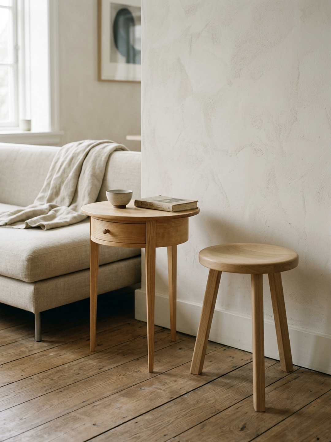
The Rough and the Refined
The pairing I find most consistently productive is some version of rough and refined: a raw or imperfect element alongside something that is precise or polished. It works because the two qualities define each other. Refinement reads as more refined against something rough. Roughness reads as more intentional against something refined.
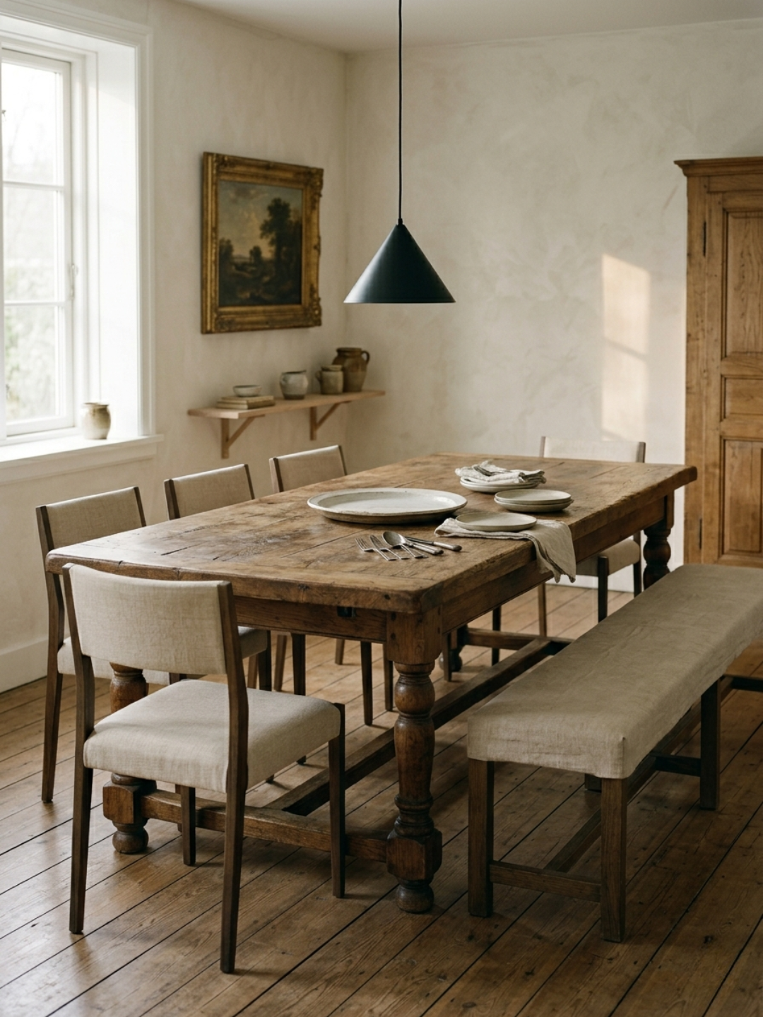
In a room I spent time putting together a couple of years ago, the main table was a thick slab of reclaimed wood with a surface that had not been sanded to smoothness, just sealed enough to be practical. Visible saw marks, knots, slight unevenness in the grain. The chairs around it were contemporary, slim-legged, upholstered in pale boucle. The table's rawness made the chairs look more considered. The chairs' refinement made the table look more intentional. Neither would have read as well alone.
The same principle appears in smaller decisions: a rough-textured wall behind a smooth, carefully glazed ceramic. A worn leather armchair beside a crisp linen sofa. A concrete floor under an antique rug. In each case the contrast is the content of the room, not an accident to be corrected.
When Tension Becomes Conflict
The version of this that does not work is when the contrast is between a strong element and a weak one. Tension requires both sides to be considered. A genuinely worn, beautiful piece of aged timber creates productive tension with refined contemporary furniture. A merely old piece of mediocre furniture alongside refined contemporary furniture just looks like the latter has not been finished yet.
The quality of the rough element matters as much as the quality of the refined one. An aged surface that has developed through use of good materials is a different thing from a surface that is simply damaged. Patina and deterioration look similar from a distance and entirely different up close. The distinction is in the material underneath: whether the aging has brought something out of the piece or simply worn it down.
Knowing When to Stop
Tension is productive up to a point, and then it becomes exhausting. A room with strong contrasts everywhere gives the eye nowhere to rest. Part of managing tension well is deciding how much of it the room can hold.
My approach is to keep the tension concentrated in one or two relationships per room rather than distributed across everything. One strong rough-refined pairing, resolved and deliberate. The rest of the room can be quieter. That way the contrast reads as a considered decision rather than an inability to commit to anything.
The rooms that manage this well have a quality of confidence about them. They do not apologize for the friction. They have decided that the friction is the point, and everything around it supports that decision. That kind of certainty in a room is what makes it feel like someone thought about it, which is the thing worth aiming for.
Disclaimer: AI-assisted writing applied.