The Strategy of Mixing Interior Styles
On why a room that lives entirely in one era rarely feels like anyone actually lives there.
The rooms I find most compelling are never the ones that read like a catalog page. They have something unresolved about them, in a good way. A nineteenth-century library chair in a spare, contemporary apartment. A raw concrete wall behind a perfectly aged oak table. Something that makes you look twice, not because it is strange, but because it is confident.
Mixing styles is not a trend. It is what happens when a home accumulates meaning over time, when you inherit a piece, when you fall for something outside your usual references, when your taste shifts and the things you already own do not disappear. The question is not whether to mix, but how to do it with enough intention that the result feels considered rather than accidental.
I have thought about this for a long time and lived inside several versions of it. What follows is how I approach it now.
Bridging Design Eras
Most people feel the safest sticking to one period or one aesthetic language. Everything mid-century, or everything Scandinavian, or everything vintage. It is coherent, but it can also feel static. A room that has been curated too tightly sometimes has less life than one where different eras are in quiet conversation.
The key to mixing periods successfully is finding the underlying quality they share. A 1950s Italian chair with tapered legs and a tight upholstered seat sits well in a contemporary room because both share a respect for precise proportion and restraint. The decades between them disappear when the sensibility is the same. What clashes is not old and new, but considered and unconsidered placed side by side. Read more on Bridging Different Design Eras.
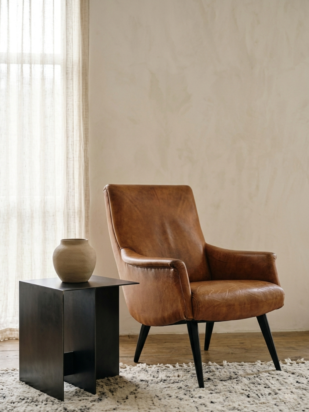
The 80/20 Rule for Aesthetic Balance
I work from a rough principle: eighty percent of a room should belong to a dominant aesthetic, and twenty percent should be allowed to diverge. The eighty creates coherence. The twenty creates personality. Without the dominant eighty, a room feels directionless. Without the experimental twenty, it feels closed.
In my own living space, the dominant register is quiet and contemporary: pale plaster walls, clean-lined furniture, a limited palette. The twenty percent is where I keep the things that do not quite fit that description but that I love too much to remove. A carved wooden object picked up years ago. A deep-toned vintage textile on a chair that is otherwise very simple. These things create the friction that makes the room feel inhabited. Read more on the 80/20 Rule.
Color as the Bridge
A disciplined palette is the most reliable tool I know for making diverse pieces coexist. When the colors across a room share an undertone, whether warm or cool, light or saturated, the eye reads the whole as cohesive even when the furniture is from entirely different periods and sensibilities.
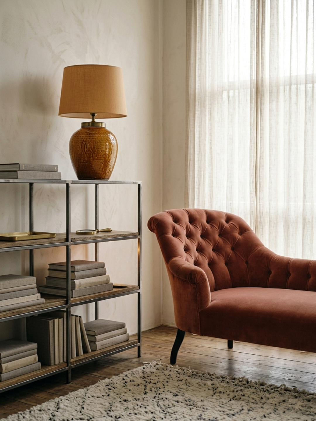
A room I spent time in recently had a Victorian chaise, a raw steel shelving unit, and a Japanese ceramic lamp. Three things with no obvious relationship. But the palette across all of them moved through the same range of dusty terracotta, warm grey, and aged brass, and the room felt completely resolved. Color was doing the work that matching furniture would otherwise do, but with far more interest. Read more on Color as a Bridge.
Materiality as a Connecting Thread
Where color creates harmony across the whole, repeating materials create local connections between individual pieces. A specific wood tone appearing in the table, the picture frame, and the base of a lamp ties those three things together quietly, without any of them needing to match in style or period.
I tend to work with two or three materials across a room and let them recur in different forms. Aged brass appears in the hardware, in a small object, in the frame of a mirror. Dark-stained oak appears in the dining table, in a stool, in the edge of a shelf. The repetition is not accidental; it is the thing that makes a collected room feel assembled rather than scattered. Read more on Materiality as a Connecting Thread.
Navigating Visual Tension
The most interesting rooms I have encountered carry some degree of tension between the rough and the refined. A beautiful, polished table on a raw stone floor. A delicate ceramic object on a heavy, worn wooden surface. The contrast between them is what makes each one more visible.
This kind of tension only works when both sides of it are strong. A rough element that is merely neglected does not create the same effect as one that has been chosen deliberately. The worn linen cushion and the scuffed leather chair are not the same as a stained one. The distinction is in the quality of the original material and the nature of its aging. Texture and imperfection that come from good materials developing over time are different from surfaces that were simply never considered.
The five posts in this series go into each of these ideas in more depth. Taken together they form a framework for mixing styles with enough confidence that the result feels like a deliberate point of view, which is always what separates a considered room from one that is just full of things. Read more on Navigating Visual Tension.
Disclaimer: AI-assisted writing applied.