




A Sherwin Williams color system for the dark academia look done right: rooms built like a private library, not a stage set. This guide gives you 8 coordinating colors, from aged parchment white to a century-old oxblood, with exact wall, trim, and accent placement so the mood reads scholarly instead of simply dark. It's a 50 page instant digital download, yours to keep and reuse across every future project.
You want the library energy: leather, brass, ink, worn oak, a room with opinions. But go one shade too far and it stops feeling considered and starts feeling like a cave. Go too safe and you lose the mood entirely and end up with a beige room wearing a dark throw pillow.
Dark palettes punish guessing more than light ones do. A neutral that's slightly off just looks a little flat. A dark green or oxblood that's slightly off looks muddy, or worse, like a bad decision you now have to live with on every wall. That's the real fear behind this look: getting the drama without the mistake.
8 coordinating Sherwin Williams colors, from an aged parchment white to a century-old oxblood, built as one cohesive system rather than picked in isolation
Detailed color profiles with placement tips, so you know exactly which color goes on walls, which on trim, which as an accent
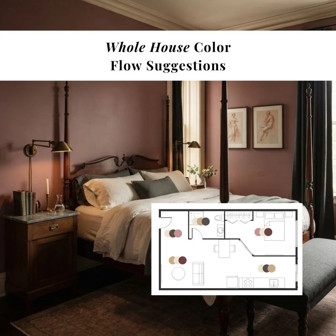
Whole house color flow suggestions, so the moody rooms and the everyday rooms connect instead of feeling like two different homes
Wall, trim, and accent pairing combinations
3 exterior paint ideas to carry the palette outside
50 pages, instant digital download, yours forever
Every color in this palette was pulled from something the dark academia look already owns: the leather of a satchel, the ink wash of a page, the brass base of a reading lamp, the cloth cover of a book read too many times. Match your materials to the palette and the room assembles itself. You're not choosing colors in isolation, you're choosing from a system that was built from the dark end up, which is exactly what keeps it from tipping into gloomy.
Buyers describe it as exactly the help they needed to pick paint samples, a well thought out palette with lovely colors, and a resource that made remodeling easier. One buyer said she loved it so much she planned her whole house around it.
The color research, palette curation, and placement guidance in this guide are mine, built from years of interior design work. AI tools assist with drafting the written content, and the room imagery throughout is AI-generated to show the palette in real spaces. Every color, pairing, and recommendation is chosen and reviewed by hand before it makes it into the guide.
Download it, open it next to your favorite room, and know within minutes which colors belong in your home and where. No more test pots, no more repainting, just a plan that works the first time.
A Sherwin Williams color system for the dark academia look done right: rooms built like a private library, not a stage set. This guide gives you 8 coordinating colors, from aged parchment white to a century-old oxblood, with exact wall, trim, and accent placement so the mood reads scholarly instead of simply dark. It's a 50 page instant digital download, yours to keep and reuse across every future project.
You want the library energy: leather, brass, ink, worn oak, a room with opinions. But go one shade too far and it stops feeling considered and starts feeling like a cave. Go too safe and you lose the mood entirely and end up with a beige room wearing a dark throw pillow.
Dark palettes punish guessing more than light ones do. A neutral that's slightly off just looks a little flat. A dark green or oxblood that's slightly off looks muddy, or worse, like a bad decision you now have to live with on every wall. That's the real fear behind this look: getting the drama without the mistake.
8 coordinating Sherwin Williams colors, from an aged parchment white to a century-old oxblood, built as one cohesive system rather than picked in isolation
Detailed color profiles with placement tips, so you know exactly which color goes on walls, which on trim, which as an accent
Whole house color flow suggestions, so the moody rooms and the everyday rooms connect instead of feeling like two different homes
Wall, trim, and accent pairing combinations
3 exterior paint ideas to carry the palette outside
50 pages, instant digital download, yours forever
Every color in this palette was pulled from something the dark academia look already owns: the leather of a satchel, the ink wash of a page, the brass base of a reading lamp, the cloth cover of a book read too many times. Match your materials to the palette and the room assembles itself. You're not choosing colors in isolation, you're choosing from a system that was built from the dark end up, which is exactly what keeps it from tipping into gloomy.
Buyers describe it as exactly the help they needed to pick paint samples, a well thought out palette with lovely colors, and a resource that made remodeling easier. One buyer said she loved it so much she planned her whole house around it.
The color research, palette curation, and placement guidance in this guide are mine, built from years of interior design work. AI tools assist with drafting the written content, and the room imagery throughout is AI-generated to show the palette in real spaces. Every color, pairing, and recommendation is chosen and reviewed by hand before it makes it into the guide.
Download it, open it next to your favorite room, and know within minutes which colors belong in your home and where. No more test pots, no more repainting, just a plan that works the first time.