


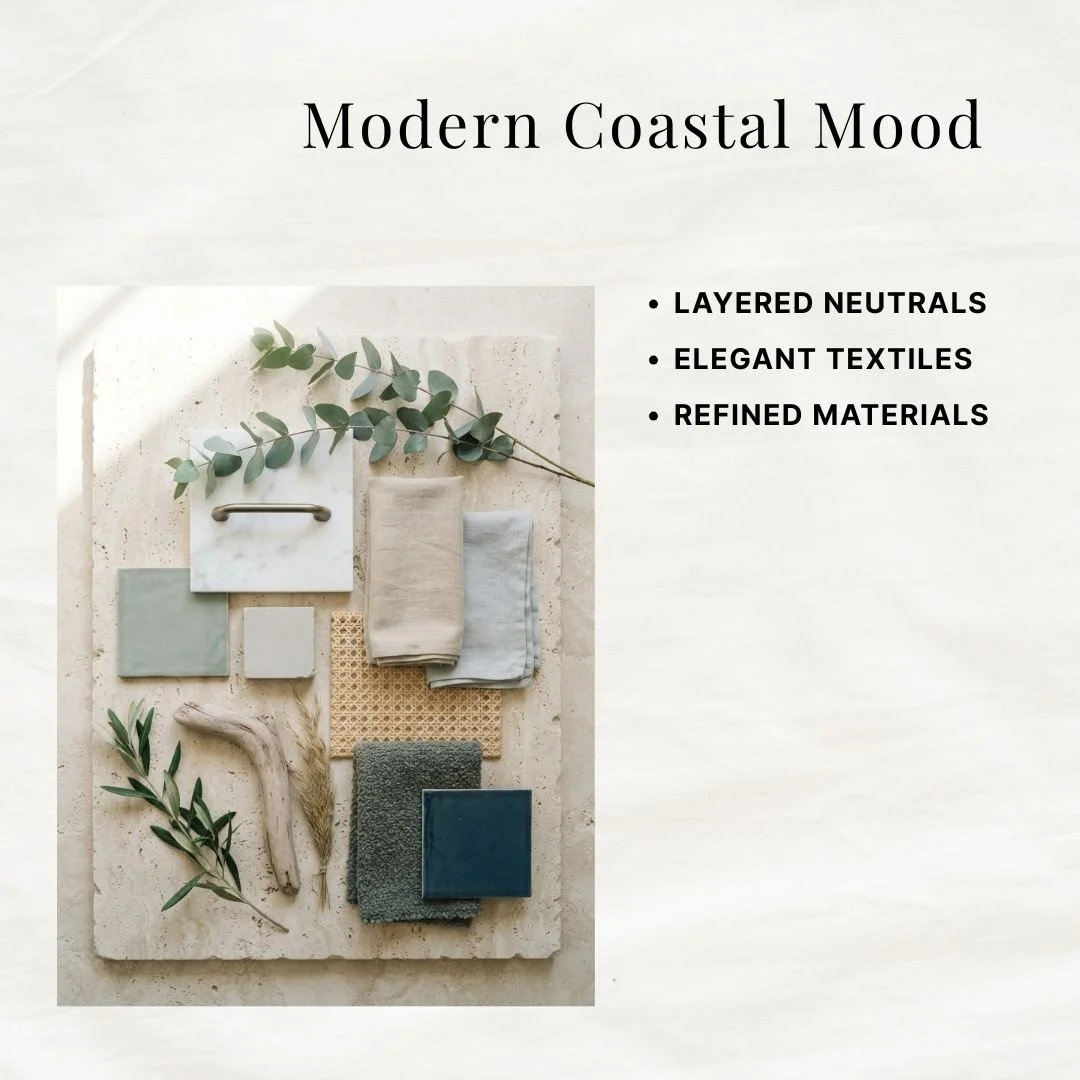


A Sherwin Williams color system for coastal done like an actual house by the water, not a souvenir shop. This guide gives you 8 coordinating colors, pulled from sail canvas, morning fog, driftwood, and open water, with exact wall, trim, and accent placement so the look reads like light and air instead of navy stripes and rope knots. It's a 50 page instant digital download, yours to keep and reuse across every future project.
You want the light: white walls, washed blues, wood gone soft from sun and salt, a room that feels like a window left open on a clear day. But reach for the obvious coastal cues and you land in beach-souvenir territory fast, anchors, rope, navy and white stripes everywhere. Play it too safe and it's just a white room with one blue accent wall, no depth, no spine.
Coastal palettes live or die on ratio. Too many darks and the room loses its light. Too many pale blues with nothing to anchor them and it goes flat and forgettable. That's the real tension here: getting the airiness without the room feeling empty, and the color without it feeling like a theme.
8 coordinating Sherwin Williams colors, built on a light-forward ratio so the room stays bright with real depth underneath
Detailed color profiles with placement tips, so you know exactly which color goes on walls, which on trim, which as an accent
Whole house color flow suggestions, so sunlit rooms and quieter rooms still read as one home
Wall, trim, and accent pairing combinations
3 exterior paint ideas to carry the palette outside
50 pages, instant digital download, yours forever
Every color in this palette was pulled from something the coast already owns: a sail in full sun, the morning marine layer, dry sand, sea glass tumbled smooth, driftwood, weather rolling in, the harbor at dusk. Match your linen, rattan, white oak, and rope details to the palette and the room assembles itself, no beach house required.
Buyers describe it as exactly the help they needed to pick paint samples, a well thought out palette with lovely colors, and a resource that made remodeling easier. One buyer said she loved it so much she planned her whole house around it.
The color research, palette curation, and placement guidance in this guide are mine, built from years of interior design work. AI tools assist with drafting the written content, and the room imagery throughout is AI-generated to show the palette in real spaces. Every color, pairing, and recommendation is chosen and reviewed by hand before it makes it into the guide.
Download it, open it next to your favorite room, and know within minutes which colors belong in your home and where. No more test pots, no more repainting, just a plan that works the first time.
A Sherwin Williams color system for coastal done like an actual house by the water, not a souvenir shop. This guide gives you 8 coordinating colors, pulled from sail canvas, morning fog, driftwood, and open water, with exact wall, trim, and accent placement so the look reads like light and air instead of navy stripes and rope knots. It's a 50 page instant digital download, yours to keep and reuse across every future project.
You want the light: white walls, washed blues, wood gone soft from sun and salt, a room that feels like a window left open on a clear day. But reach for the obvious coastal cues and you land in beach-souvenir territory fast, anchors, rope, navy and white stripes everywhere. Play it too safe and it's just a white room with one blue accent wall, no depth, no spine.
Coastal palettes live or die on ratio. Too many darks and the room loses its light. Too many pale blues with nothing to anchor them and it goes flat and forgettable. That's the real tension here: getting the airiness without the room feeling empty, and the color without it feeling like a theme.
8 coordinating Sherwin Williams colors, built on a light-forward ratio so the room stays bright with real depth underneath
Detailed color profiles with placement tips, so you know exactly which color goes on walls, which on trim, which as an accent
Whole house color flow suggestions, so sunlit rooms and quieter rooms still read as one home
Wall, trim, and accent pairing combinations
3 exterior paint ideas to carry the palette outside
50 pages, instant digital download, yours forever
Every color in this palette was pulled from something the coast already owns: a sail in full sun, the morning marine layer, dry sand, sea glass tumbled smooth, driftwood, weather rolling in, the harbor at dusk. Match your linen, rattan, white oak, and rope details to the palette and the room assembles itself, no beach house required.
Buyers describe it as exactly the help they needed to pick paint samples, a well thought out palette with lovely colors, and a resource that made remodeling easier. One buyer said she loved it so much she planned her whole house around it.
The color research, palette curation, and placement guidance in this guide are mine, built from years of interior design work. AI tools assist with drafting the written content, and the room imagery throughout is AI-generated to show the palette in real spaces. Every color, pairing, and recommendation is chosen and reviewed by hand before it makes it into the guide.
Download it, open it next to your favorite room, and know within minutes which colors belong in your home and where. No more test pots, no more repainting, just a plan that works the first time.