
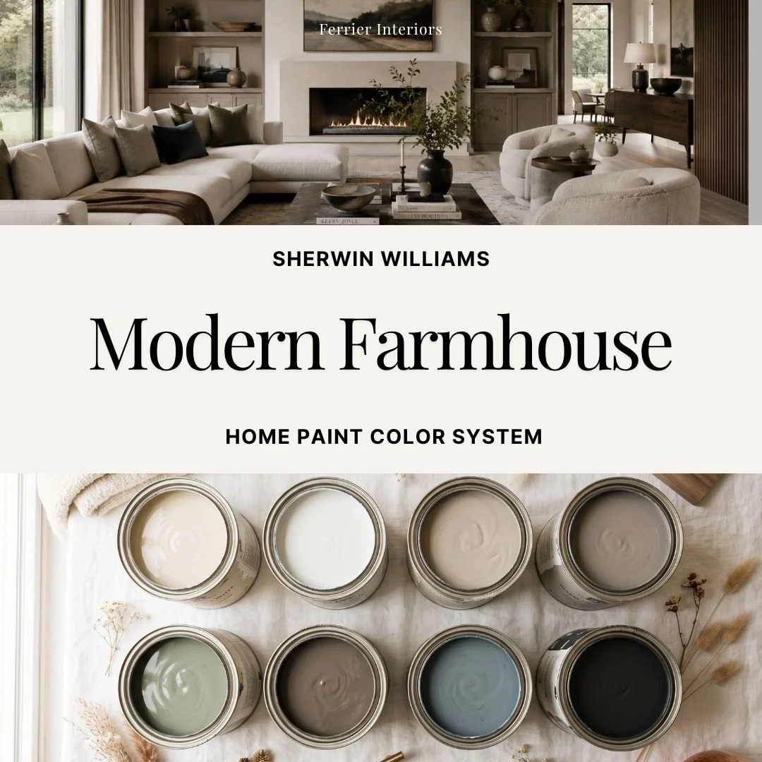


A Sherwin Williams color system for modern farmhouse done the way it actually looks in a well-designed home, not the barn-door, farmhouse-sign version. This guide gives you 8 coordinating colors, pulled from raw oak, limewashed plaster, tumbled limestone, and weathered barn board, with exact wall, trim, and accent placement so the look reads warm and considered instead of trendy.
Why modern farmhouse paint colors are harder to pin down than they look
Search "modern farmhouse paint colors" and you'll find a dozen lists that all repeat the same two or three shades with no guidance on where they actually go. A white that reads warm in the store can go cold under your lighting. A greige can shift toward pink by afternoon. Without a plan for how the colors move room to room, it's easy to end up with choices that each look fine on their own but don't quite feel like one connected home.
The style itself is subtle, too: modern farmhouse works best when the palette stays quiet and grounded rather than leaning on any one statement color or finish. Getting that balance right is exactly what this guide is built to help with.
What's inside:
8 coordinating Sherwin Williams colors, curated for a warm, grounded, modern farmhouse palette
Detailed color profiles with placement tips, so you know exactly which color goes on walls, which on trim, which as an accent
How each color shifts in north light, south light, and evening light, so you're not guessing until the paint is already on the wall
Whole house color flow suggestions, so every room transitions instead of clashing
5 example room applications and 3 exterior paint schemes to carry the palette outside
A paint sheen guide by room, and a paint quantity calculator so you know how much to buy
Instant digital download, yours forever
A note on how this guide was made
The color selections, pairings, and placement guidance in this guide reflect my own design judgment and experience. I used AI tools to help draft and organize the written content and to generate the room imagery shown throughout, so you're seeing styled visual references rather than photographs of real interiors. Every color decision is mine.
Ready to stop guessing?
Grab the guide, sample the colors in your own light, and paint with the confidence that every room is already working together before you open the can.
A Sherwin Williams color system for modern farmhouse done the way it actually looks in a well-designed home, not the barn-door, farmhouse-sign version. This guide gives you 8 coordinating colors, pulled from raw oak, limewashed plaster, tumbled limestone, and weathered barn board, with exact wall, trim, and accent placement so the look reads warm and considered instead of trendy.
Why modern farmhouse paint colors are harder to pin down than they look
Search "modern farmhouse paint colors" and you'll find a dozen lists that all repeat the same two or three shades with no guidance on where they actually go. A white that reads warm in the store can go cold under your lighting. A greige can shift toward pink by afternoon. Without a plan for how the colors move room to room, it's easy to end up with choices that each look fine on their own but don't quite feel like one connected home.
The style itself is subtle, too: modern farmhouse works best when the palette stays quiet and grounded rather than leaning on any one statement color or finish. Getting that balance right is exactly what this guide is built to help with.
What's inside:
8 coordinating Sherwin Williams colors, curated for a warm, grounded, modern farmhouse palette
Detailed color profiles with placement tips, so you know exactly which color goes on walls, which on trim, which as an accent
How each color shifts in north light, south light, and evening light, so you're not guessing until the paint is already on the wall
Whole house color flow suggestions, so every room transitions instead of clashing
5 example room applications and 3 exterior paint schemes to carry the palette outside
A paint sheen guide by room, and a paint quantity calculator so you know how much to buy
Instant digital download, yours forever
A note on how this guide was made
The color selections, pairings, and placement guidance in this guide reflect my own design judgment and experience. I used AI tools to help draft and organize the written content and to generate the room imagery shown throughout, so you're seeing styled visual references rather than photographs of real interiors. Every color decision is mine.
Ready to stop guessing?
Grab the guide, sample the colors in your own light, and paint with the confidence that every room is already working together before you open the can.